The problem
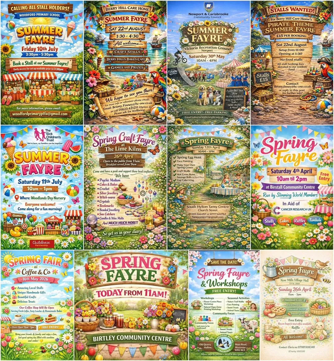
A now famous Facebook post shows us the scourge of identikit posters generated by AI.
Here’s an article on the subject from the Independent.
Here’s another I found in the wild. With apologies for picking on the Leamington Beer Festival - they are by no means unique
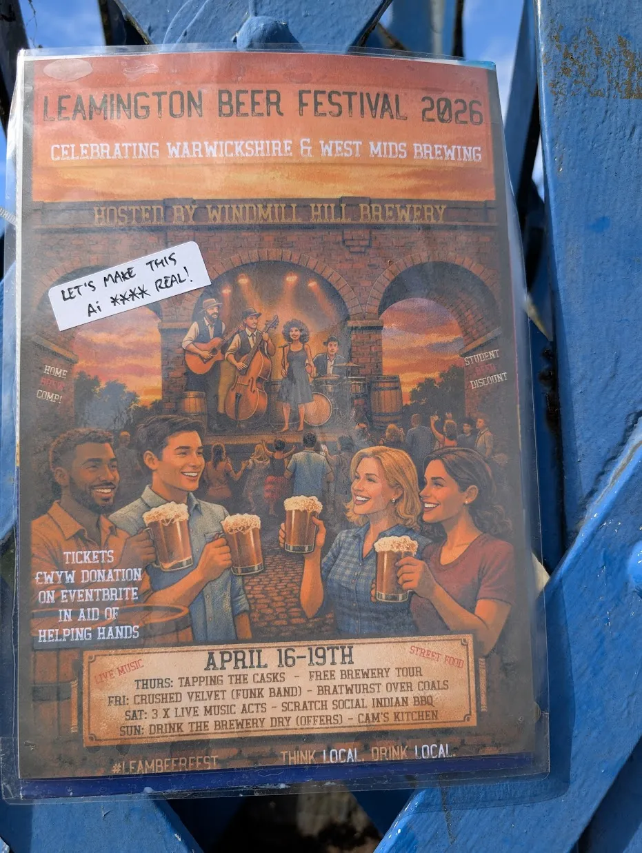
The problem with these is not so much that they’re bad. They’re OK, I don’t love them. The problem is that once you’ve seen that style 20 times it starts to irritate just from the sheer repetition.
I knew that even ChatGPT was capable of a broader variety of styles than this, so I set out to prove it.
I gave ChatGPT some invented event details and asked it to produce a poster. Rather than go with the default look it would choose for a spring fayre, I made a point of specifying what I thought was a different style:
Me:
Produce a poster for a spring fayre.
Go for a clean, unfussy, bright layout with a bold striking spring-themed graphic. Avoid pastel/airbrush/oil style art or images of people.
This is what came back.
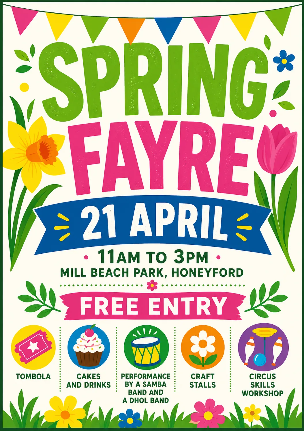
Not as successful as I hoped. To me it still feels like what I’m trying to avoid.
I asked for something deliberately different.
Me:
Make another one using a completely different design aesthetic of your choice. Treat the current one as a “what not to do” – not that there is anything wrong with it, but we want ours to stand out from other posters that look similar.
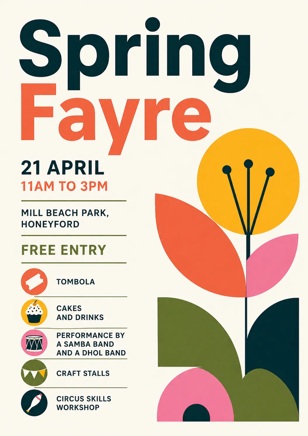
I think this is already much better. It stands out just be being different. I wondered what I would call this style if I wanted to ask for it again?
Me: What is this design style you’ve used called?
ChatGPT: This one is leaning into a modernist / Bauhaus-influenced graphic style, with a bit of contemporary “flat illustration” layered on top.
More specifically, you could describe it as:
Bauhaus / Modernist Poster Design
- Rooted in the Bauhaus tradition (1920s–30s)
- Strong emphasis on function over decoration
- Asymmetrical layout with clear hierarchy
- Bold, simple sans-serif typography
- Limited, high-contrast colour palette
Geometric Minimalism
- Built from basic shapes (circles, semicircles, rectangles)
- The flower is abstracted into almost symbolic forms
- Very little texture or shading — mostly flat colour
Swiss Style (International Typographic Style) influence
- Clean grid-based alignment (even if loosely applied)
- Information-first layout
- Clear, legible structure
If you wanted a shorthand label for a designer or printer, you could call it:
“Bauhaus-inspired geometric minimalist poster”
If you’re trying to stand out, this direction works well because most local event posters default to:
- bunting
- hand-drawn florals
- pastel palettes
- “craft fair” aesthetics
Whereas this feels more like:
- a gallery poster
- a design museum flyer
- or something you’d see in a well-curated café
If you want, I can push it further into a really distinctive niche (e.g. brutalist, risograph, 90s rave flyer, Japanese minimal, etc.).
Well, thanks GPT. I knew there was an endless array of design styles that it could produce. Instead of trying to dredge some names from my memory, I asked for suggestions.
It replied with a list of styles, some of which I’d never heard of, some I recognised but couldn’t picture, some which were names I didn’t know for styles I did.
Me: Give me a list of styles to choose from
ChatGPT: Here’s a deliberately varied menu—some safe-but-distinct, some quite left-field. I’ve kept each one concrete so you can imagine how your fayre poster would actually look.
🎨 Clean but Characterful
1. Bauhaus / Modernist
2. Swiss Style
3. Contemporary Editorial (Magazine-style)
🌿 Graphic & Illustrative (but not twee)
4. Risograph Print Style
5. Cut Paper / Collage (Matisse-inspired)
6. Botanical Scientific Illustration (Modernised)
⚡ Bold / Unusual Directions
7. Brutalist Graphic Design
8. 90s Rave Flyer / Acid Graphics
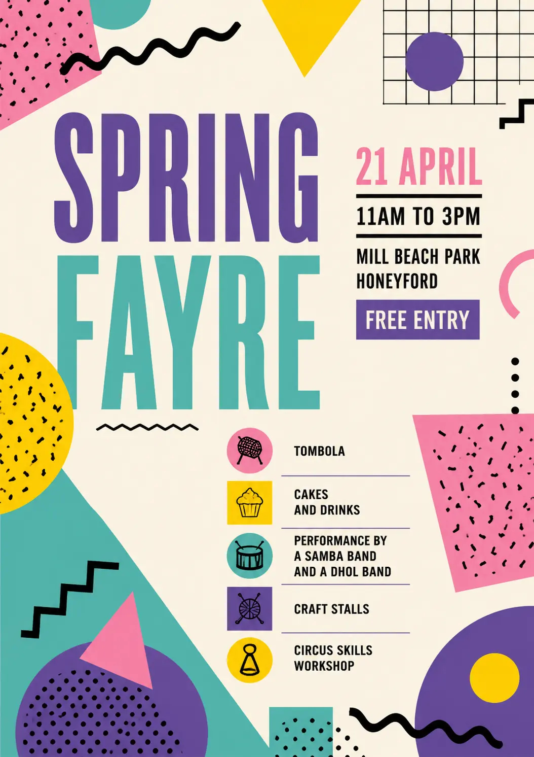
9. Memphis Design (80s Postmodern)
🧭 Quietly Distinct / Understated
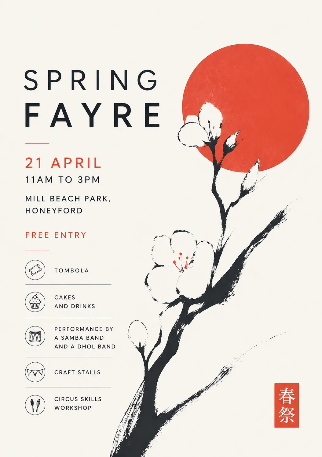
10. Japanese Minimal Poster
11. Monochrome + Single Accent (Ultra-minimal)
12. Wayfinding / Signage Style
🎪 Slightly Playful but Still Clean
13. Modern Icon System
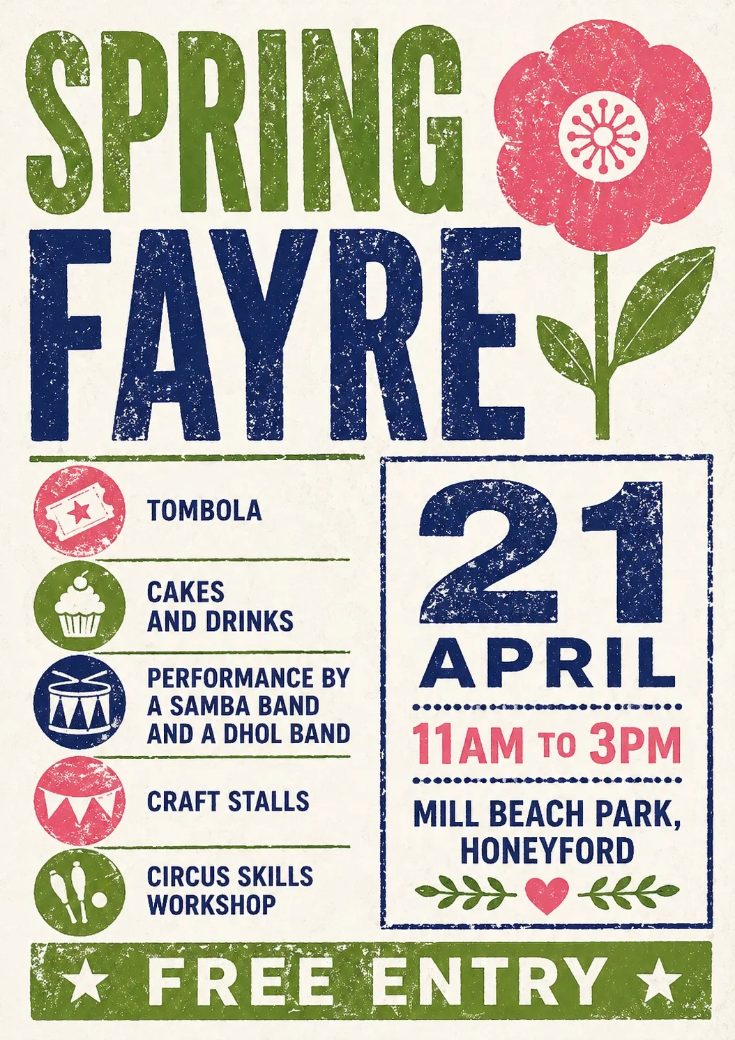
14. Stamp / Letterpress Style (Modernised)
15. Festival Poster (Contemporary Indie)
If you want a steer
Given your brief (“clean, unfussy, bold, no twee imagery”), the strongest stand-out options are:
- Risograph
- Cut paper / Matisse
- Brutalist (toned down slightly)
- Japanese minimal
- Wayfinding / signage
If one of these clicks, I can generate a poster in that exact style—and push it properly, not just superficially.
Asking for specific aesthetics produced a variety of posters.
Now, I’m not claiming these don’t have a whiff of AI about them. I don’t think that’s really my goal - we can be honest that we’re using AI, we just don’t want it to have that look that everyone’s sick of.
Me: Please give me Stamp / Letterpress Style (Modernised)
Me: and now please Japanese Minimal Poster
Me: Now do Memphis Design please
(I didn’t know what Memphis Group design was, but I recognised if when I saw it.
Then I got a bit silly. Designers Republic is a design agency famous for record covers from the late 80s onwards.
Me: And now in the style of Designers Republic
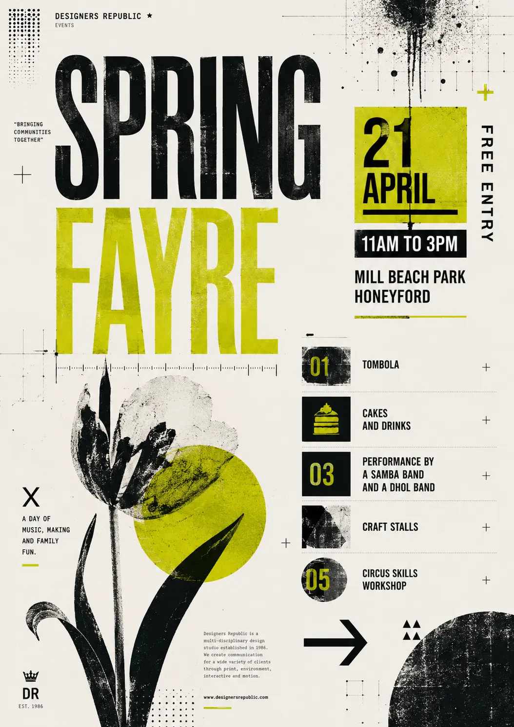
One note here is that along the way, the poster has acquired extra text (“A day of music making and family fun”) – it’s decided that Designers Republic would have thrown in some text of that kind, so it’s come up with some words. Those words are now in the chat context, so they appear in subsequent posters.
If you were working from scratch, you’d just ask for the style you want in the first place, and avoid picking up trappings as you go.
Me: Now as if a professional graphic designer has added typography to a poster paint drawing by his young child.
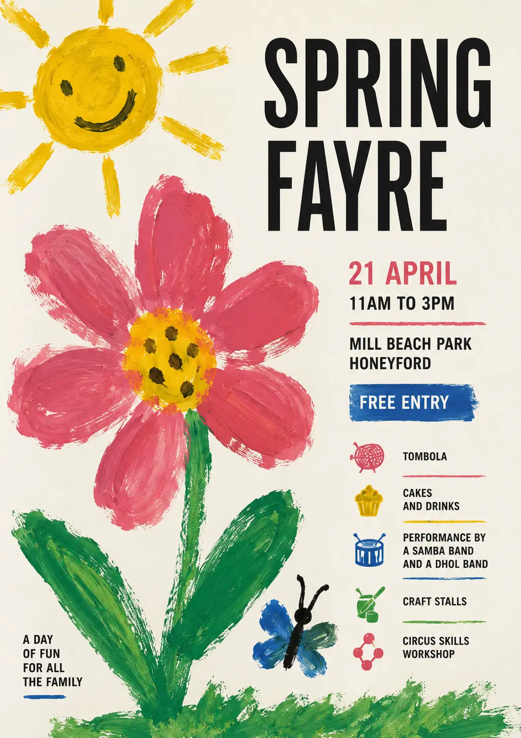
Me: Now with the aesthetic of a photocopied 1980 punk fanzine. But with some colour snuck in.
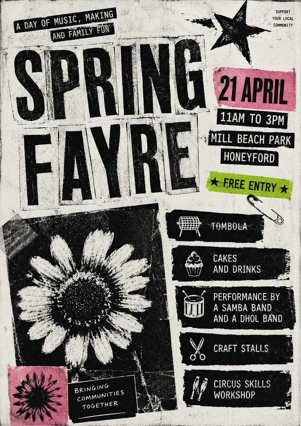
Me: Now please make one in the style of a 90s drum n bass gig flyer, with early 3D/fractal computer imagery
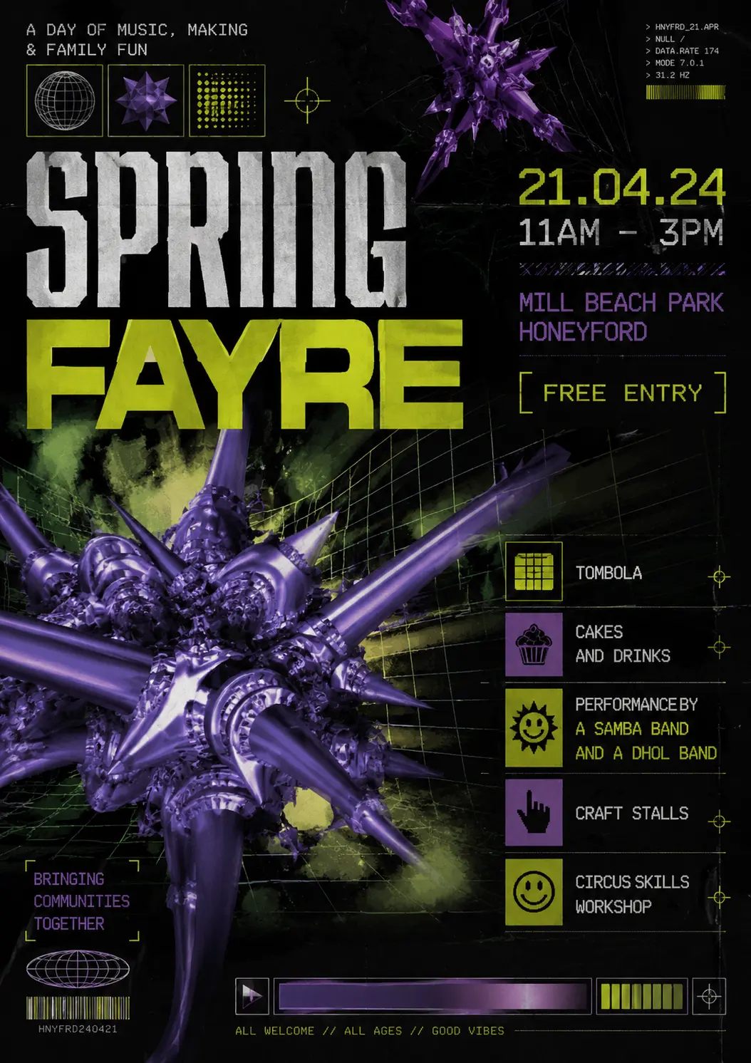
Back to sensible ideas, naming an art style but asking for a poster that movement might have used, seems like a strong tactic.
Me: Now in the style of a contemporary 40s poster for a cubist exhibition.
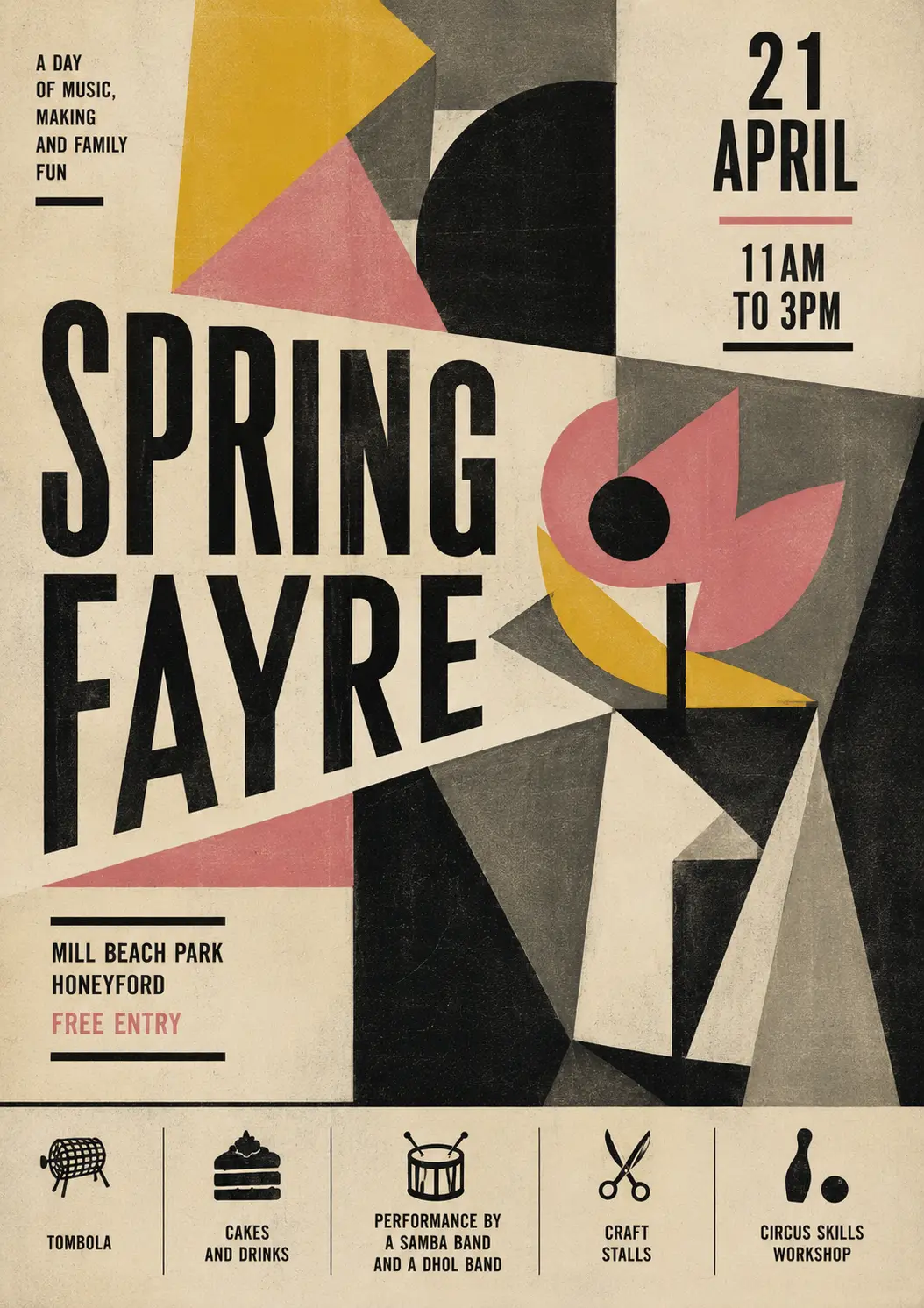
So there we are. The sharp-eyed are still going to recognise these as AI-generated, but they’re distinctive, and I think they’re not ugly.
So that’s the moral - you don’t have to make posters that look like everyone else’s.
There’s a further step - you don’t have to ask AI for posters as images that can’t be edited. Claude and Gemini can generate HTML, PNG, PDF, where the text is real text, layers are real layers, you can change fonts, move things around, edit the text – but that’s more than I want to talk about today.
Inspired by this blog post, I went on to make a catalogue of one hundred poster styles, with ready-to-paste prompts and example images for each one.