It’s here, the future of masonry layouts on the web! After the groundwork laid by Mozilla, years of effort by Apple’s WebKit team, and many rounds debate at the CSS Working Group with all the browsers, it’s now clear how it works.
Introducing CSS Grid Lanes.
.container {
  display: grid-lanes;
  grid-template-columns: repeat(auto-fill, minmax(250px, 1fr));
  gap: 16px;
}
Try it today in Safari Technology Preview 234.
How Grid Lanes work
Let’s break down exactly how to create this classic layout.

First, the HTML.
<main class="container">
  <figure><img src="photo-1.jpg"></figure>
  <figure><img src="photo-2.jpg"></figure>
  <figure><img src="photo-3.jpg"></figure>

</main>
Let’s start by applying display: grid-lanes to the main element to create a Grid container ready to make this kind of layout. Then we use grid-template-columns to create the “lanes” with the full power of CSS Grid.
In this case, we’ll use repeat(auto-fill, minmax(250px, 1fr)) to create flexible columns at least 250 pixels wide. The browser will decide how many columns to make, filling all available space.
And then, gap: 16px gives us 16 pixel gaps between the lanes, and 16 pixel gaps between items within the lanes.
.container {
  display: grid-lanes;
  grid-template-columns: repeat(auto-fill, minmax(250px, 1fr));
  gap: 16px;
}
That’s it! In three lines of CSS, with zero media queries or container queries, we created a flexible layout that works on all screen sizes.
Think of it like a highway of cars in bumper-to-bumper traffic.
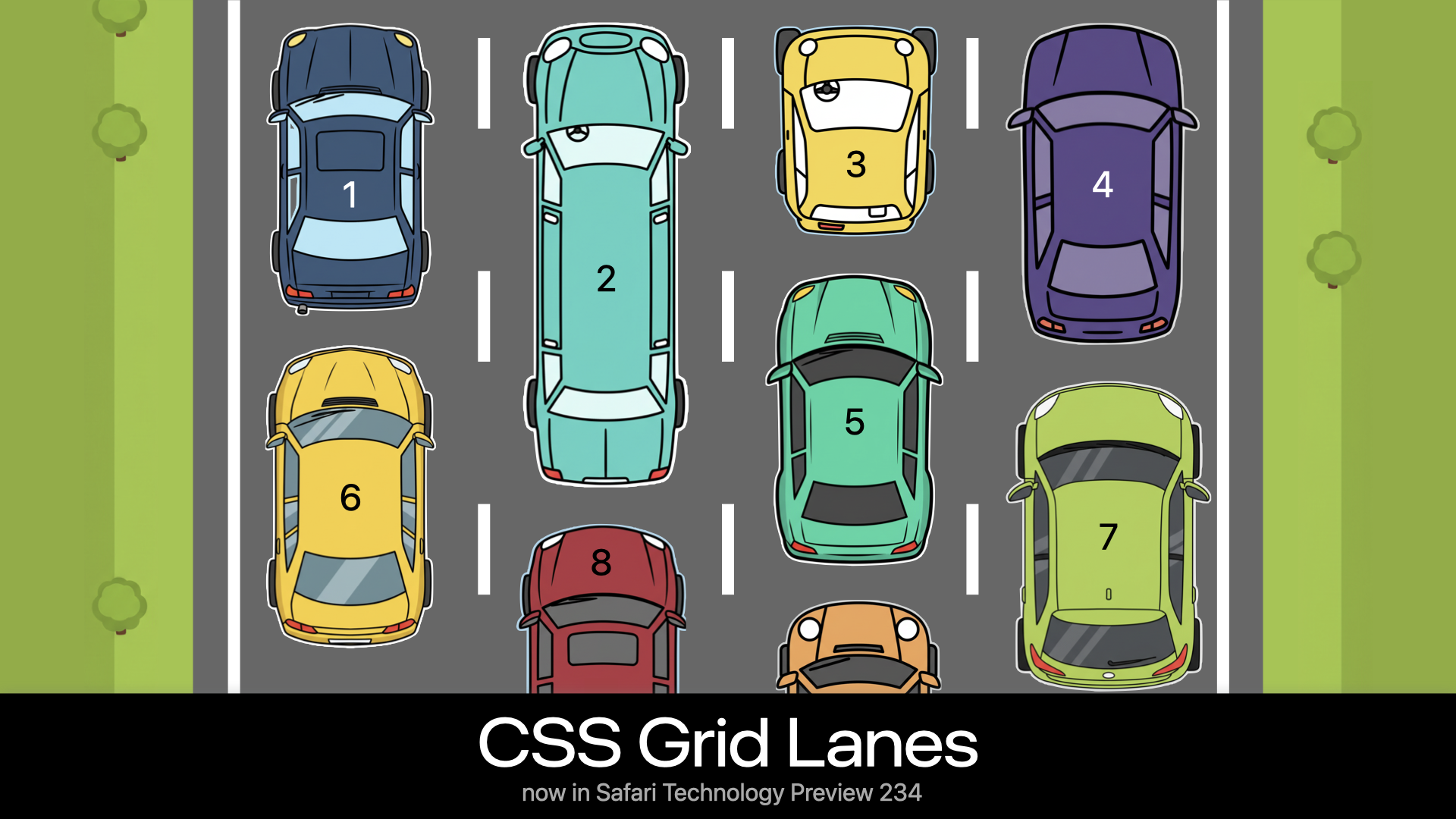
Just like the classic Masonry library, as the browser decides where to put each item, the next one is placed in whichever column gets it closest to the top of the window. Like traffic, each car “changes lanes” to end up in the lane that gets them “the furthest ahead”.
This layout makes it possible for users to tab across the lanes to all currently-visible content, (not down the first column below the fold to the very bottom, and then back to the top of the second column). It also makes it possible for you to build a site that keeps loading more content as the user scrolls, infinitely, without needing JavaScript to handle the layout.
The power of Grid
Varying lane sizes
Because Grid Lanes uses the full power of CSS Grid to define lanes using grid-template-*, it’s easy to create creative design variations.
For example, we can create a flexible layout with alternating narrow and wide columns — where both the first and last columns are always narrow, even as the number of columns changes with the viewport size. This is accomplished with grid-template-columns: repeat(auto-fill, minmax(8rem, 1fr) minmax(16rem, 2fr)) minmax(8rem, 1fr).

There’s a whole world of possibilities using grid-template-* syntax.
Spanning items
Since we have the full power of Grid layout, we can also span lanes, of course.
main {
  display: grid-lanes;
  grid-template-columns: repeat(auto-fill, minmax(20ch, 1fr));
  gap: 2lh;
}
article {
  grid-column: span 1;
}
@media (1250px < width) {
  article:nth-child(1) {
    grid-column: span 4;
  }
  article:nth-child(2), article:nth-child(3), article:nth-child(4), article:nth-child(5), article:nth-child(6), article:nth-child(7), article:nth-child(8) {
    grid-column: span 2;
  }
}
All the article teasers are first set to span 1 column. Then the 1st item is specifically told to span 4 columns, while the 2nd – 8th to span 2 columns. This creates a far more dynamic graphic design than the typical symmetrical, everything the same-width, everything the same-height layout that’s dominated over the last decade.
Placing items
We can also explicitly place items while using Grid Lanes. Here, the header is always placed in the last column, no matter how many columns exist.

main {
  display: grid-lanes;
  grid-template-columns: repeat(auto-fill, minmax(24ch, 1fr));
}
header {
  grid-column: -3 / -1;
}
Changing directions
Yes, lanes can go either direction! All of the examples above happen to create a “waterfall” shape, where the content is laid out in columns. But Grid Lanes can be used to create a layout in the other direction, in a “brick” layout shape.
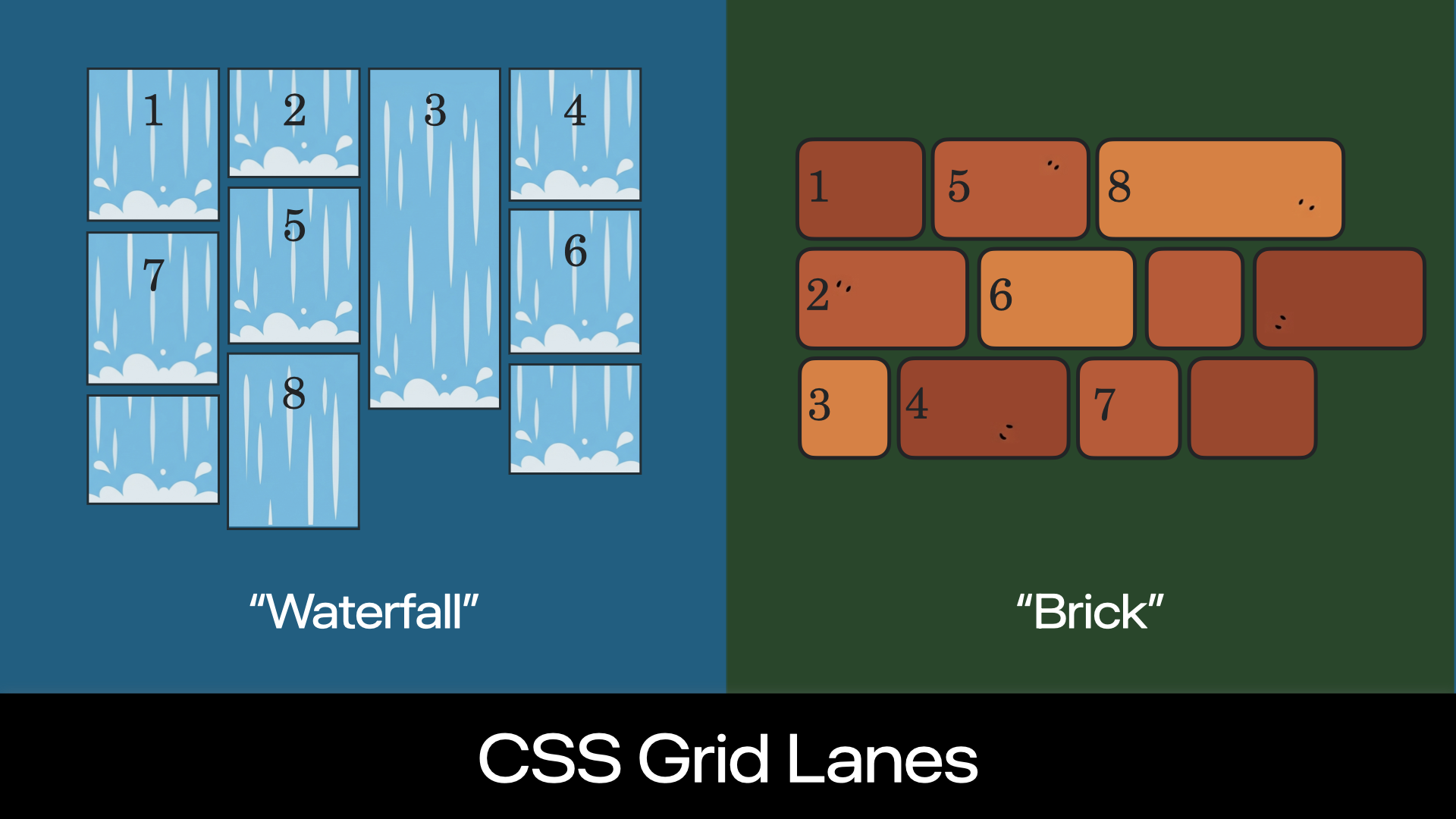
The browser automatically creates a waterfall layout when you define columns with grid-template-columns, like this:
.container {
  display: grid-lanes;
  grid-template-columns: 1fr 1fr 1fr 1fr;
}
If you want a brick layout in the other direction, instead define the rows with grid-template-rows:
.container {
  display: grid-lanes;
  grid-template-rows: 1fr 1fr 1fr;
}
This works automatically thanks to a new default forgrid-auto-flow, the normal value. It figures out whether to create columns or rows based on whether you defined the lanes using grid-template-columns or grid-template-rows.
The CSS Working Group is still discussing which property will explicitly control the flow orientation, and what its syntax will be. The debate is over whether to reuse grid-auto-flow or create new properties like grid-lanes-direction. If you’re interested in reading about the options being considered or chime in with your thoughts, see this discussion.
However, since normal will be the initial value either way, you don’t have to wait for this decision to learn Grid Lanes. When you define only one direction — grid-template-rows or grid-template-columns — it will Just Work™. (If it doesn’t, check if grid-auto-flow is set to a conflicting value. You canunset it if needed.)
Placement sensitivity
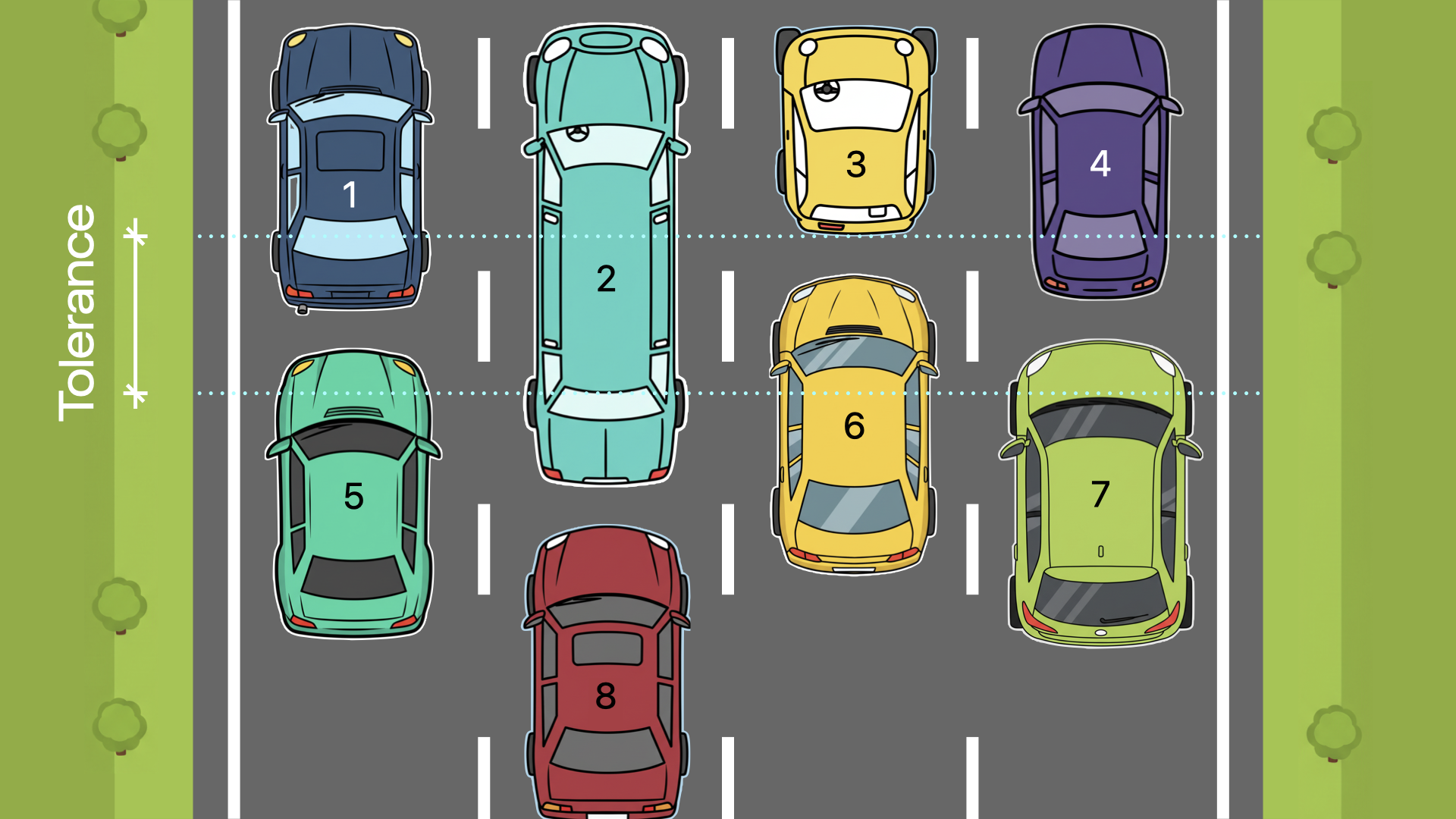
“Tolerance” is a new concept created for Grid Lanes. It lets you adjust just how picky the layout algorithm is when deciding where to place items.
Look at the next drawing. Notice that Car 4 is a tiny bit shorter than Car 1. When the “tolerance” is zero, Car 6 ends up in the right-most lane, while Car 7 is on the left. Car 6 ends up behind Car 4 on the right because that gets it a tiny bit closer “down the road” (closer to the top of the Grid container). Car 7 then takes the next-closest-to-the-top slot, and ends up behind Car 1 on the left. The end result? The first horizontal grouping of content is ordered 1, 2, 3, 4, and the next is 7, 5, 6.
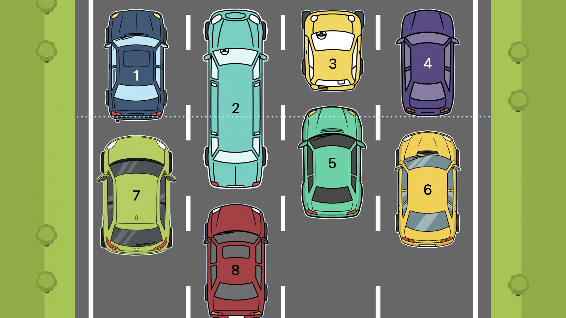
But the difference in length between Car 1 and Car 4 is tiny. Car 6 isn’t meaningfully closer to the top of the page. And having item 6 on the right, with item 7 on the left is likely an unexpected experience — especially for users who are tabbing through content, or when the content order is somehow labeled.
These tiny differences in size don’t matter in any practical sense. Instead, the browser should consider item sizes like Car 1 and Car 4 to be a tie. That’s why the default for item-tolerance is 1em — which means only differences in content length greater than 1 em will matter when figuring out where the next item goes.
If you’d like the layout of items to shuffle around less, you can set a higher value for item-tolerance. In the next digram, the tolerance is set to half-a-car, causing the cars to lay out basically from left to right and only moving to another lane to avoid the extra-long limo. Now, the horizontal groupings of content are 1, 2, 3, 4, and 5, 6, 7.
Think of tolerance as how chill you want the car drivers to be. Will they change lanes to get just a few inches ahead? Or will they only move if there’s a lot of space in the other lane? The amount of space you want them to care about is the amount you set in item-tolerance.
Remember that people tabbing through the page will see each item highlighted as it comes into focus, and may be experiencing the page through a screenreader. An item tolerance that’s set too high can create an awkward experience jumping up and down the layout. An item tolerance that’s too low can result in jumping back and forth across the layout more than necessary. Adjust item-tolerance to something appropriate for the sizes and size variations of your content.
Currently, this property is named item-tolerance in the specification and in Safari Technology Preview 234. However, there is still a chance this name will change, perhaps to something like flow-tolerance or pack-tolerance. If you have a preference, or ideas for a better name, you can chime in here. Keep an eye out for updates about the final name before using this property on production websites.
Try it out
Try out Grid Lanes in Safari Technology Preview 234! All of the demos at webkit.org/demos/grid3 have been updated with the new syntax, including other use cases for Grid Lanes. It’s not just for images! For example, a mega menu footer full of links suddenly becomes easy to layout.

.container {
  display: grid-lanes;
  grid-template-columns: repeat(auto-fill, minmax(max-content, 24ch));
  column-gap: 4lh;
}
What’s next?
There are a few last decisions for the CSS Working Group to make. But overall, the feature as described in this article is ready to go. It’s time to try it out. And it’s finally safe to commit the basic syntax to memory!
We’d love for you to make some demos! Demonstrate what new use cases you can imagine. And let us know about any bugs or possible improvements you discover. Ping Jen Simmons on Bluesky or Mastodon with links, comments and ideas.
Our team has been working on this since mid-2022, implementing in WebKit and writing the web standard. We can’t wait to see what you will do with it.