published: 4 November 2024, tagged: desktop, linux
I don’t know when it started happening, or why. Maybe it’s because people are getting so used to touch screens on smartphones, maybe it’s because designers want to make their interfaces as minimal as possible; I can’t say. But I like a good, old-fashioned scrollbar, and unfortunately they seem to be going the way of the dodo.
I have a few problems with the new style of overlay scrollbar, the kind that disappear after a while if you leave them alone. For one, the scrollbar gives me two useful pieces of information if I’m reading an article: first, the size of the scrollbar lets me see roughly how long the article is; and second, I can see how far through the page I am. It makes me a little sad that some websites feel the need to add a fancy progress bar at the top of the page to let me see where I am – this is a solved problem! This is what scrollbars are for!
The other issue I have with overlay scrollbars is, y’know, using them for scrolling! If I want to scroll with a conventional scroll bar, I can see the whole scrollbar and I can either click on the thumb (the little rectangle that moves) and drag it, or click somewhere along the track (the big rectangle the thumb moves along) to jump there. With overlay scrollbars, I have to wiggle my mouse over the rough area I think the scrollbar is to summon it, and then drag the absolutely teensy thumb, and there isn’t a track to click on anymore, so that’s not an option.

wow, I didn't know anyone cared so much about scrollbars...
Okay, perhaps I’m nitpicking, but I stand by the fact that having nice chunky, persistent scrollbars makes it easier to use my computer. Fortunately, it’s pretty easy to get them back!
Most of the time if I’m on my computer, I’m either in emacs or firefox, and for the former I tend not to use scollbars anyway. After all, it’s not often I need to know how far down I am in a code file, and even when I do, the percentage progress indicator at the bottom is good enough for me. Suffice it to say, I really want my scrollbars in firefox to be good. Luckily, there are a few hidden settings we can use to get them that way.
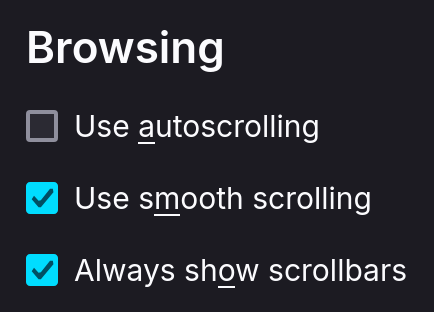
First, there’s an option in the general settings menu to always show scrollbars. Enabling this will give you a fairly sensible scrollbar that stays on the side of the window where you left it.

This is a pretty good start, but there are some hidden settings in about:config that are worth playing with as well. Here are the ones I change:
layout.css.scrollbar-width-thin.disabled = truestops web pages from making your scrollbar thin in CSSwidget.gtk.overlay-scrollbars.enabled = falseseems to stop a few scrollbars in weird places from appearing? I’m not quite sure what this one does honestly, but it might be handywidget.non-native-theme.gtk.scrollbar.allow-buttons = trueputs the buttons back at the top and bottom of the scrollbar if you’re on linux and your GTK theme has them; I’ll get to that in a moment!widget.non-native-theme.scrollbar.style = 4chooses between a few shapes for your scrollbar. I like 4 the best, since it gives you a lovely, chunky, deliciously clickable, rectangular scrollbar.widget.non-native-theme.scrollbar.size.override = 20changes the width of the scrollbars, so you can make the click target as big as you like
Here’s what my scrollbars look like after all of that:

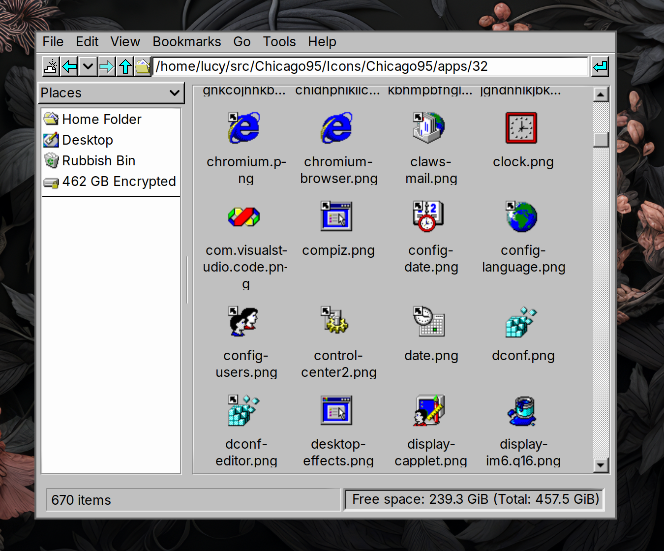
I said I’d mention my GTK theme since Adwaita, the default in most places, doesn’t have arrows on scrollbars. I’m enjoying the chicago95 theme at the minute, which gives me my scrollbar buttons back in firefox, and as an added bonus it makes all my other GTK applications look delightfully charming:

That’s all for now, but if any of you know any other scrollbar related tricks, I’d love to hear about them <3