How do you show someone all the colors in a photograph? Not just the dominant ones, but all variations of orange, tints of purple, and shades of green. This is the story of building the Spectrimage analyzer for Chromaculture, a tool that extracts and displays the color composition of an uploaded image.
Iteration 1: Median Cut Bar

I started with a classic algorithm from image compression: median cut quantization. Put all pixels in the image in a bucket. Find which color channel (red, green, or blue) has the widest range of values. Sort by that channel and split the bucket in half. Repeat until you have 32 buckets. Average the colors in each bucket. Display them as a bar.
The result was 32 equally-sized color swatches arranged in a line. Tidy. But wrong. Every swatch was the same size regardless of how common that color was in the image. The 32-color cap threw away nuance from photographs. And the sort order was jumbled.
Median cut is designed to find representative colors for image compression, not to visualize color distribution. It equalizes bucket sizes by design, splitting the largest bucket each time, which is exactly what you want for reducing a 16-million-color image to 256 colors, and exactly what you don't want when the whole point is showing that orange takes up 60% of the photograph.
Iteration 2: Hue Histogram

If median cut doesn't preserve frequency, what does? A histogram. I convereed to HSL, and used hue to determine which bin each pixel falls into (72 bins spanning 5 degrees of the 360-degree hue wheel).
This fixed two of the three problems immediately. The bins were sorted by hue, so the spectrum now followed ROYGBIV order. And each bin's width was proportional to its pixel count, so we can see frequency.
But five-degree bins are coarse. And each bin averaged all the pixels within it into a single color, which meant a dark shadowed orange and a bright sunlit orange in the same 5-degree range became one muddy in-between.
Iteration 3: The Pixel-Level Sort
![]()
I had already paid the computational cost of downsampling the image, and reduced it to 300 pixels on its longest side. So why bin pixels at all? I couldn't put 60,000 divs in a flex container, but adjacent sorted pixels could be chunked, averaged, and rendered with flex: percentage. With 400+ segments instead of 72 bins, the spectrum should be rich and smooth.
It was not smooth. The orange section looked like a barcode with dark-light-dark-light striping, a rapid oscillation between burnt umber and bright tangerine. The problem was subtle: sorting by hue alone means that a dark pixel at hue 25 sits right next to a bright pixel at hue 25.01. When you chunk these together, one chunk might randomly get mostly dark pixels, and the next chunk mostly bright ones. Adjacent chunks at the same hue should average to similar values, but, the variance was visible.
Iteration 4: Band Sorting with Lightness

Maybe the fix was to control the order within each hue region. I made ROYGBIV bands and sorted pixels dark to light. This way, the red section would smoothly transition from deep burgundy through pure red to pale pink, then the orange section would do the same.
There was some improvement in the orange section, but it felt like a step back. I still had stripes and the ordering was worse.
Iteration 5: Continuous Hue with Degree-Level Sorting

Same idea, finer granularity. Each integer degree of hue became its own group, sorting by lightness within each degree, so all pixels at hue 25 would sort by lightness together, then all pixels at hue 26, and so on.
The transitions between adjacent degrees were nearly invisible, but the striping was really prominent, though at a finer scale. Within each degree, pixels went dark-to-light, then reset to dark at the next degree. The fundamental problem persisted: any lightness-based sub-sort creates periodic discontinuities.
Iteration 6: Canvas Rendering with Smoothing

I stripped out the lightness sub-sort entirely, going back to pure hue ordering, and changed the rendering approach. Instead of DOM elements, I drew directly onto an HTML Canvas, with one column per screen pixel, each column averaging the pixels that mapped to it.
To smooth, each column's final color was the average of itself and its three nearest neighbors on each side. Plus, the canvas rendering eliminated the overhead of hundreds of DOM elements.
It was getting closer to the gradient, but the banding was still there. And I felt like this was a dead end. Any one-dimensional ordering of pixels that vary in two dimensions will produce these stripey artifacts. Averaging can’t hide or eliminate them.
But looking back at iteration 5, gave me an idea. The banding was an inherent part of the color, I needed to make each dark-to-light section a position along the spectrum. Instead of asking how to sort these pixels into a smooth line, how can I best display the different vectors of information I am juggling. I turned my head to touch my ear to my shoulder and I could see it.
Iteration 7: Breakthrough with Another Dimension
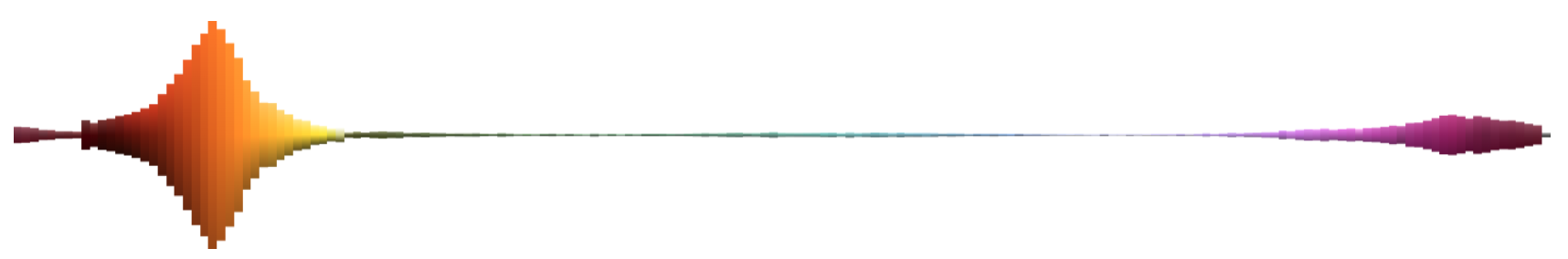
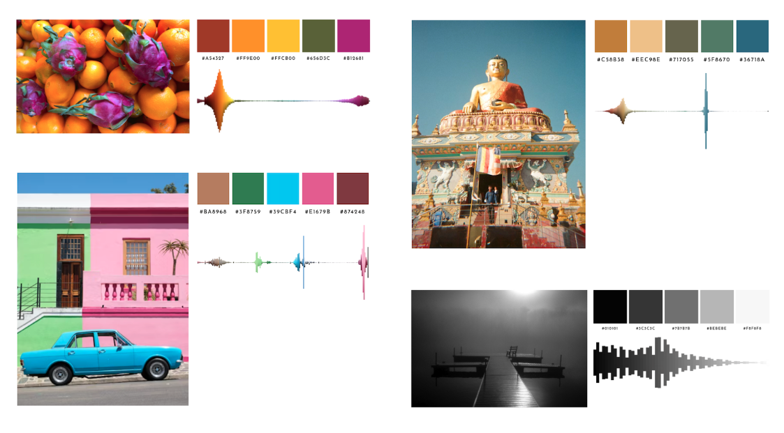
The final design gives each hue its own vertical column. The x-axis is hue, in ROYGBIV order. The y-axis is lightness: the purest, most saturated version of the color sits at the horizontal center, lighter tints extend upward, and darker shades extend downward. And the height of each column is proportional to how many pixels of that hue appear in the image.
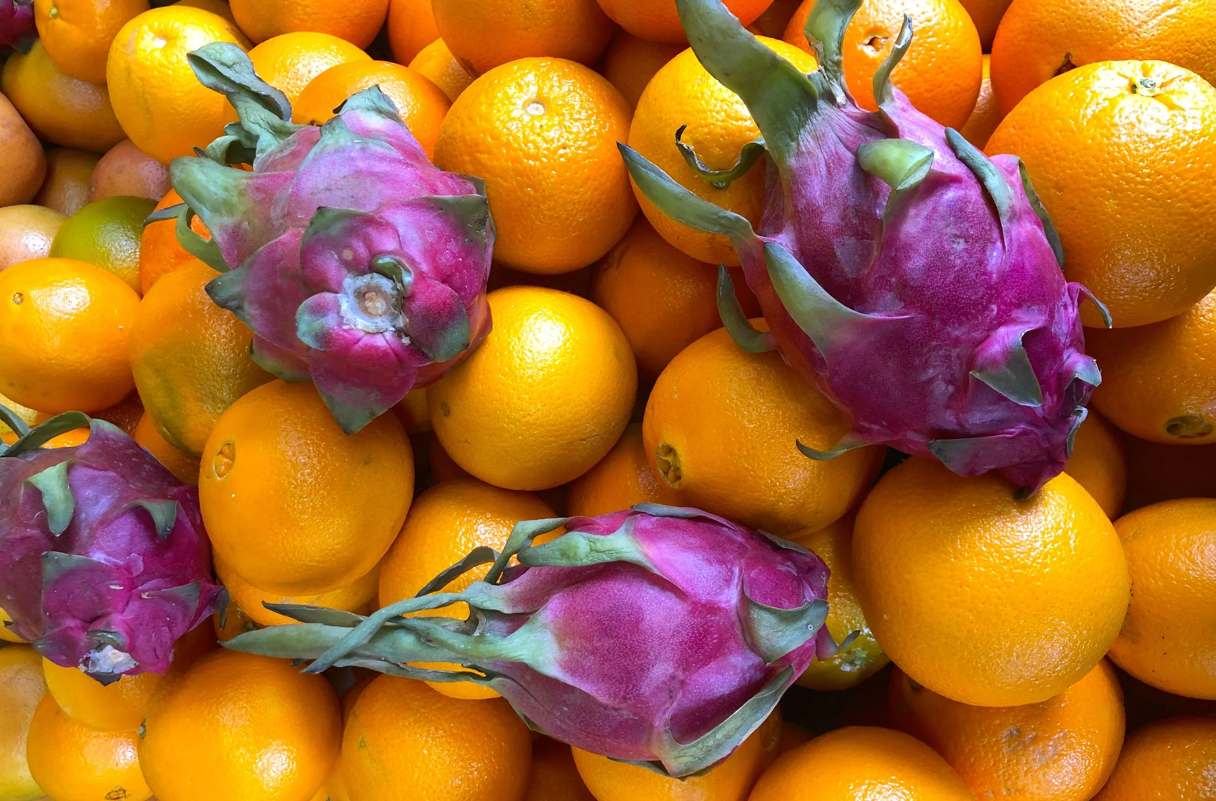
The result looks something like a sound waveform. For the dragonfruit and oranges image, the orange columns tower, with pale peach tips at the top fading through vivid orange to dark browns at the base. A thin line of green represents a variety of hues with little tint/shade variation. And a concentration of magenta bubbles at the violet end. There is a small achromatic column at the far right with the image's few colorless pixels (black, white, and grays).
This visualization communicates which hues are present (x-position), how much of each hue exists (column height), and the tonal range of each hue in the image (the vertical gradient from tint to shade).
Iteration 8: Black and White Images

Black and white photographs presented a special case. With no hue to plot, the original visualization collapsed every pixel into one block. The gradient that would have been the rightmost gray column on a color image. Accurate, but useless.
When the analyzer detects that more than 95% of an image's pixels are achromatic (saturation below 3%), it switches axes. The x-axis becomes lightness, running from black on the left to white on the right, divided into 60 bins. Each bin still becomes a column whose height reflects how many pixels share that lightness level. The waveform shape, displaying frequency as height, stays consistent. A foggy landscape and a high-contrast portrait produce visually distinct silhouettes that immediately communicate their tonal character.
How It Works
When you upload a photo to Spectrimage, the image is drawn onto a hidden canvas scaled so the longest side is 300 pixels, preserving the original aspect ratio. Every pixel is read and converted from RGB to HSL. Pixels with black, white, and grays with no discernible color go into an achromatic bucket. Everything else is binned by hue into 2-degree slices (180 bins across the color wheel).
For each hue bin, the pixels are sorted by lightness. The darkest 20% are averaged to produce the shade color (bottom of the column). The middle 20% produce the pure color. The lightest 20% produce the tint (top of the column). Using 20% slices reduces outlier noise (such as a single nearly-black pixel from a deep crack between two oranges). Averaging the darkest 20% pixels gives a representative shade that matches what your eye actually perceives as "the dark version of this orange."
The bins are sorted into ROYGBIV order using a continuous hue remapping that handles red's wrap-around (red straddles both ends of the 0–360 degree scale, appearing at both 355 and 5 degrees). The achromatic bin is appended at the end.
The spectrum is rendered on an HTML Canvas. Each bin gets an equal-width column. The column's height is proportional to its pixel count relative to the most common hue. A linear gradient paints each column from tint at top, through pure at center, to shade at bottom. The gradient produces a smoother visual result than representing every pixel.
The whole process runs client-side in the browser. No server round-trip, no image upload to external services, no dependencies beyond the Canvas API and my HSL conversion utilities. For a 4000x3000 photograph, analysis completes in under a second.