
Back in 2019, I started collecting all kinds of metrics about my life. Every single day for the last 3 years I tracked over 100 different data types - ranging from fitness & nutrition to social life, computer usage and weather.
The goal of this project was to answer questions about my life, like
- How does living in different cities affect other factors like fitness, productivity and happiness?
- How does sleep affect my day, my fitness level, and happiness?
- How does the weather, and the different seasons affect my life?
- Are there any trends over the last few years?
- How does computer time, work and hours in meetings affect my personal life?
Since the start of this project, I collected ~380,000 data points, with the biggest data sources being:
| Data Source | Number of data entries | Type of data |
|---|---|---|
| RescueTime | 149,466 | Daily computer usage (which website, which apps) |
| Foursquare Swarm | 126,285 | Location and POI data, places I've visited |
| Manually entered | 67,031 | Fitness, mood, sleep, social life, health, nutrition, energy levels, TV, stress, ... |
| Manually entered date ranges | 19,273 | Occupation, lockdown status, living setup |
| Weather API | 15,442 | Temperature, rain, sunlight, wind |
| Apple Health | 3,048 | Days of steps data |
Naturally after I started collecting this data, I wanted to visualize what I was learning, so I created this page. Initially, the domain whereisFelix.today (now renamed to howisFelix.today) started as a joke to respond to friends asking when I’d be back in NYC or San Francisco. Rather than send them my schedule, I’d point them to this domain. However, now it’s more than my location: it’s all of me.
Rules I setup for the project
- Use a single database, owned and hosted by me, with all the data I’ve collected over the years
- Be able to easily add and remove questions on the fly, as I learn what’s beneficial to track
- Full control of how the data is visualized
- Works well for frequent flyers with mixed time zones
- 100% fully open source, MIT licensed and self-hosted
I selected 48 graphs to show publicly on this page. For privacy reasons, and to prevent any accidental data leaks, the graphs below are snapshots taken on a given day.
Number of Data Entries over Time
Visualization of the number of data entries in FxLifeSheet over the last 10 years, and where the data came from.
- Initially (2014) the only data used was RescueTime and Foursquare Swarm location data
- Once I started the FxLifeSheet project in April 2019, I manually tracked 75 data entries every day, ranging from mood, sleep, social life, to fitness data
- I was able to retrospectively fetch the historic weather data based on my location on a given day
- I also implemented other import sources, like fetching my historic weight and the number of steps from Apple Health
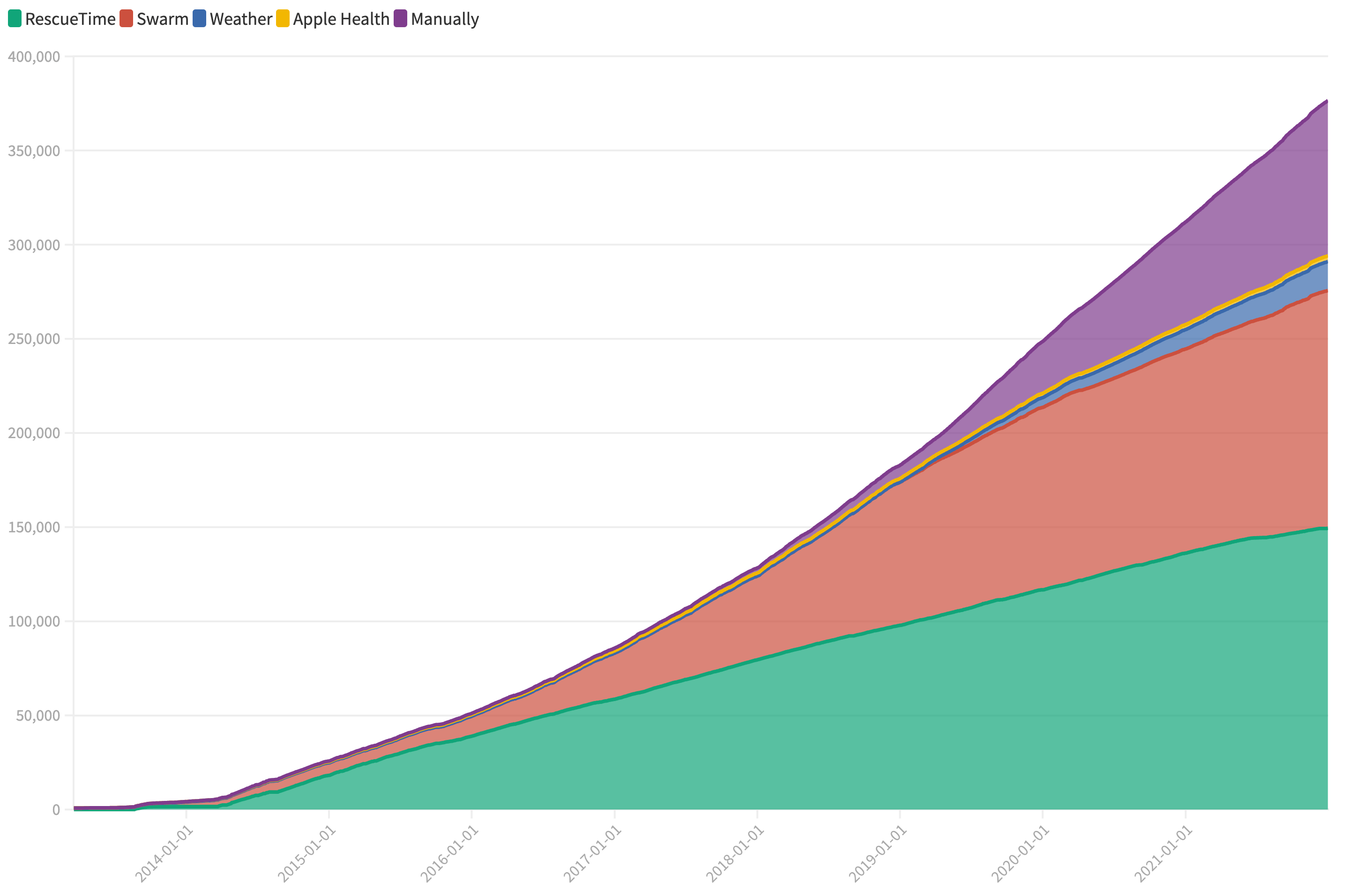
10 years of data - Last updated on 2022-01-01
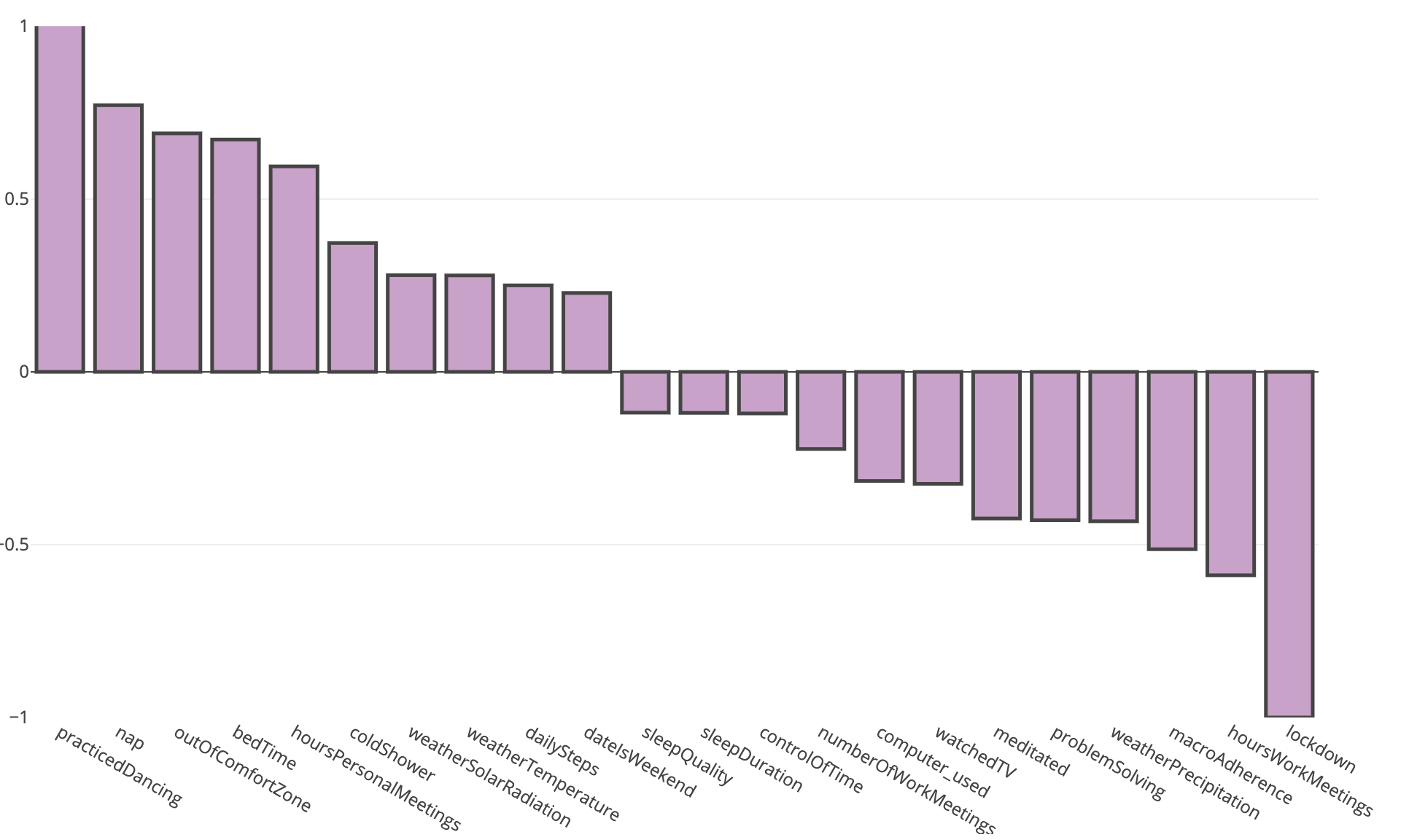
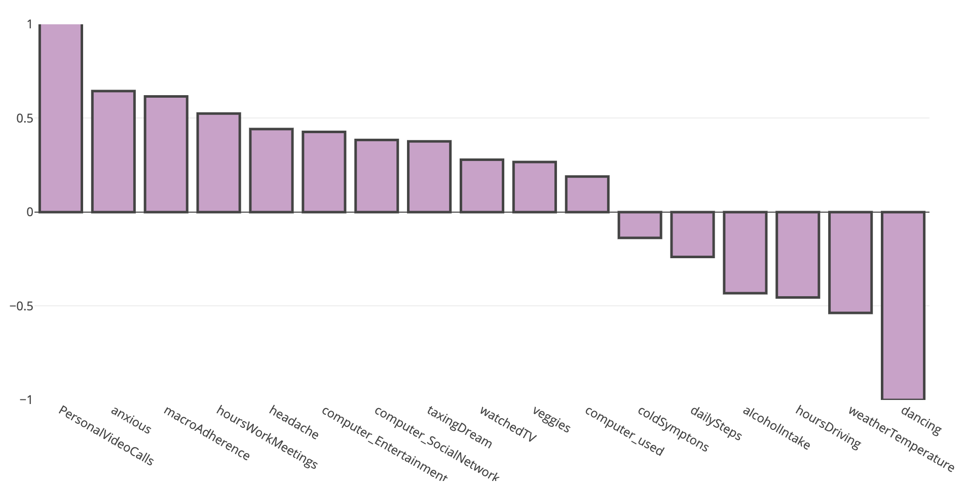
Days tracked my Mood to be Happy & Excited
On days where I tracked my mood to be "happy" & "excited", the following other factors of my life were affected
- 50% more likely to have pushed my comfort zone
- 44% more likely to have meditated that day
- 33% more excited about what's ahead in the future
- 31% more likely to drink alcohol that day (parties, good friends and such)
- 28% more time spent reading or listening to audio books
- 26% more likely to have worked on interesting technical challenges
- 26% warmer temperature that day
- 20% more likely to have learned something new that day
- 45% less time spent in video & audio calls that day
Manually
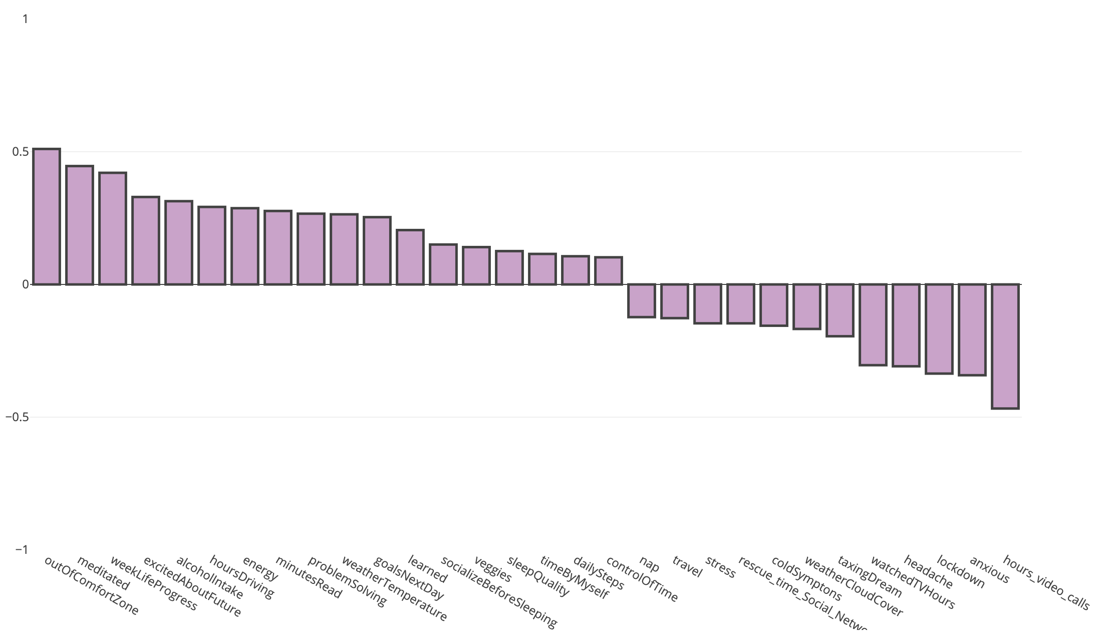
2.5 years of data - Last updated on 2022-01-01
Flying Stats - General
All flights taken within the last 7 years, tracked using Foursquare Swarm, analyzed by JetLovers.
- The stats clearly show the impact of COVID starting 2020
- Sunday has been my "commute" day, flying between San Francisco, New York City and Vienna
JetLovers, Swarm
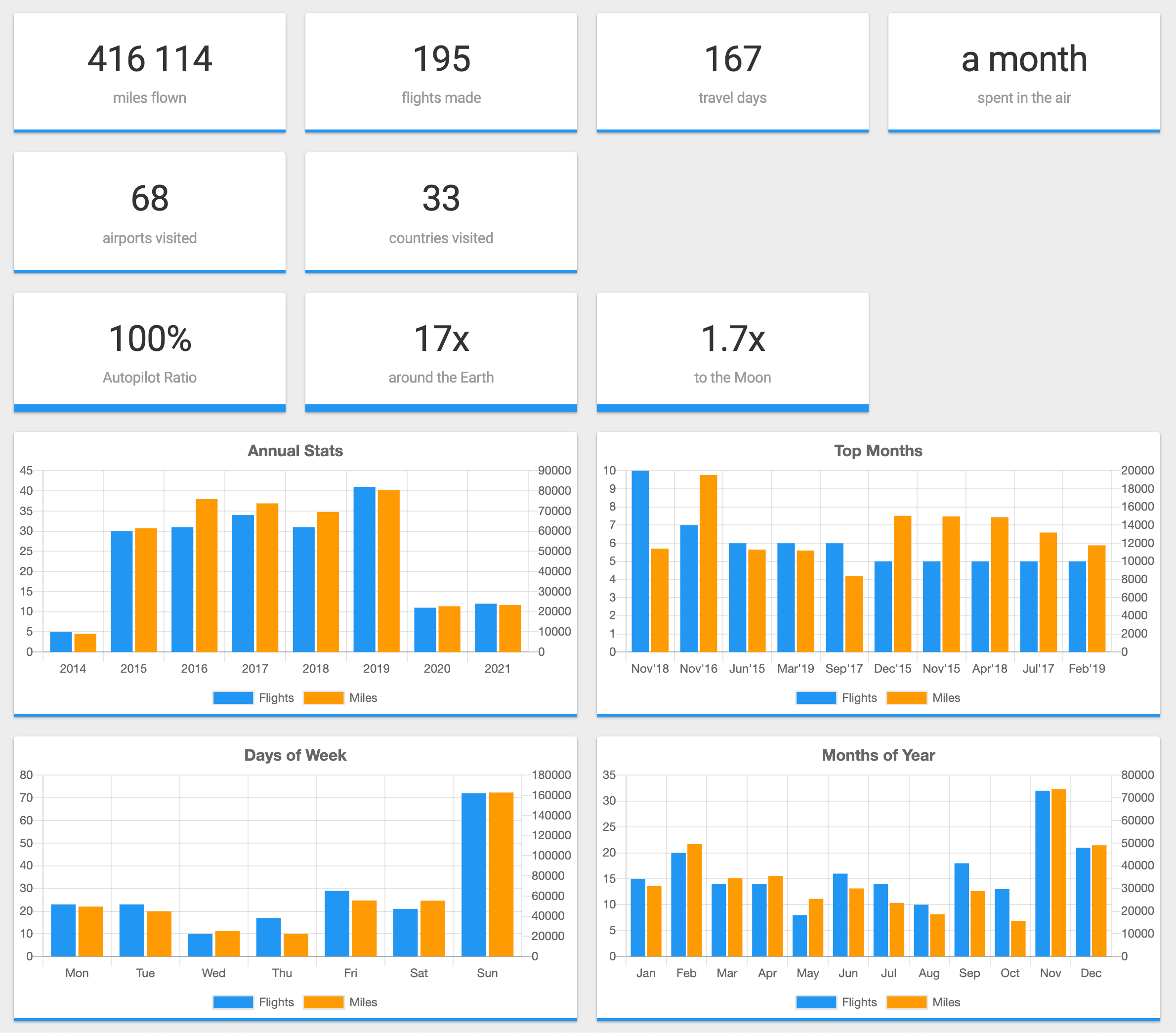
7 years of data - Last updated on 2022-01-01
Flying Stats - Top
All flights taken within the last 7 years, tracked using Foursquare Swarm, analyzed by JetLovers.
- Frankfurt - Vienna was the flight connecting me with most US airports
- Germany is high up on the list due to layovers, even though I didn't spend actually much time there
JetLovers, Swarm
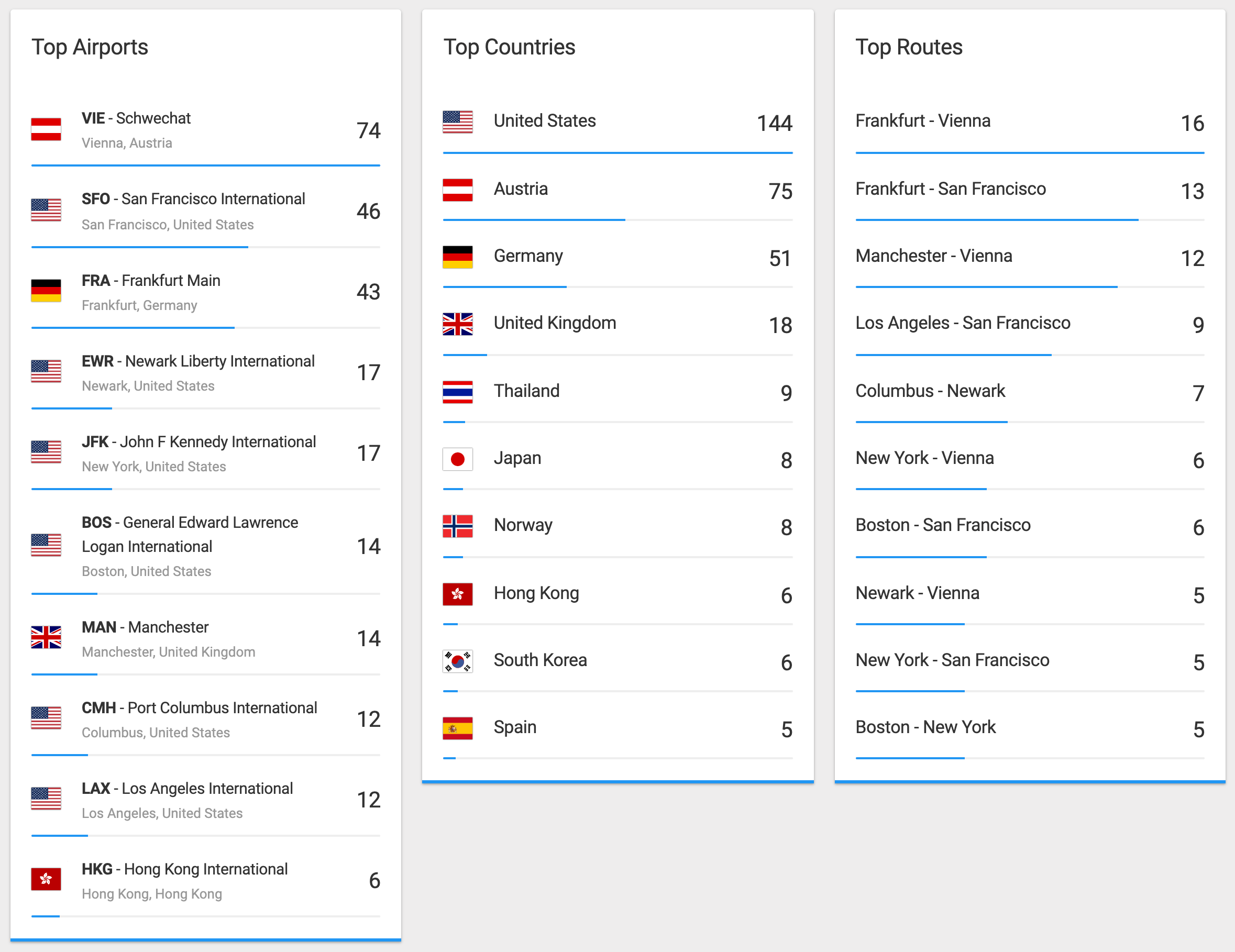
7 years of data - Last updated on 2022-01-01
My Life in Weeks
Inspired by Your Life in Weeks by WaitButWhy, I use Google Sheets to visualize every week of my life, with little notes on what city/country I was in, and other life events that have happened.
- The first 14 years I didn't really get much done
- I can highly recommend taking a few weeks (or even months) off between jobs (if you have the possibility)
- Yellow area indicates no active full-time employment
- Shades of blue indicate my full-time employments
- Shades of red is formal education
- You can create your own version using my template
Manually
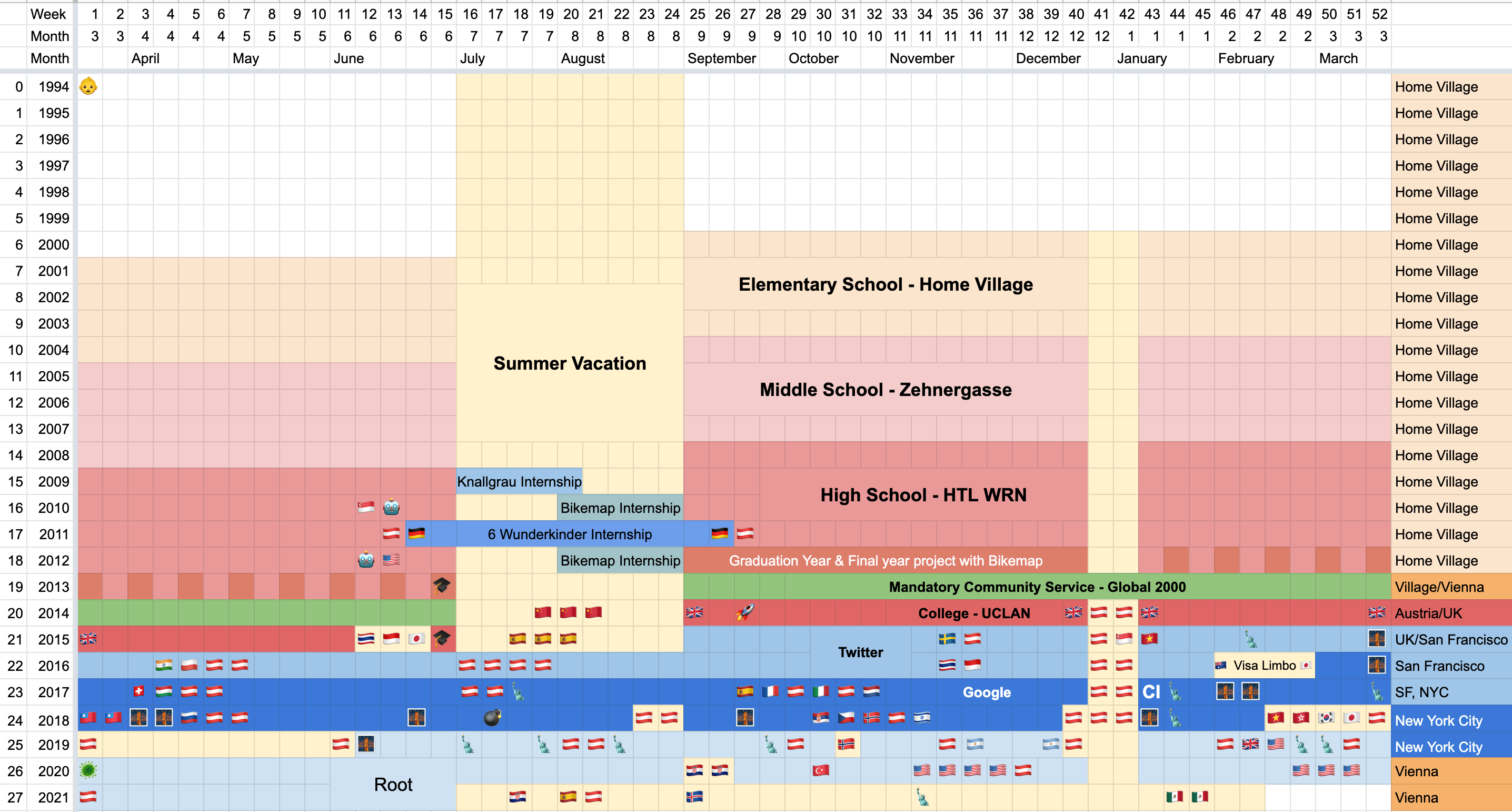
27.5 years of data - Last updated on 2022-02-24
Average Daily Steps over Time
Average daily steps measured through the iPhone's Apple Health app. I decided against using SmartWatch data for steps, as SmartWatches have changed over the last 8 years.
- I walked a total of 22,830,860 steps over last 8 years
- I walk more than twice as much when I'm in New York, compared to any other city
- In NYC I had the general rule of thumb to walk instead of taking public transit whenever it's less than 40 minutes. I used that time to call friends & family, or listen to audio books
- Although Vienna is very walkable, the excellent public transit system with subway trains coming every 3-5 minutes, has caused me to walk less
- San Francisco was always scary to walk
Apple Health
8 years of data - Last updated on 2022-01-01
Correlation: Weight and Resting Heart Rate
This graph clearly shows the correlation between my body weight and my sleeping/resting heart rate. The resting heart rate is measured by the Withings ScanWatch while sleeping, and indicates how hard your heart has to work while not being active. Generally the lower the resting heart rate, the better.
- I started my lean bulk (controlled weight gain combined with 5 workouts a week) in August 2020
- My resting heart rate went from 58bpm to 67bpm (+9bpm) from August 2020 to March 2021 with a weight gain of +8.5kg (+19lbs) as part of a controlled lean-bulk combined with a 5-day/week workout routine
- The spike in resting heart rate in July & August 2021 was due to bars and nightclubs opening up again in Austria
- After a night of drinking, my resting/sleeping heart rate was about 50% higher than after a night without any alcohol
- The spike in resting heart rate in Oct/Nov/Dec 2021 was due to having bronchitis and a cold/flu, not getting correct treatment early enough
Withings ScanWatch, Withings Scale
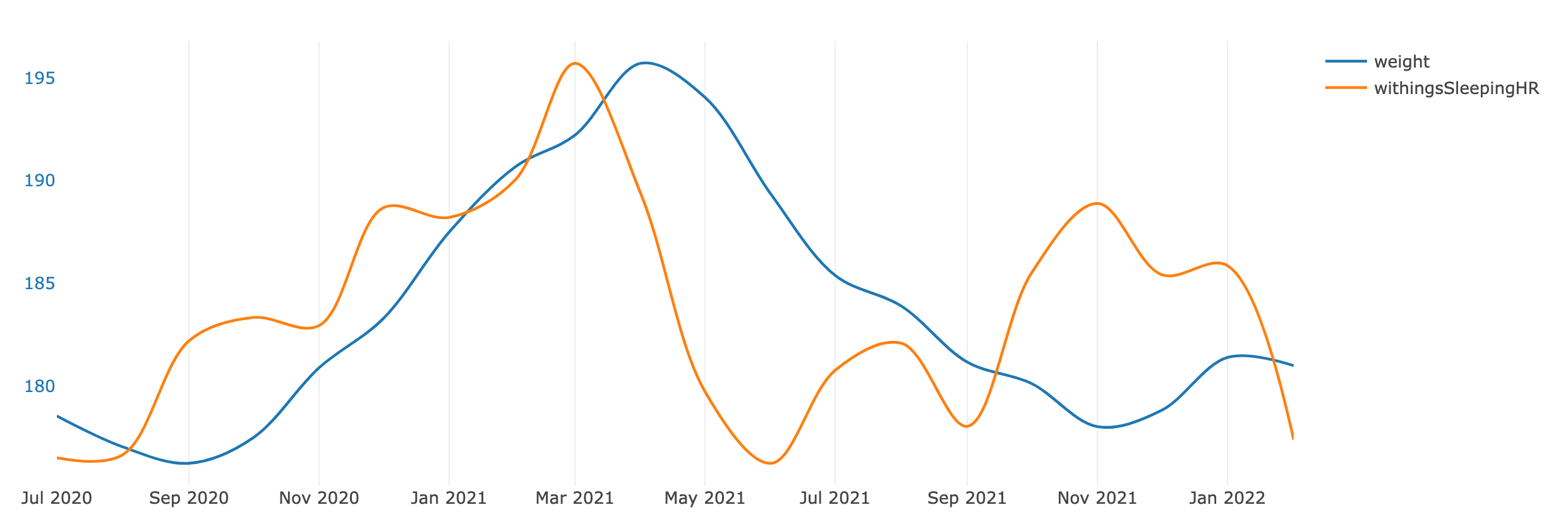
1.5 years of data - Last updated on 2022-02-09
How healthy have I been over the Years?
Every day I answered the question on how healthy I felt. In the graph, the yellow color indicates that I felt a little under the weather, not sick per se. Red means I was sick and had to stay home. Green means I felt energized and healthy.
- During the COVID lockdowns I tended to stay healthier. This may be due to not going out, no heavy drinking, less close contact with others, etc. which resulted in me having better sleep.
- Usually during excessive traveling I get sick (cold/flu)
- Q4 2021 I had bronchitis, however, I didn't know about it at the time and didn't get proper treatment
- Overall I'm quite prone to getting sick (cold/flu)
Manually
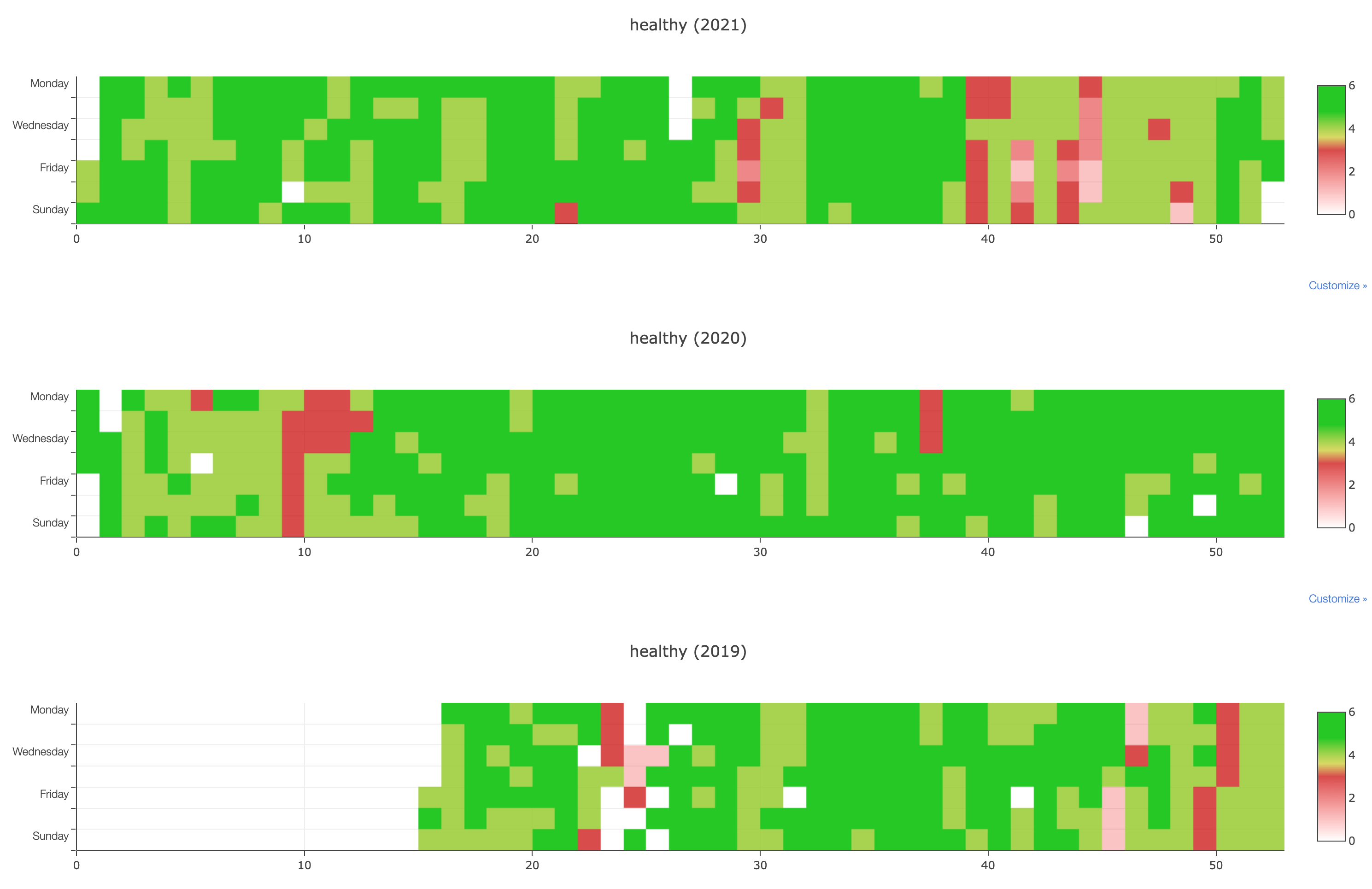
2.5 years of data - Last updated on 2022-01-01
Days with more than 4 Alcoholic Drinks
On days where I had more than 4 alcoholic beverages (meaning I was partying), the following other factors were affected
- 21x more likely to dance
- 80% more likely to take a nap the day of, or the day after
- 60% more time spent with friends
- 40% warmer temperatures, and 40% less precipitation. There weren't many opportunities for parties in Winter due to lockdowns in the last 2 years. Also, people are more motivated to go out when it's nice outside.
- 25% more steps
Manually
2.5 years of data - Last updated on 2022-01-01
Mood over the Years
My FxLifeSheet bot asks me 4 times a day how I'm feeling at the moment.
- This graph groups the entries by month, and shows the % of entries for each value (0 - 5) with 5 being very excited, and 0 being worried.
- I designed the ranges so that 0 or 5 are not entered as much. 0 is rendered as dark green at the top, whereas 5 is rendered as light green at the bottom.
- For privacy reasons I won't get into some of the details on why certain months were worse than others.
Manually
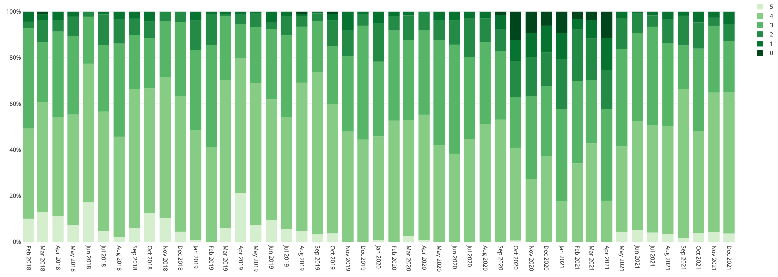
4 years of data - Last updated on 2022-01-01
Location History
Every Swarm check-in over the last 7 years visualized on a map, including the actual trip (flight, drive, etc.)
Swarm
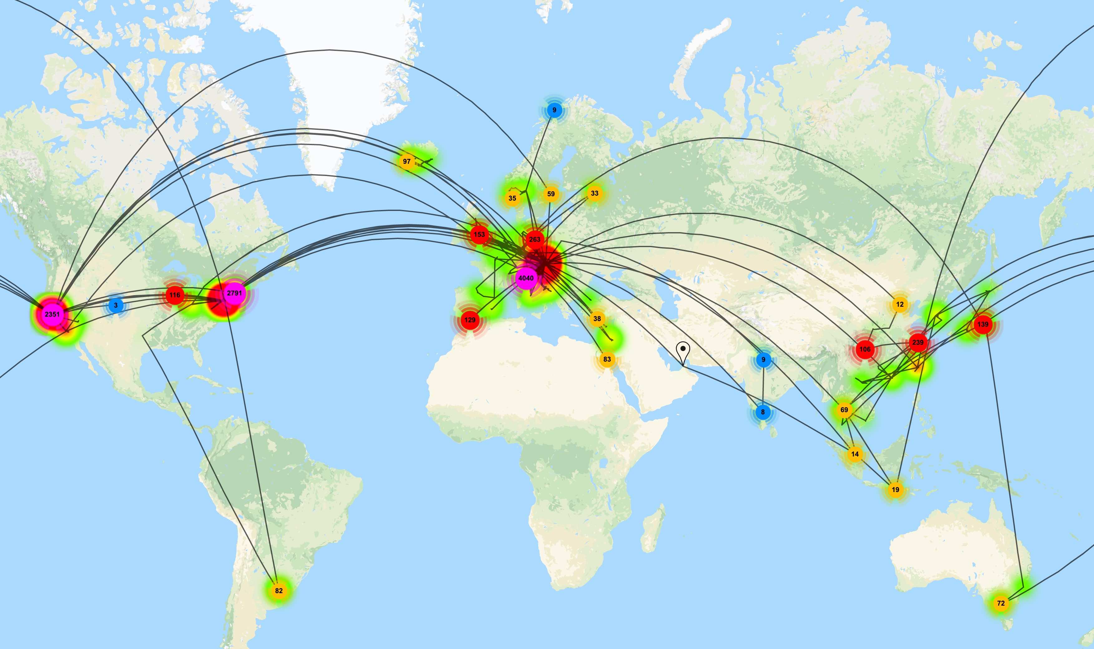
7 years of data - Last updated on 2022-01-01
Location History - Cities
Every Swarm check-in over the last 7 years visualized, zoomed in
Swarm
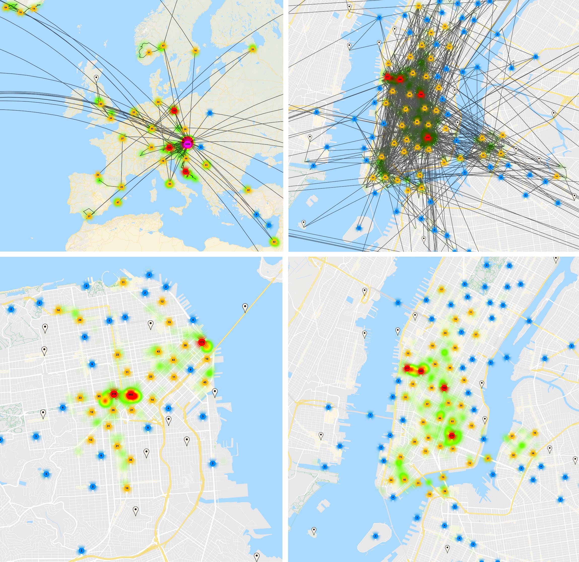
7 years of data - Last updated on 2022-01-01
Most visited POIs, grouped by City
Each time I did a check-in at a place (e.g. Coffee, Restaurant, Airport, Gym) on Foursquare Swarm at a given city, this is tracked as a single entry.
Swarm

7 years of data - Last updated on 2022-01-01
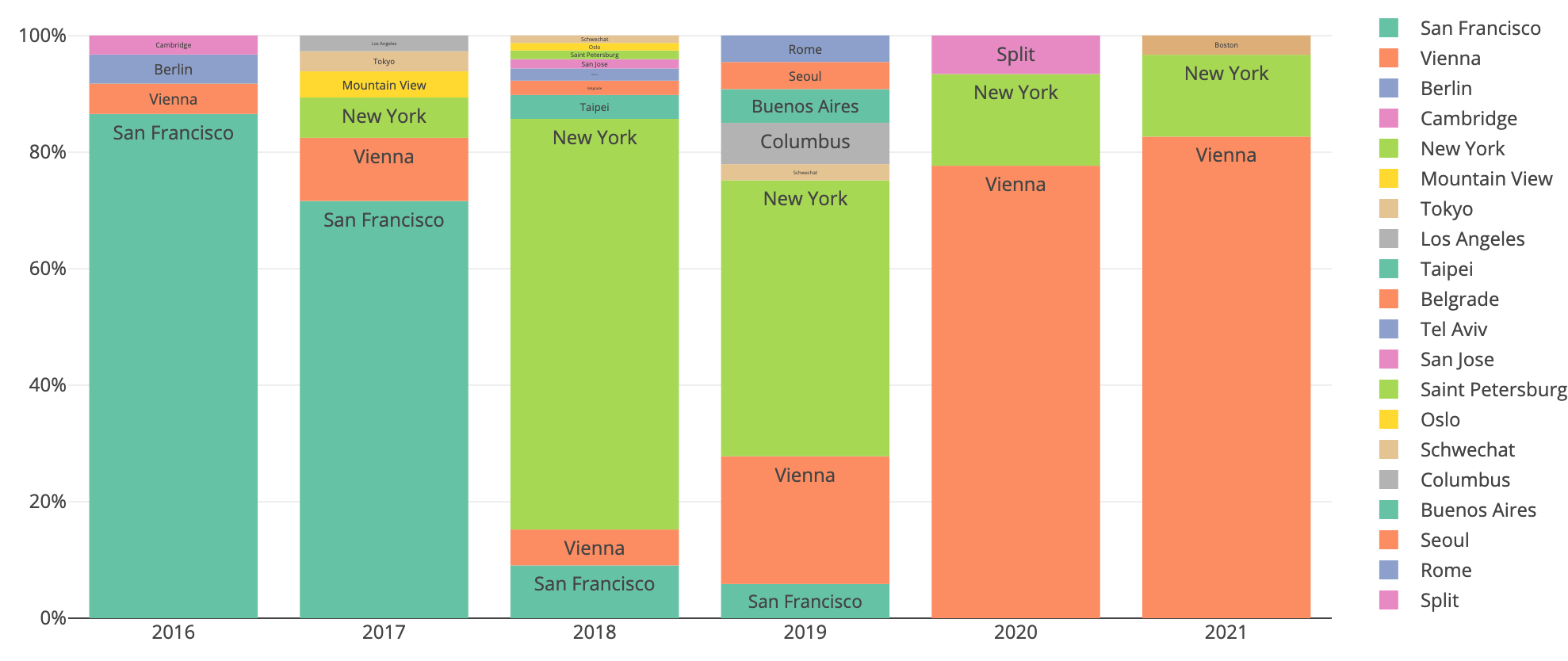
Number of Check-Ins grouped by City
Each check-in at a given city is counted as a single entry, grouped by years
- 2016 and 2017 I lived in San Francisco
- 2018 and 2019 I lived in New York City
- 2020 and 2021 I lived in Vienna
- The longer it's been since I moved away from Austria, the more time I actually spent back home in Austria for visits and vacations
- 2020 clearly shows the impact of COVID
Swarm
7 years of data - Last updated on 2022-01-01
Top Categories of Check-Ins
Each check-in at a given category is tracked, and summed up over the last years
- In 2020 and 2021, check-ins at Offices went down to zero due to COVID, and a distributed work setup
- Airports being the #4 most visited category was a surprise, but is accurate. A total of 403 airport check-ins, whereas a flight with a layover would count as 3 airport check-ins
- Earlier in my life, I didn't always check into 'commute' places like public transit and super markets
Swarm
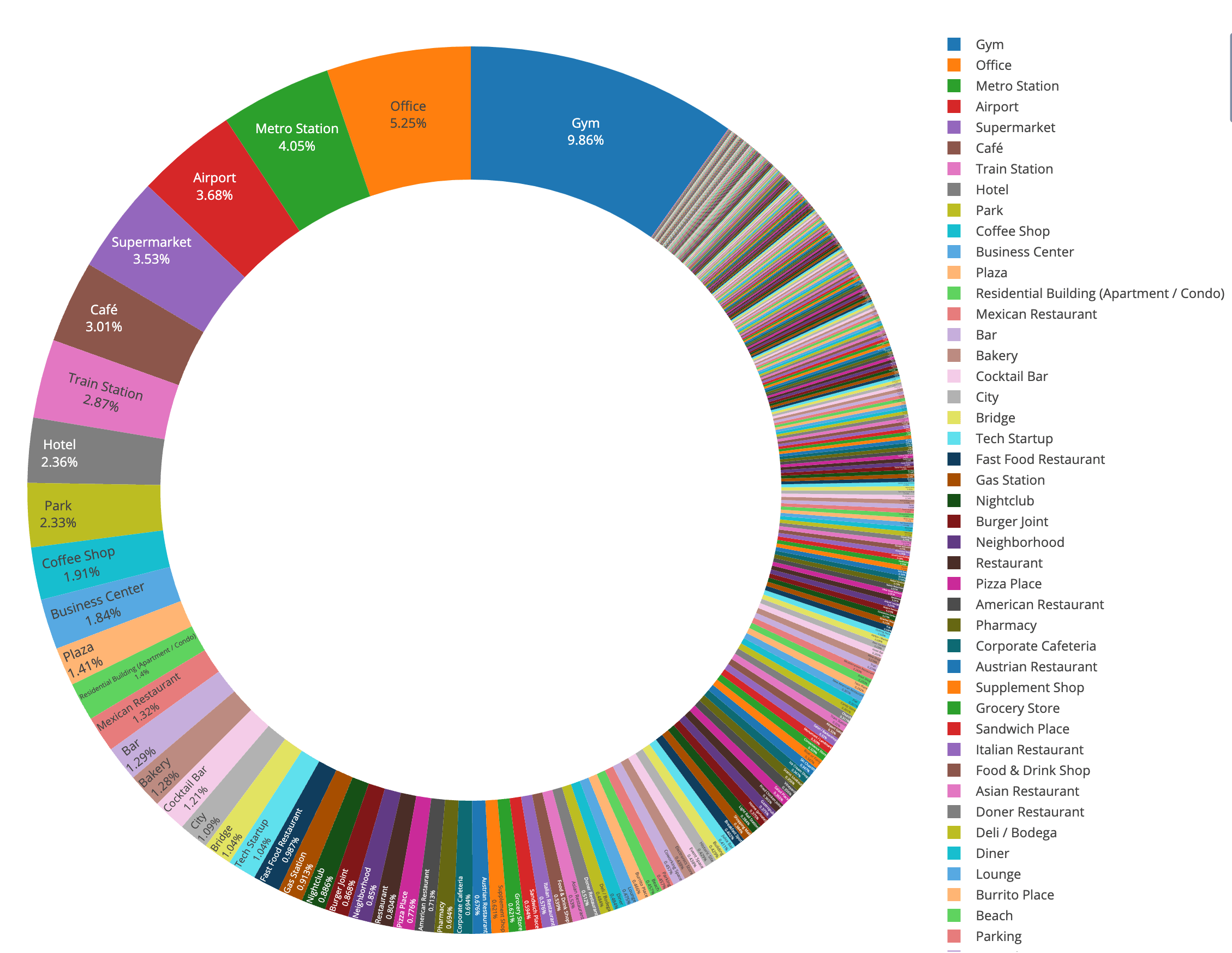
7 years of data - Last updated on 2022-01-01
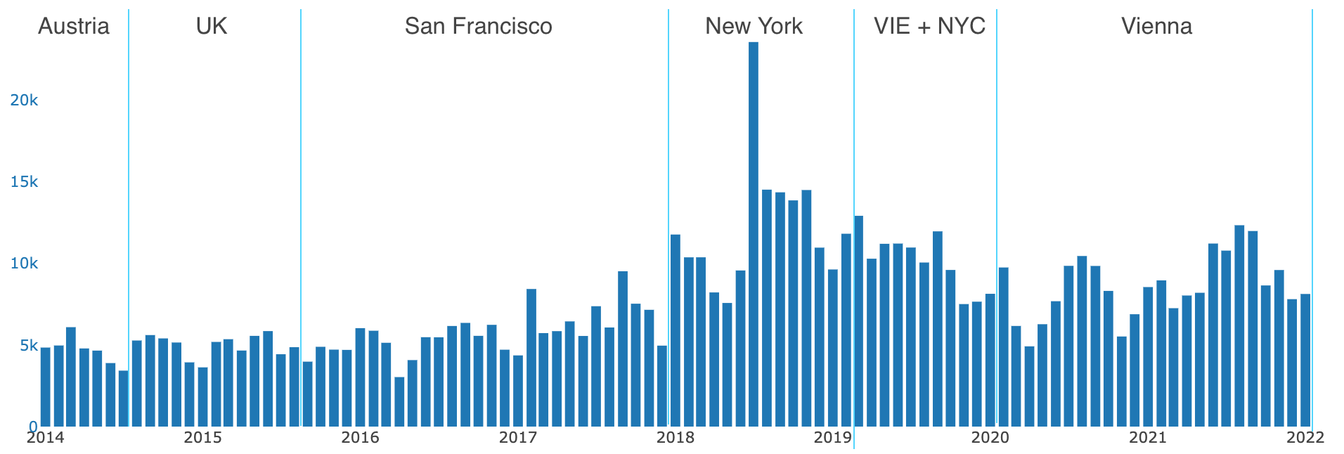
Number of Swarm Check-Ins over Time
Number of Foursquare Swarm check-ins on each quarter over the last 10 years. I didn't use Foursquare Swarm as seriously before 2015. Once I moved to San Francisco in Q3 2015 I started my habit of checking into every point of interest (POI) I visit.
- Q3 2015 I moved to San Francisco, however I couldn't use Swarm yet, since my move was a secret until the official announced at the Twitter Flight conference
- Q2 2020 clearly shows the impact of COVID with Q3 already being open in Austria
- Q3 2021 the vaccine was already widely available and I was able to travel/visit more again
- My time in New York was the most active when it comes to check-ins. When I'm in NYC, I tend to eat/drink out more, and grab to-go food, which I do way less in Vienna
Swarm
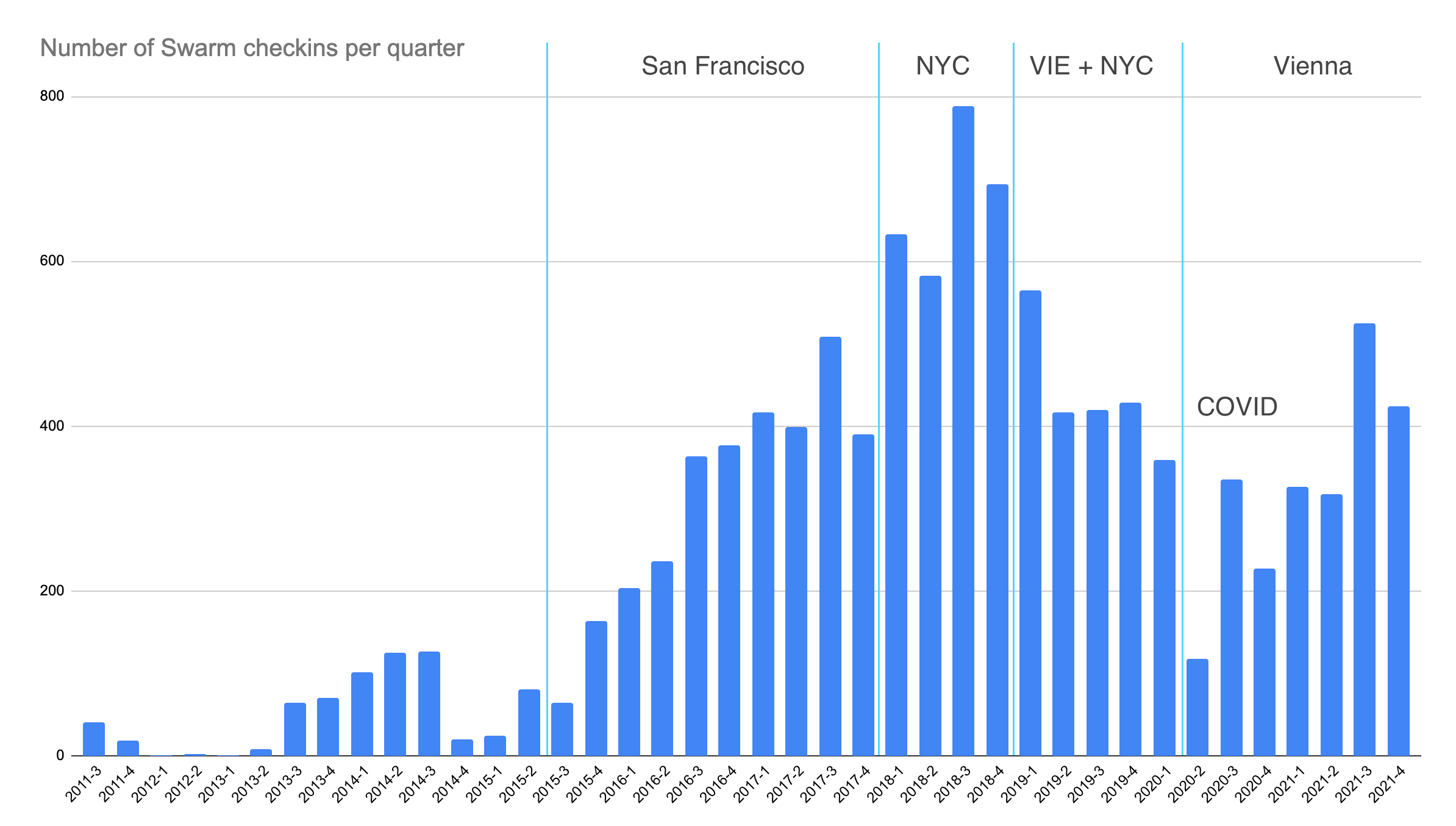
10 years of data - Last updated on 2022-01-01
Location History
Every Swarm check-in visualized on a map. Only areas where I've had multiple check-ins are rendered.
Swarm
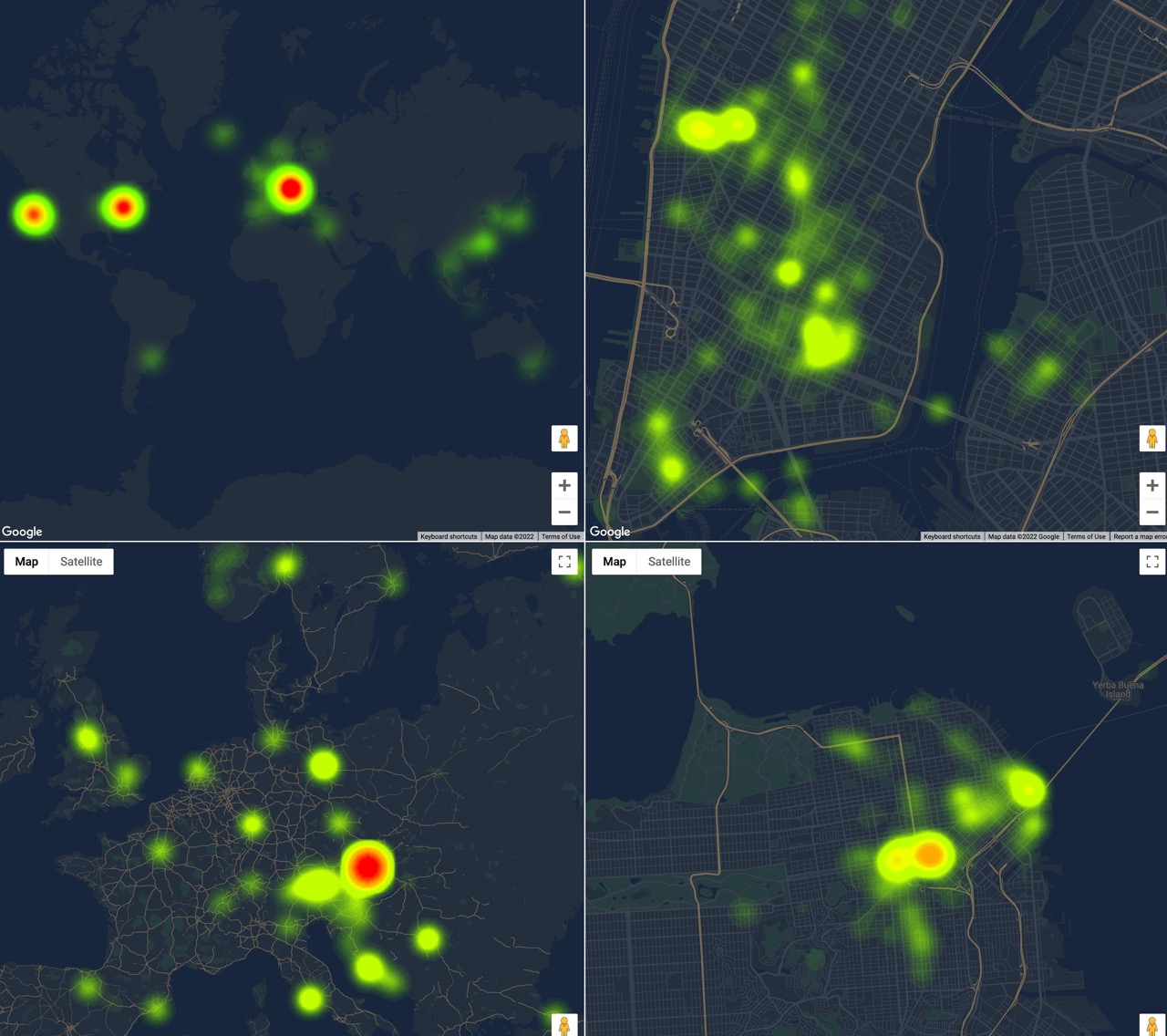
7 years of data - Last updated on 2022-01-01
Days in Full Lockdown
Number of days per year that I've spent in full lockdown, meaning restaurants, bars and non-essential stores were closed.
- I escaped parts of the Austrian lockdown by spending time in the US when I was already vaccinated
- Surprisingly 2021 I spent more days in a full lockdown than in 2020, even with vaccines available
Manually
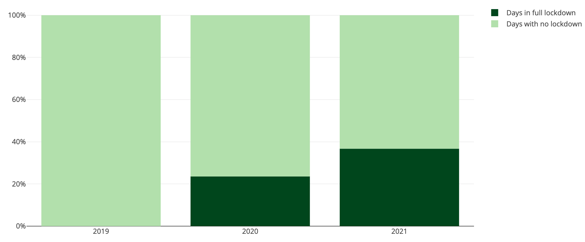
3 years of data - Last updated on 2022-01-01
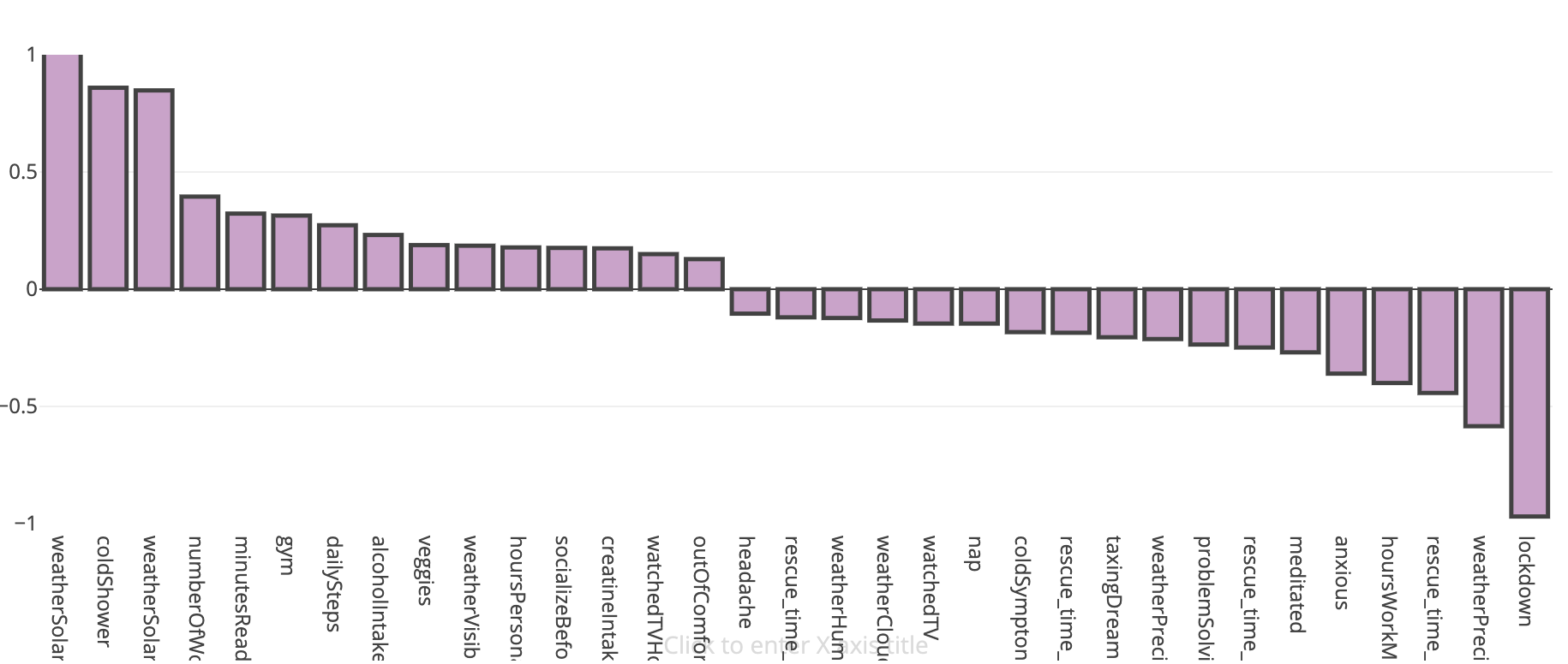
Effects of the Lockdowns
How was my life affected by the recent COVID lockdowns? As lockdown day I classify every day where places like restaurants, gyms and non-essential stores were closed.
- 200% more time spent in audio & video calls with friends (non-work related)
- 60% more likely to follow my meal plan (macros & calories)
- 24% less steps
- 40% less alcoholic beverages
- 50% colder temperatures: Lockdowns tended to happen in Autumn and Winter
- 100% less likely to dance
Manually
3 years of data - Last updated on 2022-05-23
Alcoholic Beverages per Day
Alcoholic drinks per day. Days with no data are rendered as white
- Friday and Saturday nights are clearly visible on those graphs
- 2021 and summer/winter of 2019 also show the Wednesday night party in Vienna
- Q2 and Q4 2020 clearly show the COVID lockdowns, as well as Q2 2021
- Summer of 2021 all bars and dance clubs were open in Vienna
Manually
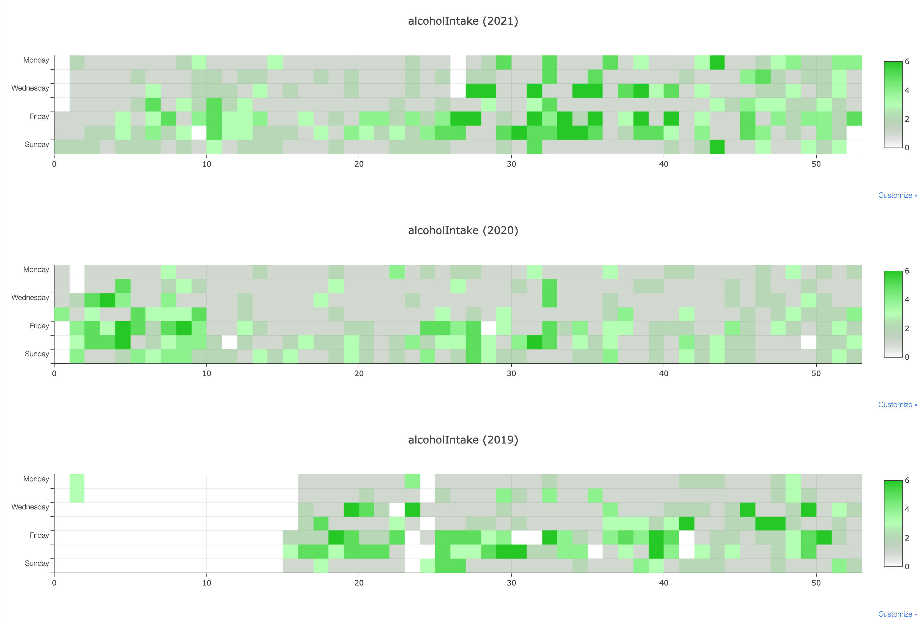
2.5 years of data - Last updated on 2022-01-01
Alcoholic Beverages per Month
Each bar represents a month, the graph shows the number of alcoholic beverages on a given day, with '5' being 5 or more drinks.
- Unless there are social obligations, or there is a party, I usually drink 0 alcoholic drinks
- In May 2019, the 0 bar is rendered to be 55%, meaning on 55% days of that month I didn't drink any alcohol
- July 2021 Austrian night life was fully open up again, with most COVID restrictions being lifted
Manually
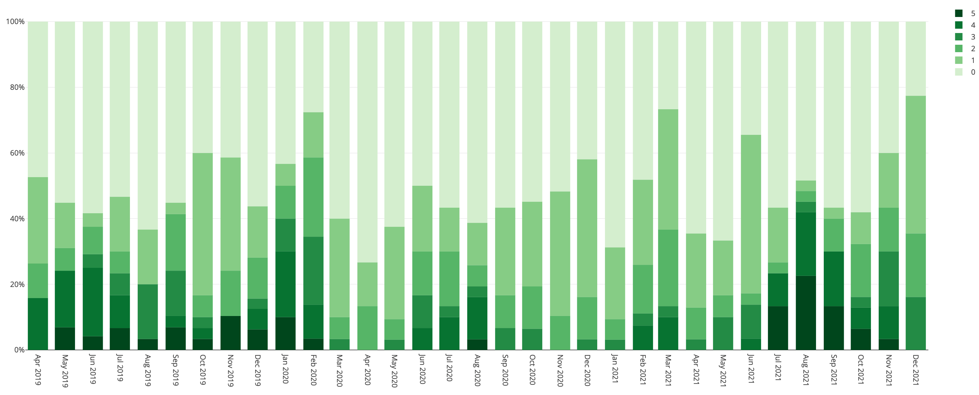
2.5 years of data - Last updated on 2022-01-01
Gym Workouts
Each green square represents a strength-workout in the gym, I try my best to purchase day passes at gyms while traveling
- During the first lockdown in Q2 2020 I didn't have access to a gym, and didn't count home-workouts as gym visits
- In 2021 I tended to work out less often on Sunday, the day I visit my family's place
- In Q4 2021 I had a cold for a longer time
- I went from ~50 workouts per year in 2014/2015 to ~200 per year in 2018 - 2021
Manually
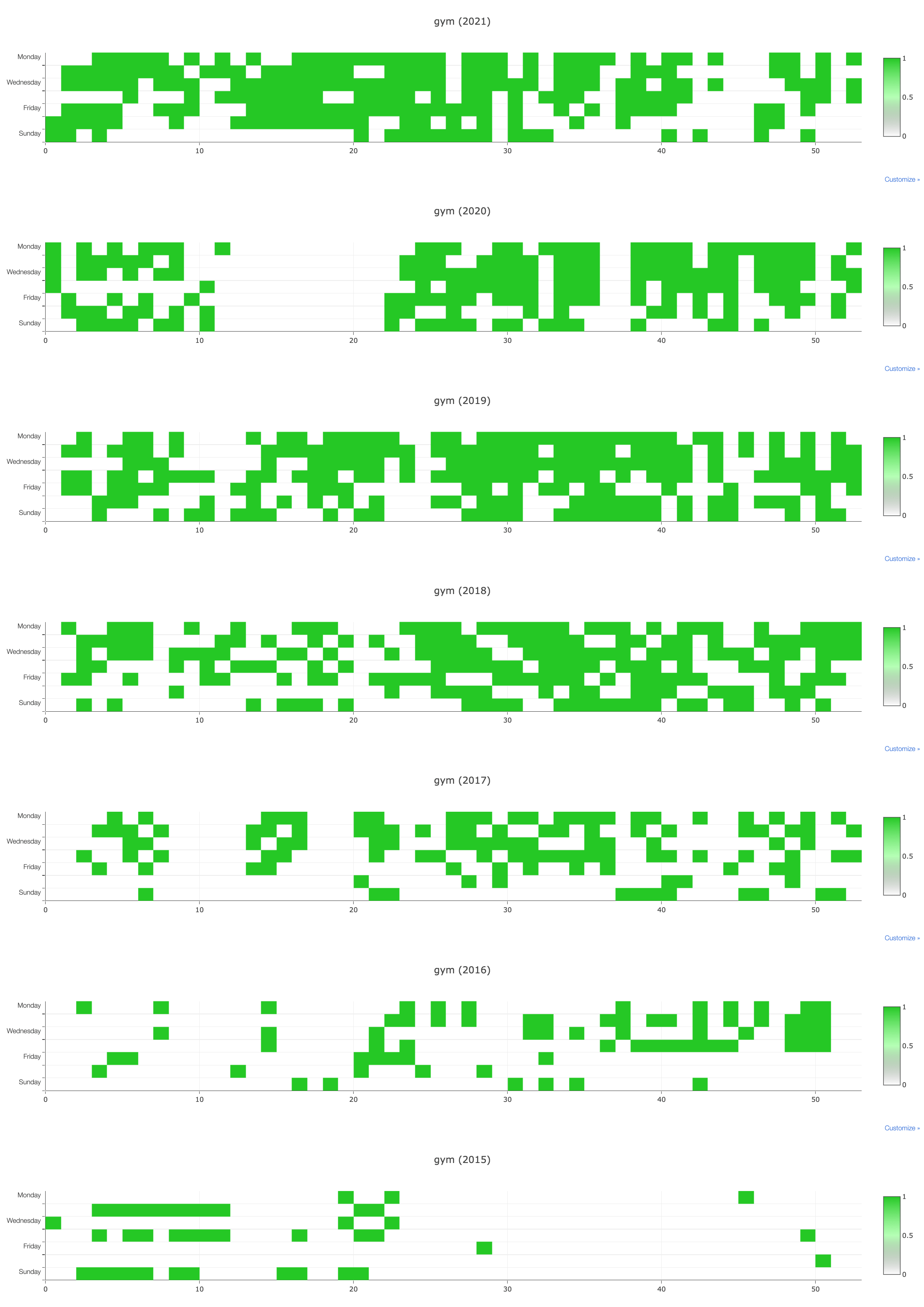
7 years of data - Last updated on 2022-01-01
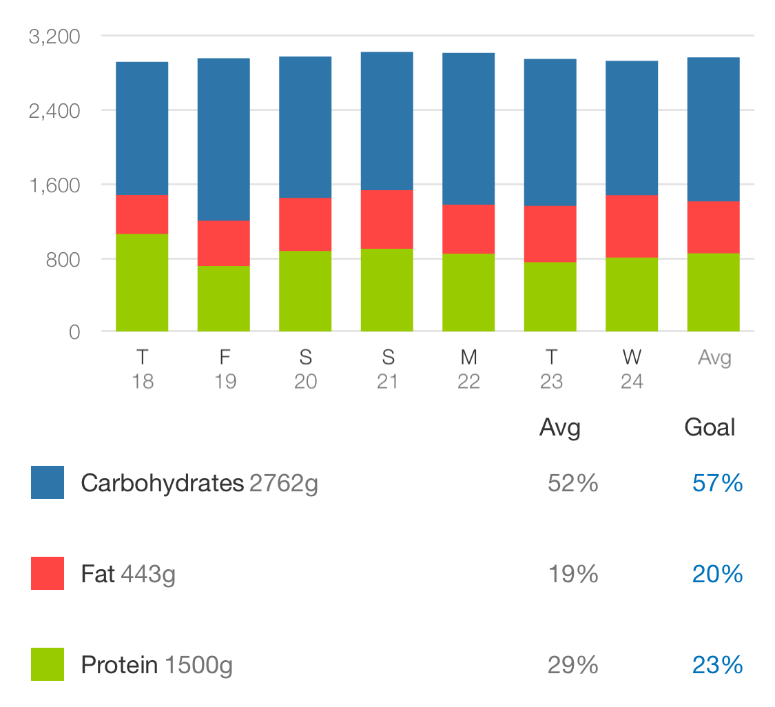
Food Tracking - Macros
On weeks where I have a routine (not traveling), I track most of my meals. Whenever I scale my food, I try to guess the weight before to become better at estimating portion sizes.
- Tracking macros precisely is the best way to lose/gain weight at a controlled and healthy speed
- When I first started tracking macros, additionally to already working out regularly, is when I started seeing the best results
- It takes a lot of energy to be consistent, but it's worth it, and it will make you feel good (e.g. feeling good about using a spoon to eat plain Nutella if you have the macros left)
- Gaining and losing weight is pretty much math, if you track your macros and body weight
MyFitnessPal
4 years of data - Last updated on 2022-02-17
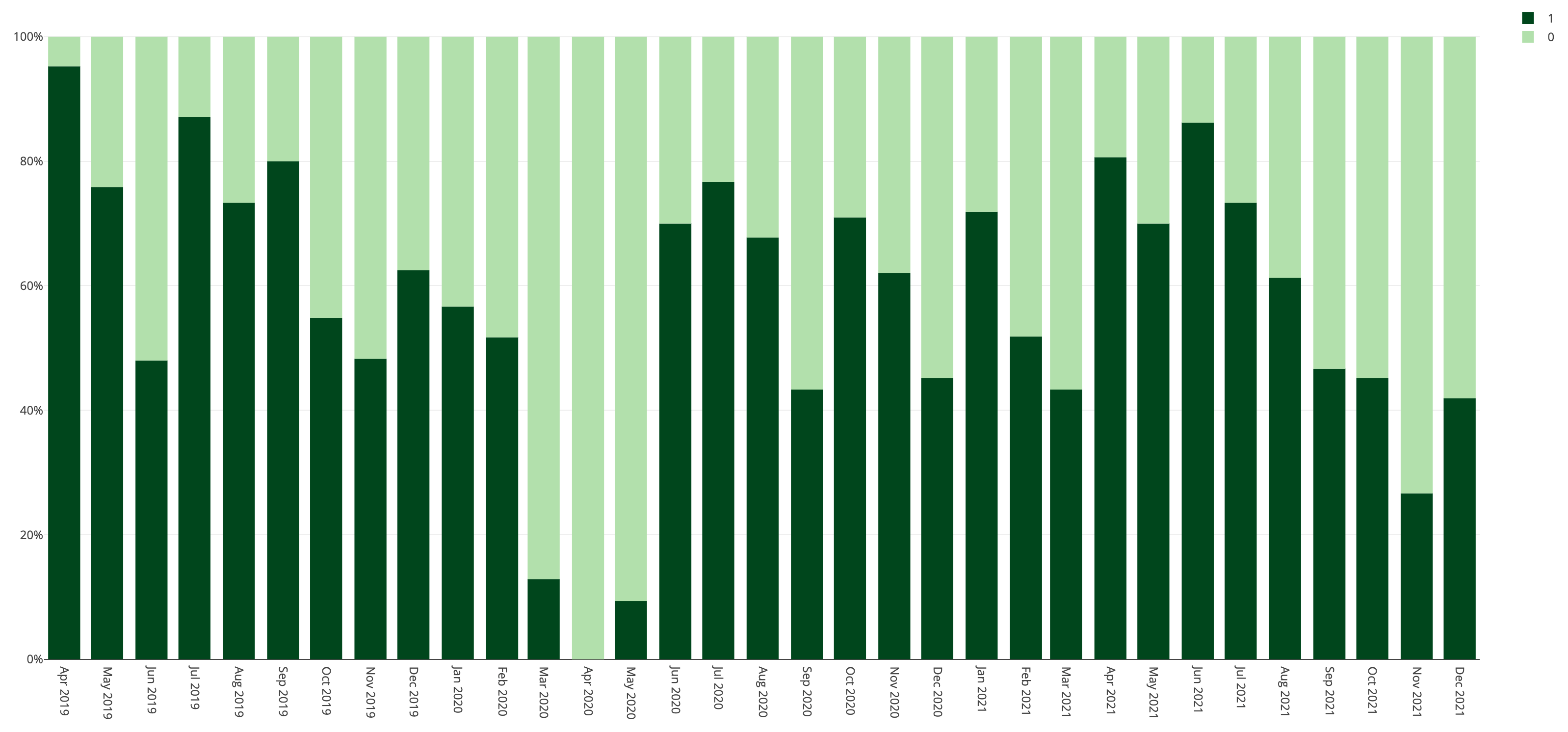
Gym Workouts grouped by Month
Percentage of days I went to the gym
- During the first lockdown in Q2 2020 I didn't have access to a gym, and didn't count home-workouts as gym visits
- Generally I hit the gym 5 days a week when I'm at home, but as shown on this graph it ends up being less, mostly due to traveling, and occasional colds
Manually
2.5 years of data - Last updated on 2022-01-01
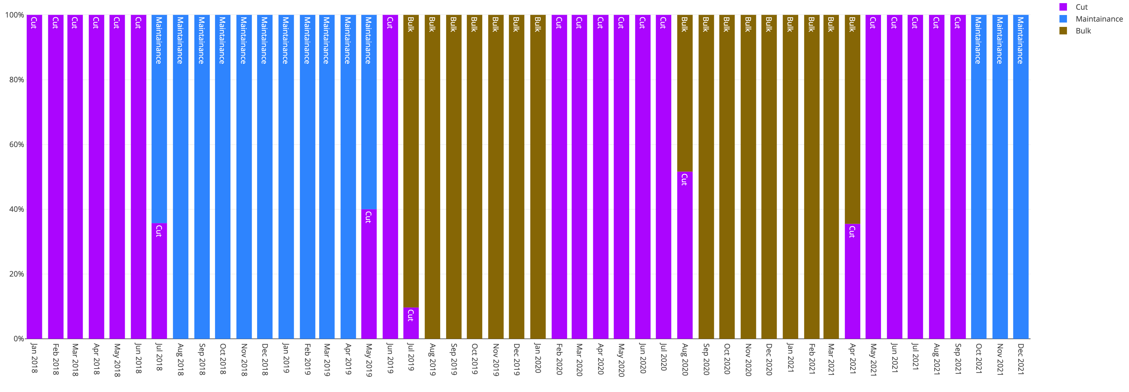
Fitness Bulk & Cut Season
I'm following a pretty regular bodybuilding routine, a 3-day workout split, and a normal bulk & cut seasons
- During times where fitness isn't high up on my priority list, I usually switch to maintenance
- During a cut, I have a slight kcal deficit of about 300kcal, to not negatively impact the rest of my life
- During the bulk, I aim to gain about 300g of body weight per week
- During a cut, I tend to track my meals more precisely than during a bulk or while maintaining
- Purple = Cut
- Brown = Bulk
- Blue = Maintenance
Manually
4 years of data - Last updated on 2022-01-01
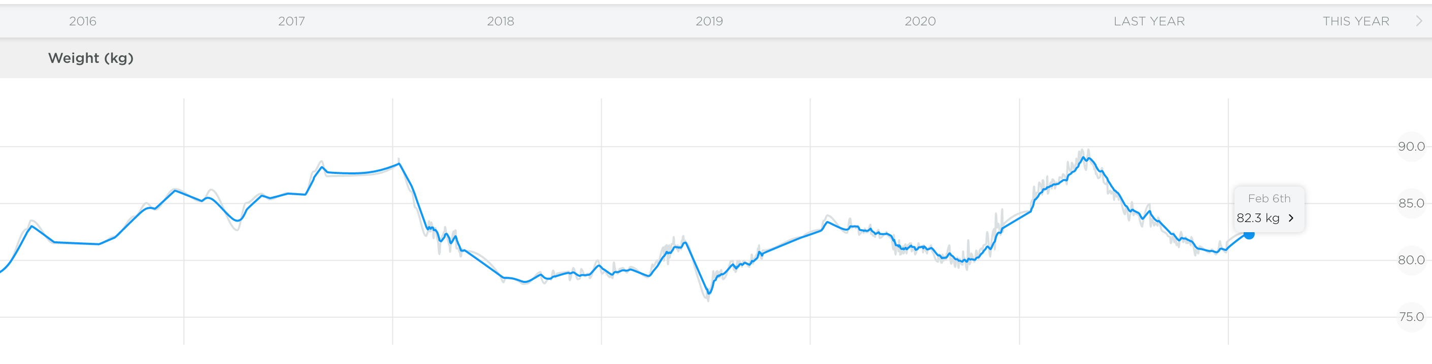
Weight History of 8 Years
Historic weight, clearly showing the various bulks and cuts I've made over the years. Only the last 5 years are rendered in this graph, with the last 3 years having tracked my weight way more frequently.
- Lowest recorded weight was 69kg/152lbs in 2014 (age 20)
- Highest recorded weight was 89.8kg/198lbs in 2021 (age 27)
- I gained 20kg (44lbs) while staying under 12% body fat on 193cm (6"4)
Withings Scale
9 years of data - Last updated on 2022-02-17
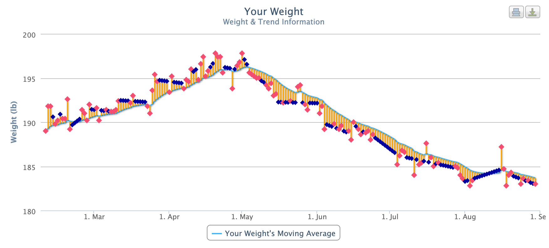
Bulk & Cut Phase visualized
I usually have slow bulk & cut phases, where I gain and lose weight at a controlled speed, combined with tracking my meals.
- I only track my weight if I didn't drink alcohol the night before, and after getting a full night's sleep, since otherwise the weight fluctuates a lot
- Generally, you can pretty much calculate your weight on a certain date, if you consistently track your meals, and correctly calculated your macros
Withings Scale, weightgrapher.com
1 years of data - Last updated on 2022-01-01
Days with more than 15,000 Steps
On days where I walked more than 15,000 steps (I walked an average of 9200 steps a day the last 3 years)
- 60% more time spent with friends in real-life
- 50% warmer temperature that day
- 40% more likely to socialize with friends before going to sleep
- 35% more likely to be a weekend day
- 20% less likely to take a nap that day
- 30% less likely to correctly track my macros (food)
- 30% less time spent in work calls/meetings
- 30% less anxious
- 40% less likely to meditate
- 40% less time spent writing code
- 40% less likely to be a rainy day
- 50% less time spent watching TV
- 95% less likely to be a day in lockdown
Apple Health
2.5 years of data - Last updated on 2022-01-01
How does longer Sleep Duration affect my Day?
On days where I had a total sleep duration of more than 8.5 hours, the following other factors were affected
- 65% more likely to have cold symptoms
- 60% more likely to have headache
- 40% more social media usage
- 30% more likely to be a rainy day
- 20% more likely to be a weekend
- 15% more likely to have bad/stressful dreams
- 12% colder weather on average
- 20% less likely to hit the gym that day
- 24% less energy
- Overall, it's clear that days with a longer sleep duration tend to be significantly worse days. This is most likely due to the fact that I try to sleep a maximum of 8 hours, and if I actually sleep more than usually because I'm not feeling too well, or even sick
Withings Scan Watch, Manually
2.5 years of data - Last updated on 2022-01-01
Air Quality in various Rooms
I used the Awair Element at home in Vienna, in every room over multiple days
- Overall, the air quality in Vienna is excellent. Just opening the windows for a few minutes is enough to get a 100% air score
- The smaller the room, the more difficult it is to keep the CO2 levels low
- The only room where I'm still struggling to keep the CO2 levels low is my bedroom, which is small, and doesn't offer any ventilation. Keeping the doors open mostly solves the high CO2 levels, however comes with other downsides like more light
- Probably obvious for many, but I didn't realize ACs don't transport any air into the room, but just moves it around
- Opening the windows for a longer time in winter will cause low humidity and low temperatures, so it's often not a good option
- I didn't learn anything from the Chemicals and PM2.5 graphs
Awair
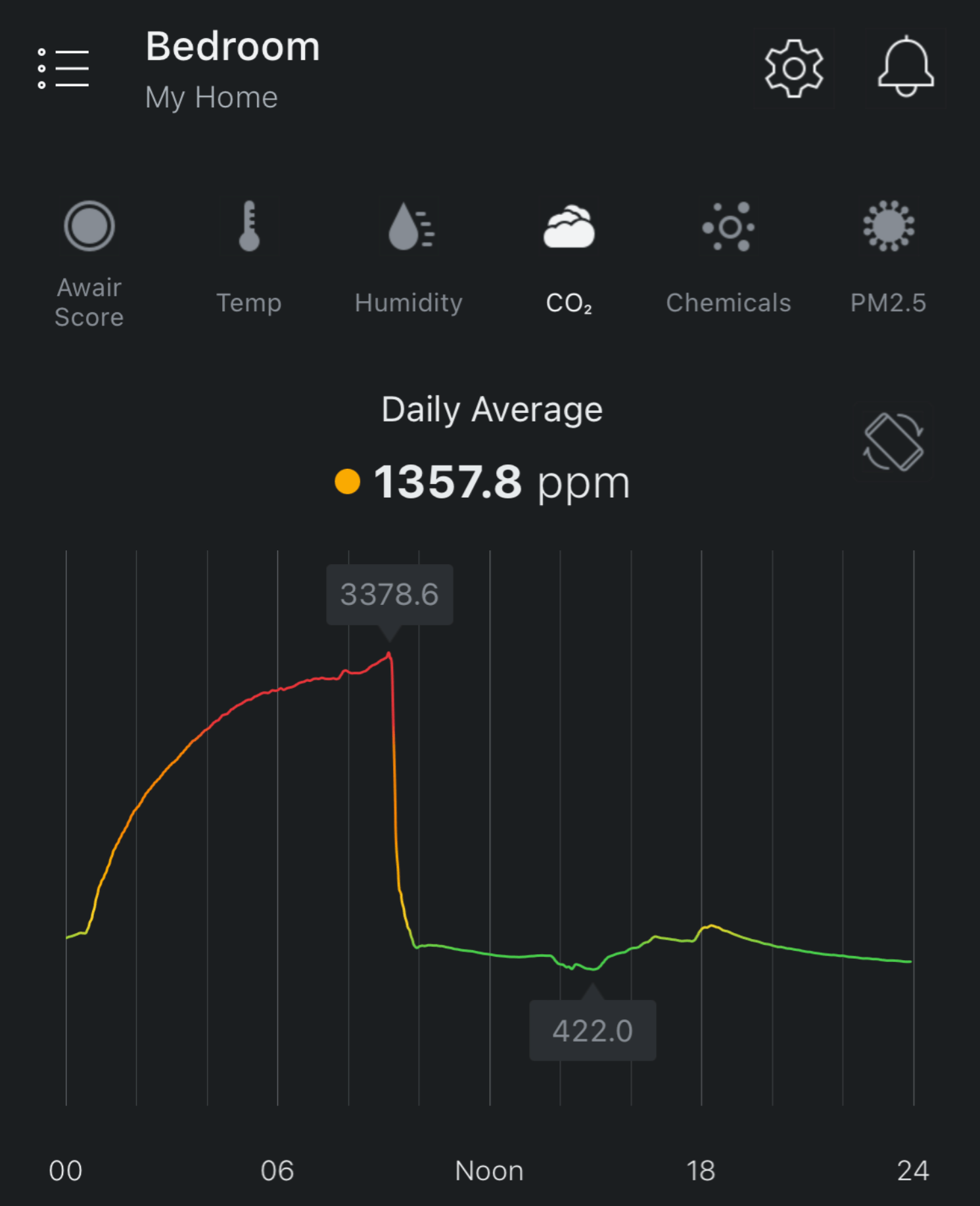
1 years of data - Last updated on 2022-02-09
RescueTime Computer Usage Categories
Using RescueTime, I tracked my exact computer usage, and the categories of activities in which I spend time with.
- Over the last 7 years, I went from spending around 10% of my time with communication & scheduling, to around 30%
- Over the last 7 years, I went from spending around 33% of my time with software development, to less than 10% (now that I'm not currently full-time employed)
- All other categories stayed pretty much on the same ratio over the last 7 years
- Total amount spent on my computer went down significantly after having left my job late 2021
- Tracking productivity levels automatically is difficult to get right, as it's hard to classify certain activities.
- Day to day I'm using Timing App which has a significantly nicer user experience, however I just had many additional years of data on RescueTime
- I highly recommend every professional to track their computer usage. It's surprising to see how many hours a day you actually get on your computer, and how much of it is considered productive. Timing App shows the amount of hours of the day on the Mac's status bar, and it's been extremely useful
RescueTime
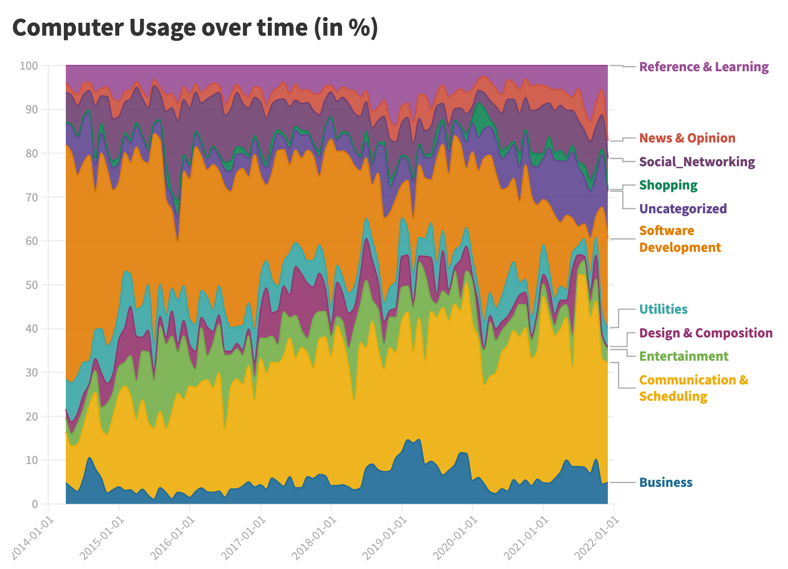
7 years of data - Last updated on 2022-01-01
How does Summer affect my Life?
Summer (being from 21st June to 23rd September) has the following effects on my life:
- Chances of taking a freezing cold shower goes up by 100%
- I walk 33% more steps in Summer
- 30% more likely to hit the gym
- 23% more alcoholic beverages (there were no lockdowns in Summer)
- 20% less time spent reading news & opinions (as per RescueTime classifications)
- 40% less likely to be sick
- 40% less time spent on Entertainment on my computer (as per RescueTime classifications)
- 30% less likely to have bad dreams
Manually
2.5 years of data - Last updated on 2022-01-01
How does Winter affect my Life?
Winter (being from 21st Dec to 20th March) has the following effects on my life:
- Online shopping time going up by 100%, most likely due to the last Winters having spent in lockdown
- Chances of having cold symptoms goes up 45%
- 35% less likely to take a freezing cold shower
- Unsurprisingly, I'm exposed to less solar energy in Winter, make sure to get enough Vitamin D
Manually
2.5 years of data - Last updated on 2022-01-01
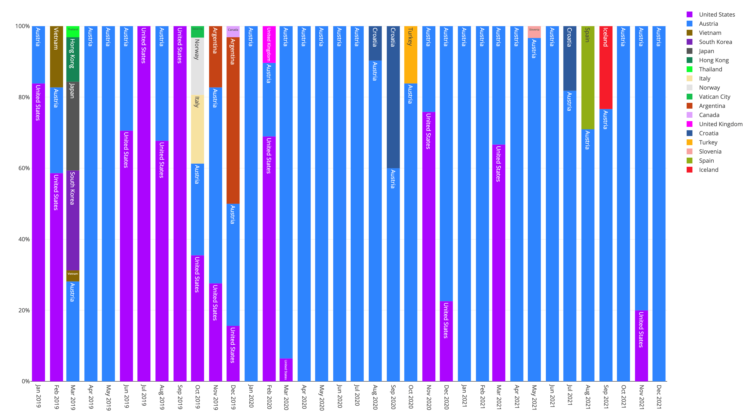
Days spent in each Country
Percentage of days spent in each country over the last 4 years
- International travel has slowed down significantly since COVID started
- Traveling without a stop home for more than 3 weeks gets exhausting for me, I prefer doing more shorter travels instead
Manually
4 years of data - Last updated on 2022-01-01
Living Style
From late 2017 to early 2020 I lived without a permanent home address as a digital nomad, staying at various Airbnbs or taking over a few weeks of a lease from a friend
Manually
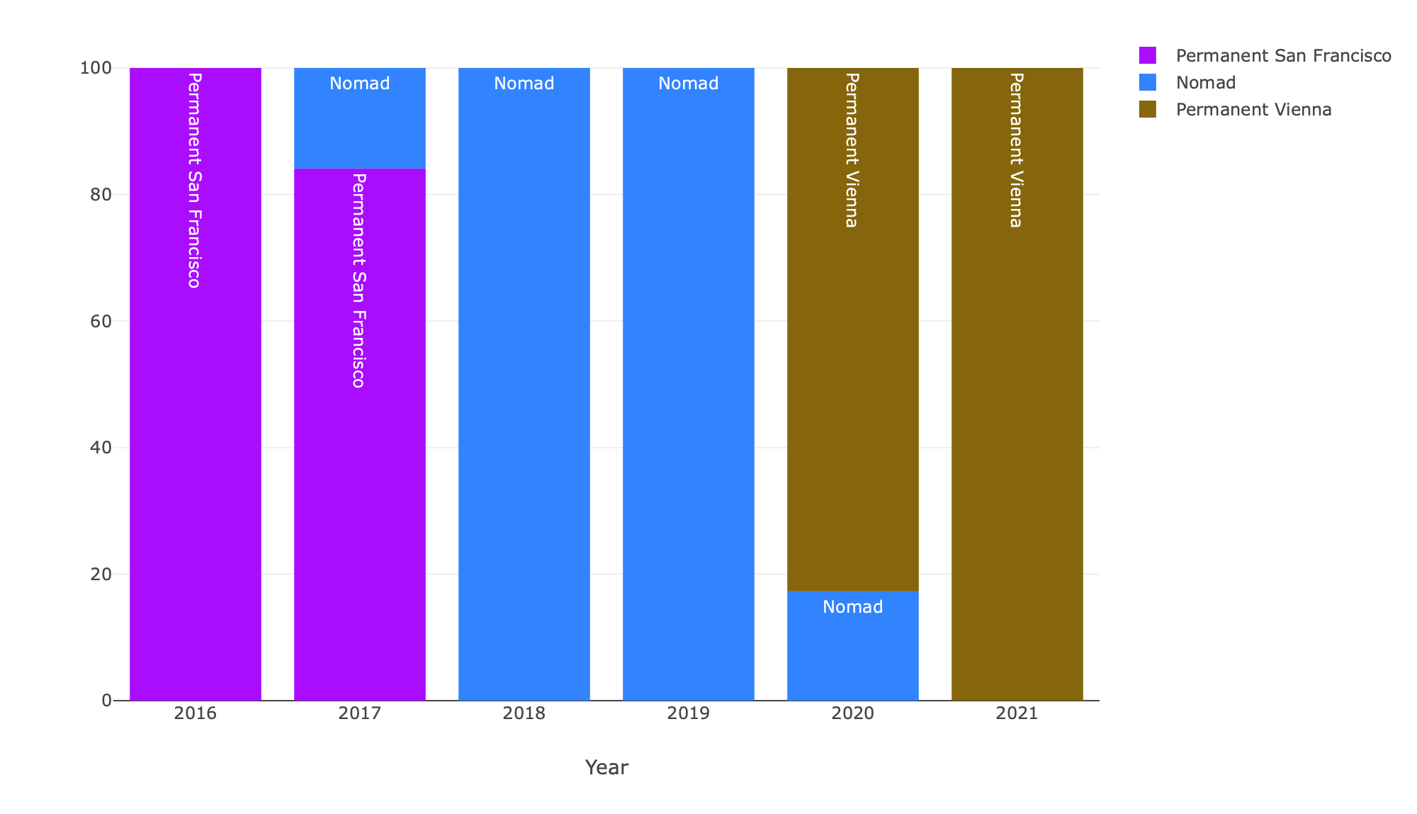
7 years of data - Last updated on 2022-01-01
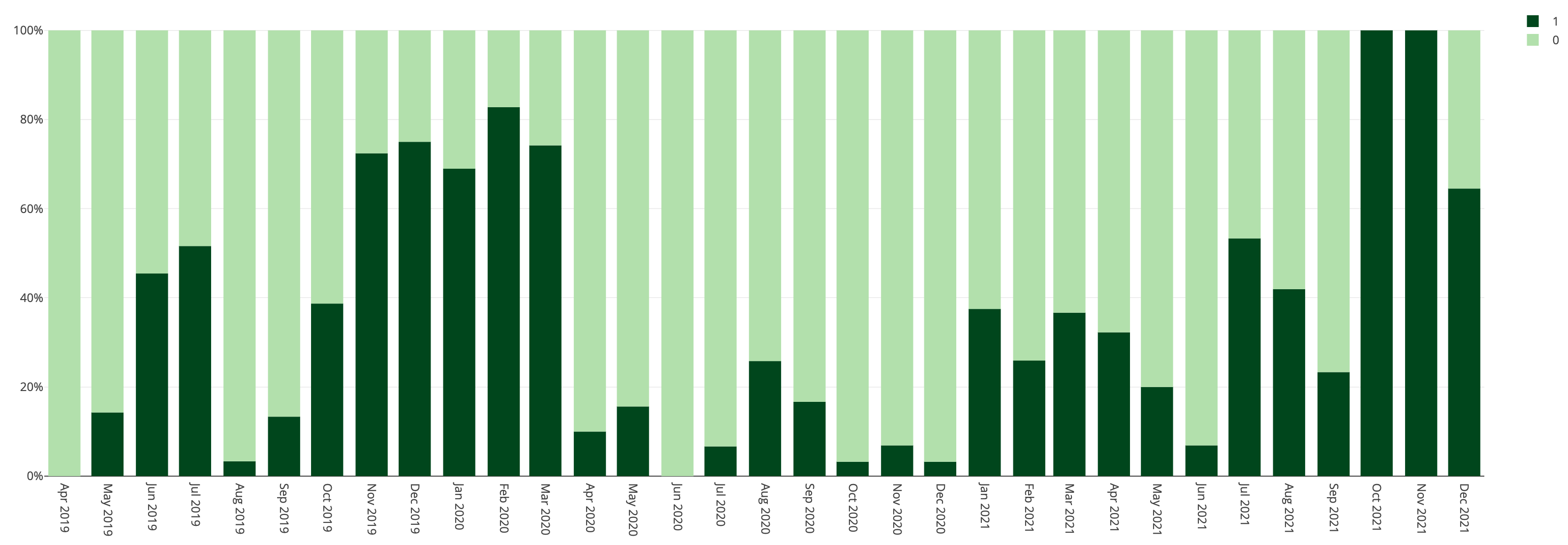
Cold Symptoms
Number of days each month where I had cold symptoms (dark green [1] = day with cold symptoms), which I classify as having a runny nose, feeling light-headed or having light ear pain.
- Clearly the cold months of 2019 and 2021 I had significantly more days with cold symptoms
- Winter 2021 was a full lockdown, I assume this reduced the risk of getting sick
- October and November 2021 I had bronchitis, without getting the proper treatment
Manually
2.5 years of data - Last updated on 2022-01-01
What are Weekends like?
Weekends for me naturally involve less working time, more going out, and social interactions, as well as visiting family members outside the city
- 150% more computer time spent on "Entertainment", which is mostly coming from occasionally playing Factorio or Age Of Empires with friends at LAN-Party gatherings
- 74% more time spent watching TV
- 60% more time spent with friends IRL
- 55% more dancing, when going out
- 45% more likely to have a headache, due to drinking alcohol the night before
- 25% less gym visits, mostly due to family gatherings and not being in the city
- 45% less likely to properly track my macros/meals, mostly due to family gatherings and going out
Manually
2.5 years of data - Last updated on 2022-01-01
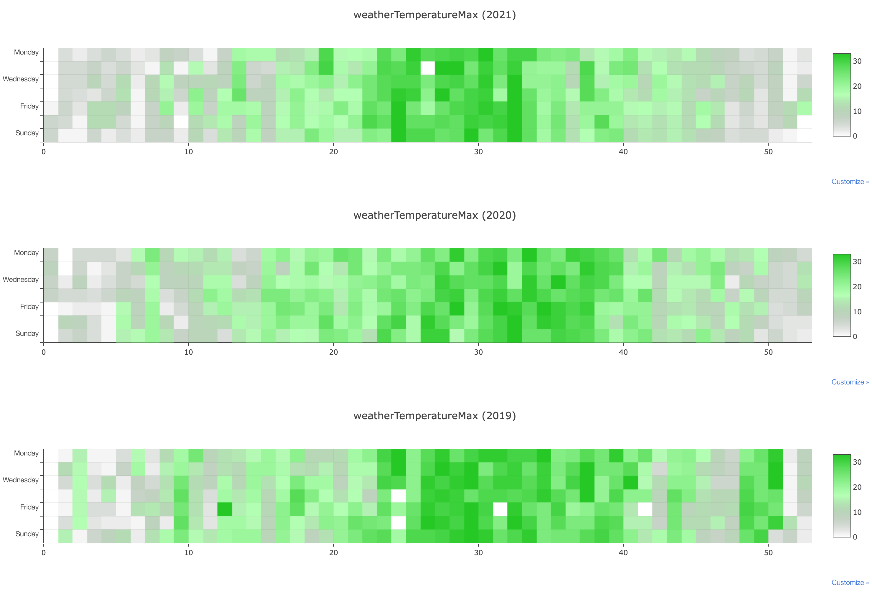
Maximal Temperature each Day of the Year
Historic weather data based on the location I was at on that day based on my Swarm check-ins. Days with no data are rendered as white
- Turns out, days in Summer are warmer than days in Winter
- Summer 2019 I spent in New York City, while 2020 and 2021 I spent in Vienna. The graph shows the summer in NYC to reach higher temperatures
- Week 36 in 2021 I spent in Iceland, therefore significantly lower temperatures
- End of November in 2019 I spent in Buenos Aires, therefore way higher temperatures
- December 2019 I spent in Columbus, Ohio, being the coldest week of the year
Visual Crossing historic weather data, Swarm
3 years of data - Last updated on 2022-01-01
Weather Conditions per Year
Historic weather data based on the location I was at on that day based on my Swarm check-ins.
- 2019 I experienced more cloudy weather than the following years
Visual Crossing historic weather data, Swarm
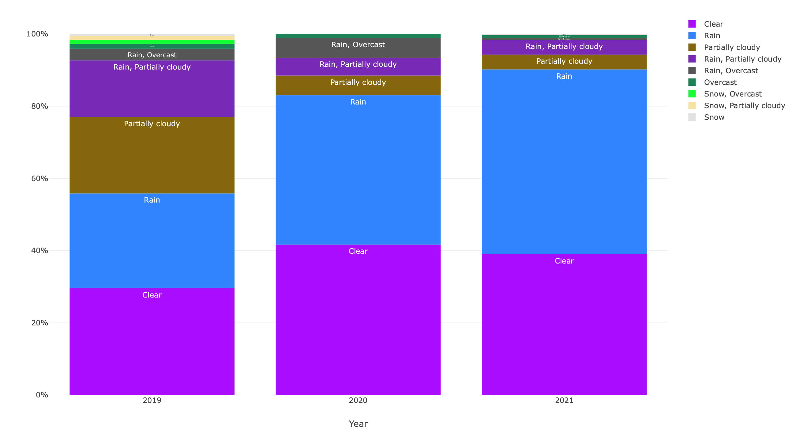
3 years of data - Last updated on 2022-01-01
CO2 Emissions from flying
My radiation exposure, as well as CO2 emissions from all my flights over the last 7 years
Nomadlist
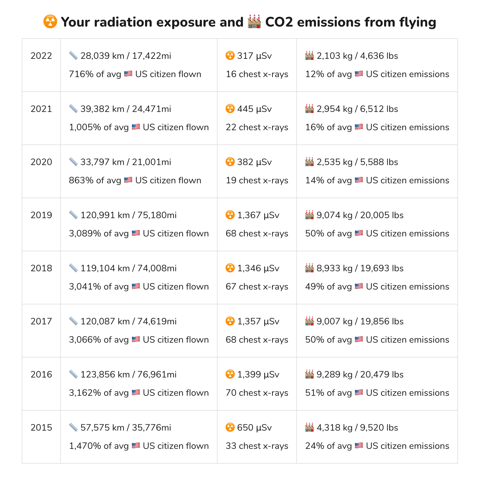
7 years of data - Last updated on 2022-04-28
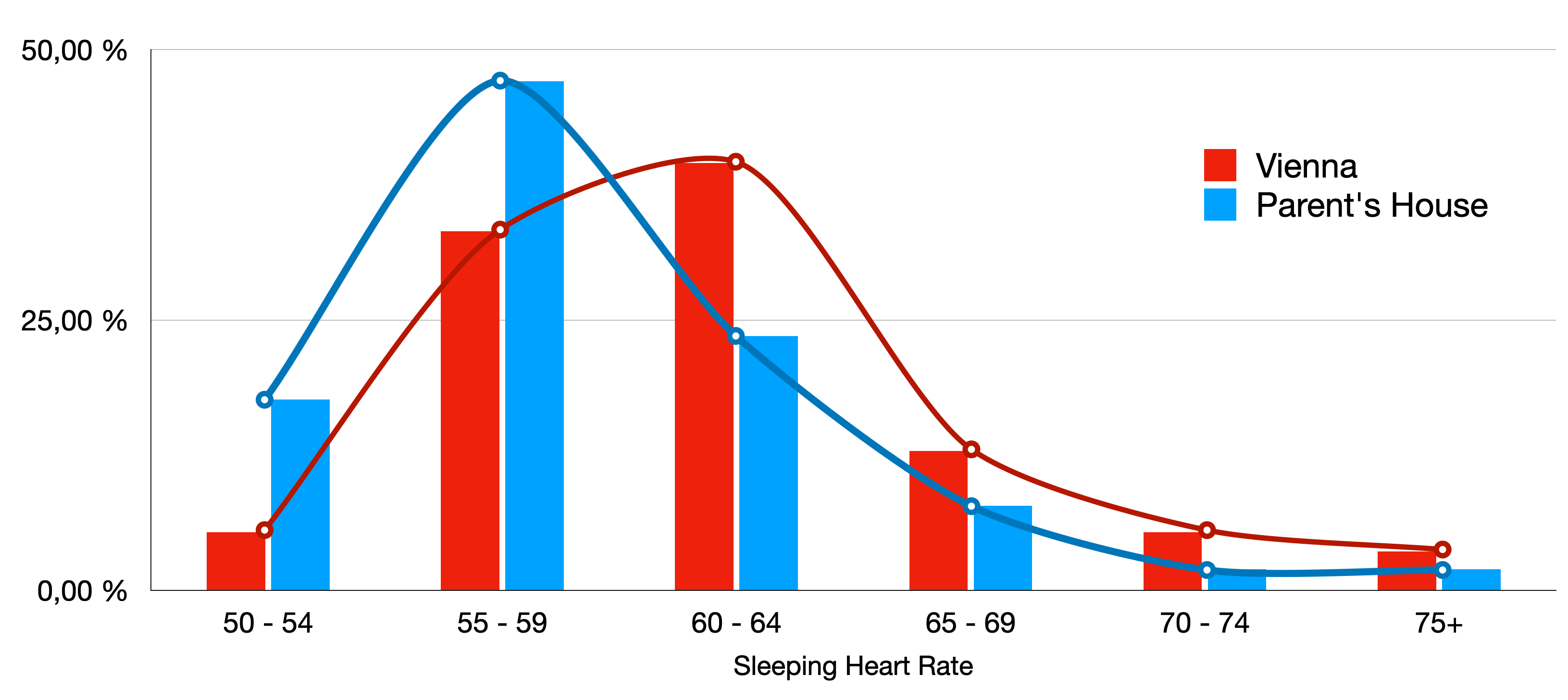
Resting Heart Rate based on location
I noticed myself feeling more refreshed whenever I spent a night at my childhood bedroom at my parents' on the countryside.
- On average, my sleeping heart rate when sleeping at my parents' home is less than when sleeping at my own place in Vienna
- All nights above 70 bpm are usually associated with either drinking alcohol in the evening, being sick, or sleeping for only a short amount of time (e.g. before a flight)
- Even removing all 70+ bpm nights, there is a clear difference between nights spent at my own place in the city, compared to the nights spent on the countryside
Withings ScanWatch, Manual
1 years of data - Last updated on 2022-05-30
Spotify Listening Duration over Time
Spotify tracks every single interaction on their end, including every single song you've ever listened to, and if you finished or skipped each song.
- Since 2013, I've listened to a total of 480,155 minutes of music, that's 8,002 hours, or 334 days
- That's 202,148 songs, however I only finished 49% of them
- End of 2013 I didn't have an active Spotify subscription, due to issues accessing it from Austria
- During some areas in my life, I listened to Cercle/Coccolino Deep sets on YouTube, therefore using Spotify less
- I stored a total of 312 Spotify Discover Weekly playlists, every single one since December 2015
- As part of this script, I built a tool to create a playlist of the 500 most listened to songs, as well as the first 500 songs listened to
- In total, I have paid 1,080 EUR for Spotify Premium
Spotify

9 years of data - Last updated on 2022-05-01
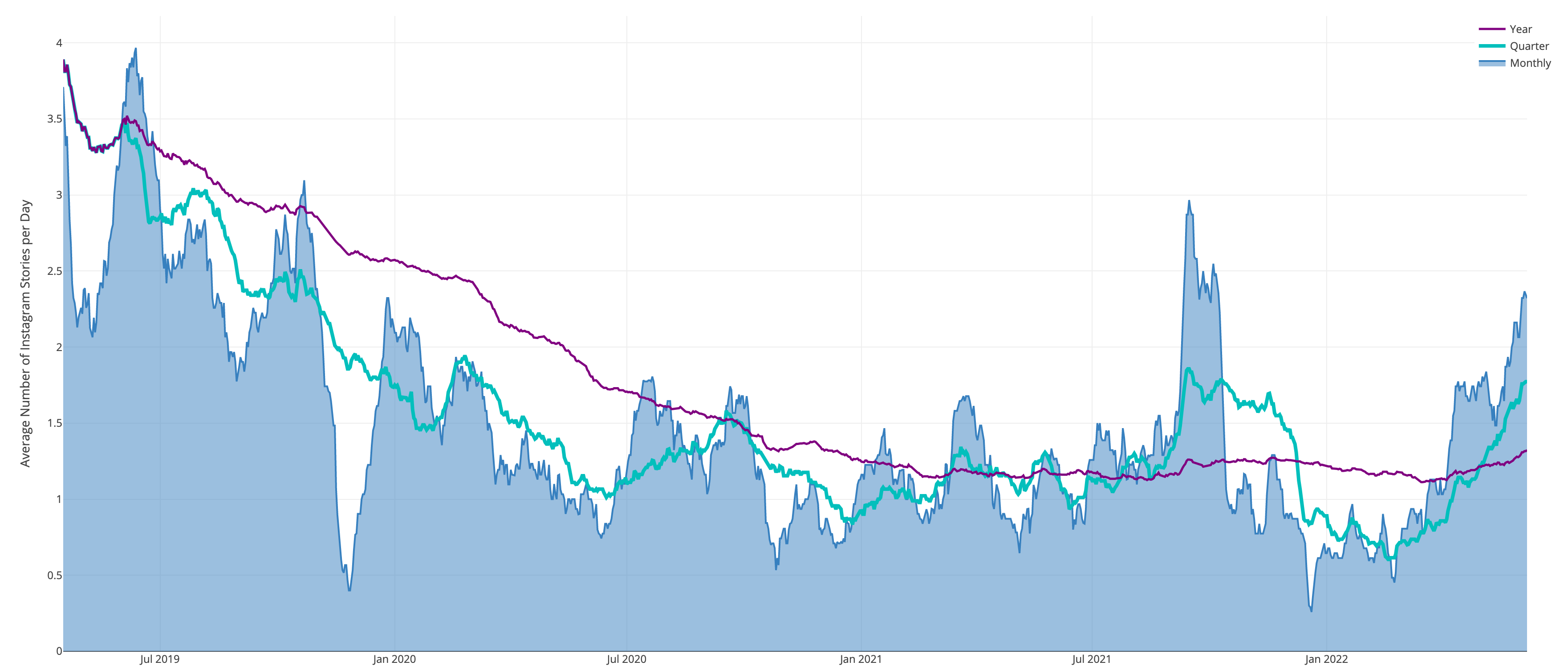
Number of Instagram Stories per Day
Since I've built instapipe.net, I have all my Instagram Stories available in my own database. The blue 'Monthly' area shows the monthly average of IG stories posted, while the green shows the 'Quarterly' average and purple the 'Yearly' average.
- April 2019 I built instapipe while traveling in Hong Kong and South Korea
- November 2019 I had a deadline at work, as well as being sick for a few days
- March 2020, the start of COVID, shows a clear downwards trend the following months until June when Austria opened up again
- September 2021 I was on a roadtrip through Iceland, posting many pictures & videos
- Overall you can see a clear downwards trend of the purple 'Year' line over the last 3 years
- Since April 2019, I have published a total of 1,906 Instagram stories, averaging 1.6 Stories per day
3 years of data - Last updated on 2022-06-01
How does High Temperature affect my Life?
On days with a maximum temperature of more than 26 Celsius (78.8 Fahrenheit), the following other factors were affected
- 80% more likely to take a freezing cold shower
- 37% more likely to hit the gym
- 26% more daily steps
- 20% more alcoholic beverages
- 15% more likely to go out in the evening
- 13% less likely to take a nap
- 20% less time in a code editor
- 21% less likely to be sick
- Generally lower stress/anxiety levels
- 100% less likely to be in a COVID related lockdown
Visual Crossing historic weather data, Manually
2.5 years of data - Last updated on 2022-01-01
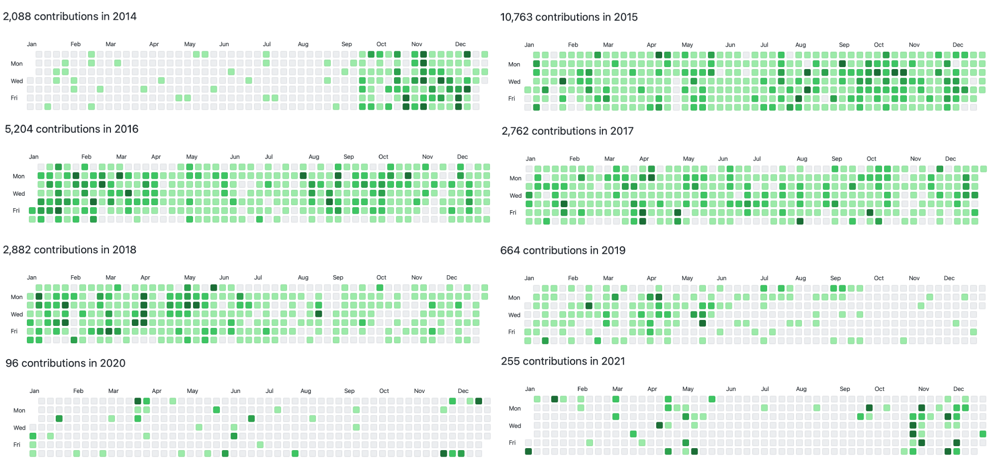
GitHub Open Source Contributions
GitHub open source contributions visualized using GitHub's own contribution graph. The graphs only count code commits to open source repositories.
- I started fastlane September 2014, and worked on it until early 2018
- Early 2018 I started working on fastlane.ci which slowly got shut down over time by Google
- January 2019 I decided to leave Google, as fastlane.ci wasn't going anywhere
- Early 2019 I worked on instapipe.net and this very project via FxLifeSheet
- Second half of 2019, until Summer 2021 I worked at Root on commercial software, which doesn't show up on those graphs
- End of 2021 I resumed work on FxLifeSheet to build this very page
GitHub
11 years of data - Last updated on 2022-01-01
Investment Management & Simulations
Every second week I track my current investments and cash positions. It shows me how to most efficiently re-balance my investments in case they're off track, while also minimizing the occuring trading fees.
- I have a burndown chart, which visualizes how my networth would grow/drop over time in various scenarios
- I have a graph that ensures I have the right target distribution of high, medium and low risk positions
- Whenever I take on a potential new project/role, I simulate the various outcome scenarios that could happen over the next few years
- For obvious reasons, I can't include more of the graphs and simulations I have available
Manually

8 years of data - Last updated on 2022-02-09
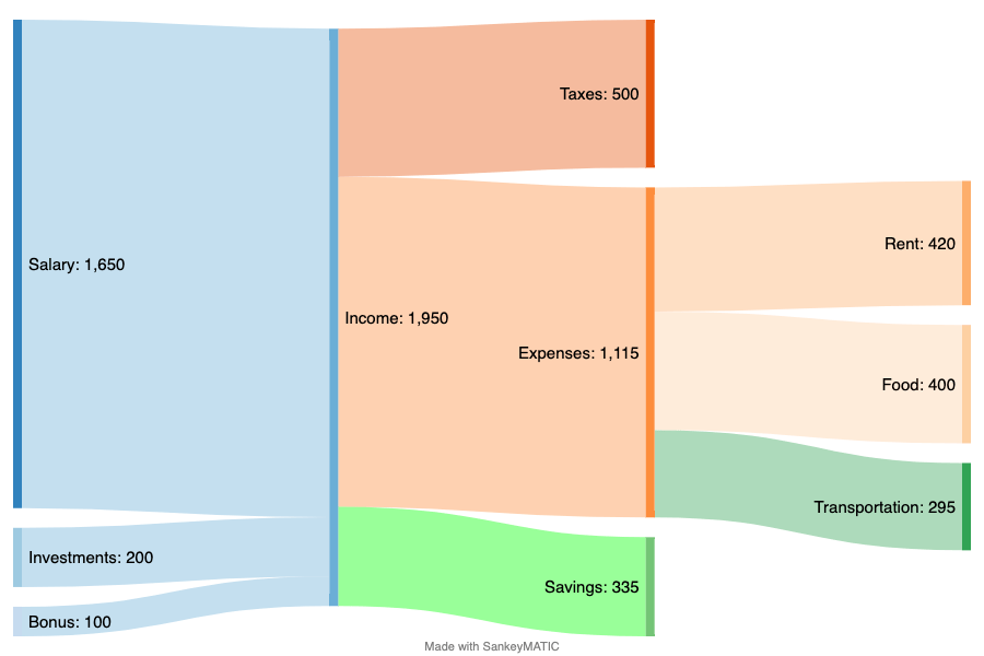
Annual Money Flow
Inspired by a Reddit finance community, I had been creating annual money flow charts to clearly see how much money I earned, where I spent how much, and how much I saved. The chart below isn't mine (for privacy reasons), but just an example I created.
- Not owning an apartment, and living in Airbnbs as a nomad I actually spent less money. This was due to not having to buy any furniture, appliances, etc. but also because the number of items I could buy for myself was limited, as everything was limited to be able to fit into 2 suitcases. Additionally I didn't have to pay any rent whenever I traveled for my job, or during conferences.
- Misc. subscriptions/expenses are adding up quickly
- Having an End-Of-Year summary from your credit card provider, and always using your card when possible, is a great way to get those numbers
- Creating this chart is still a lot of work, as you have to keep in mind that some expenses are not solely yours, but you might have covered for a group (e.g. booked a larger Airbnb), or got reimbursed
Chase Credit Card Year Summary, sankeymatic.com, Manually
5 years of data - Last updated on 2022-02-09
More Details on how this works
This project is custom-built for my own personal use, the resulting code is 100% open source on KrauseFx/FxLifeSheet. There are 3 components to this project:
• Database
A timestamp-based key-value database of all data entries powered by Postgres. This allows me to add and remove questions on-the-fly.
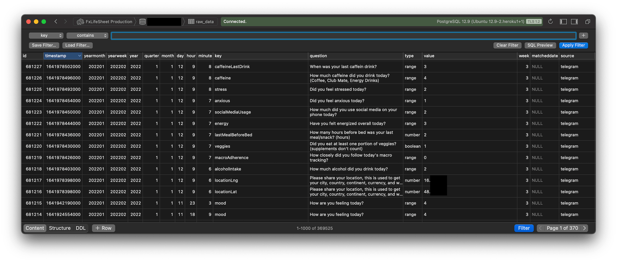
Each row has a timestamp, key and value.
- The
timestampis the time for which the data was recorded for. This might differ fromimported_atwhich contains the timestamp on when this entry was created. Additionally I have a few extra columns likeyearmonth(e.g. 202010), which makes it easier and faster for some queries and graphs. - The
keydescribes what is being recorded (e.g."weight","locationLat","mood"). This can be any string, and I can add and remove keys easily on the fly in the FxLifeSheet configuration file without having to modify the database. - The
valueis the actual value being recorded. This can be any number, string, boolean, etc.
Early on in the project I made the decision not to associate an entry to a specific day due to complexities when traveling and time zones, since the idea was just to detect trends using the collected data. It became clear that detecting trends is only a small part of what can be done with the data, so I wrote a script to associate each entry to the correct date.
• Data Inputs
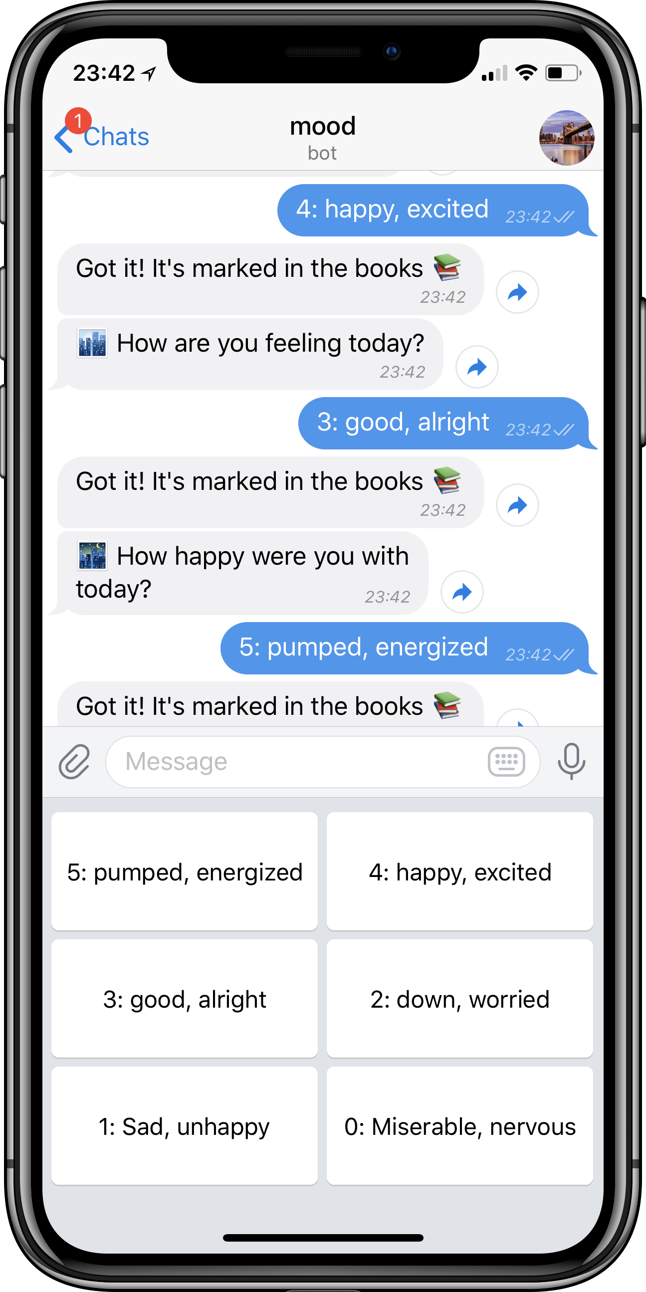
To populate the data, I manually answer questions multiple times a day through a Telegram bot. These questions span from fitness or health (e.g. nutrition, exercise, sleep, etc.) to questions about my life (e.g. how I’m feeling, how much time I spend on social media, etc.). The extensible use of the Telegram API made this easy, and even allowed me to customize the keyboard to have predefined replies based on the question asked.
Additionally I can fill-out date ranges with specific values, for example lockdown periods, and bulking/cutting fitness seasons.
• Data Visualizations
After having tried various tools available to visualize, I ended up writing my own data analysis layer using Ruby, JavaScript together with Plotly. You can find the full source code on KrauseFx/FxLifeSheet - visual_playground.
But what about privacy?
I actually published many privacy projects for iOS. That little green/orange LED that’s rendered on iOS when you record something? Yep, that was me! So why this project?
- Much of the data visualized here, is data many larger companies already have about you. Why shouldn’t you have it as well?
- The data is stored in my own, private database, not connected to any service
- The data shown above seems very personal but doesn’t actually expose any sensitive information. For example, disclosing your current location, your home address, or stores and places you frequently visits is sensitive and potentially dangerous. Even looking at the map of my movement data, you won’t get any more information that what most people have in their public Twitter bio.
Can I use this for my life?
Yes, you could. However, setting up FxLifeSheet is a bit of a challenge and requires engineering skills and time. Some of the features are specific to my life (like the services I use), and so you’d have to modify parts of the codebase. This project is 100% open source MIT licensed, so you can use, and modify everything to your liking. However, I don’t plan on productionizing this project, nor providing any support on GitHub for it.
Realistically, if you want to get started with QuantifiedSelf, you can use one of the services availalbe. I’d recommend looking for the following:
- Make sure you get full access to the data, as a data export, or a public API
- See how the project maintainers react to feedback. Do they listen to their users, and address issues?
- How much time do you want to invest tracking your data?
- What’s their business model? Are they sustainable and charge money for their service?
- Don’t use anything that’s only available as an app: In my experience apps tend to be their own data silo, their feature sets are limited, and analyzing data on the big screen is way more efficient.
Conclusion
I’ve always been fascinated by tracking my own data, and seeing it visualized. While I can’t pinpoint the reason why, I remember having this fascination growing up, asking myself questions like How many steps did I walk in my life?, and Did I turn right more often or left?.
Having read many articles similar to r/QuantifiedSelf/, I really loved the visualizations, but disliked the fact that almost all solutions were data-silos (e.g. standalone iOS apps, Gyroscope, …) without having full control over the data, nor how it’s visualized. Because the data collection spans multiple years, I was apprehensive to rely on any startup or service that runs the risk of being shut down. Additionally, every individual may have differences in how they want to visualize or analyze the data.
Apple was in a great position to improve the current state with Apple Health, but they completely failed with their implementation on both the APIs, as well as the actual Health app.
One aspect I overestimated is the number of days you will track: If you want to look into how many steps you walked in a given city, you’ll quickly notice the number of days in each city already being quite low. You’d then also slice the data by season or temperature, since you naturally walk less on very cold days, ending up with only a handful of days outside your main residence.
Overall, having spent a significant amount of time building this project, scaling it up to the size it’s at now, as well as analysing the data, the main conclusion is that it is not worth building your own solution, and investing this much time. When I first started building this project 3 years ago, I expected to learn way more surprising and interesting facts. There were some, and it’s super interesting to look through those graphs, however retrospectively, it did not justify the hundreds of hours I invested in this project.
I’ll likely continue tracking my mood, as well as a few other key metrics, however will significantly reduce the amount of time I invest in it.
I’m very happy I’ve built this project in the first place, as it gave me a much better awareness of everything going on in my life. I’m excited to have built this website to wrap-up this project and show-case some of the outcomes to the public.
2025 Update: I’ve stopped collecting data and working on this project, but I will keep this page alive.