There are billions of monitors worldwide that can reproduce the exact same colour when instructed to. This in itself is an engineering marvel, but it glosses over the fact that this is only possible if there is a standard definition for colours in the first place. Earlier, colours were loosely defined using a limited set of words — most languages have at most twelve words to describe colours. These loose definitions are fine in most cases, but it is not precise enough for describing the tiny differences between similar looking colours that is required for accurate colour reproduction.
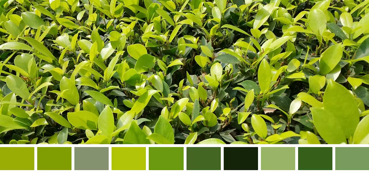
Same name, different colours
The above coloured rectangles shows some of the colours present in the above image. Despite being different, all the shades can be described by the same label — green. One could argue, they can be labelled as lime-green, olive-green, light-green, dark-green, etc to create some distinction. But this naming system is still clunky and highly inefficient. To display the above image accurately, there needs to be a way to describe the all the different shades of green uniquely without needing to resort to an ever-growing list of labels.
Instead of mapping colours to possibly millions of labels, it would be much simpler to use numbered units — the desired precision can then be achieved by simply using more or fewer digits. The idea of mapping colours to numbers might look odd, but it is not too far fetched. Most measurable physical phenomena have already been quantified (for eg. distances, temperature, etc). So if colours can be physically measured it should be easy to map them to numbers, in theory.
Defining colours using numbers also opens up interesting questions: What does addition or multiplication of colours look like? The process of quantifying colours will also reveal why colour hexcodes cannot show enough colours even with 16,777,216 values, and how a dress became a debate on the internet, and why colour blindness exists.
Spectral Power Distribution
The goal is to then measure colours as some physical entity. Unfortunately, colours are a subjective phenomenon. However the fact that most people can agree on the colour of something suggests that there must be at least something objective and physical about it. And there is. Colours are only visible in the presence of light, and that provides a huge clue as to what colours are.
Light is complicated, but it can be thought of as a bunch of wave-like particles, called photons — each carrying some specific amount of energy. The energy of these particles is determined by their wavelength or frequency.
Wavelength
Photon representation
The above is an interpretation of a photon, and is not necessarily accurate. The exact shape of photons is difficult to describe since photons exhibit both particle and wave-like behaviour. Trying to visualize photons as both a particle and a wave can get very tricky very quickly.
Electromagnetic spectrum
There are photons with different energies (or wavelengths). The different wavelengths of photons together form the electromagnetic spectrum. It is simply the full range photons energies, ordered by wavelength or frequency. The above wavelengths are not to scale.
The energy carried by photons can be physically measured, making it trivial to quantify light. To simplify comparisons between different types of light however, the energy measurements are normalized per unit time as power, and then normalized per unit area as intensity — where the area is the total area of the body radiating the photons/light.
So, light sources can be quantified using a singular intensity value. However, for reasons that will become more obvious later, light is actually represented using multiple intensity values — by measuring the intensity separately for photons at different wavelengths. The intensity-per-wavelength distribution is called the spectral power distribution.
450nm Photons
Spectral power distribution
The above is an example of a spectral power distribution. The intensity at each wavelength depends on the number of photons at that wavelength and the energy of photons at that wavelength. The energy of a photon is inversely proportional to its wavelength, so the shorter wavelength photons shown above have a higher intensity for the same number of photons.
The spectral power distribution provides a way to quantify light. But this is all irrelevant until there is a quantitative way to define a relationship between colours and the spectral power distribution (light) as well.
Photoreceptor Cells
The biggest clue to finding that relationship is rather obvious — colour perception is not possible without light, but it is also not possible without eyes. Eyes are sensitive to light, but more importantly they react differently to different wavelengths of light.
To understand how eyes can distinguish between different wavelengths of light, it helps to know a little bit about human physiology. Eyes have different types of photoreceptor cells that have evolved to respond to photons with specific wavelengths. Unsurprisingly, these wavelengths are very similar to those emitted by the sun (380nm–750nm):
Spectral power distribution of the sun
The above is an approximation of the spectral power distribution of the sun. Human eyes have evolved to become sensitive to these wavelengths to be able to perceive environments lit up by the sun.
Photons, depending on their energy (their wavelength), can ‘excite’ certain photoreceptor cells to produce a specific response. The human eye has two kinds of photoreceptor cells — rod cells and three types of cone cells. The different types of photoreceptor cells are sensitive to different wavelengths of light by differing amounts — some cone cells will not produce a significant response to lights with longer wavelengths but other cones may. The sensitivity curves of the different photoreceptor cells are shown below:
Normalized approximations
The sensitivity curves shown here are normalized approximations (for simpler visualizations and calculations), and are not accurate. In reality, the sensitivity curves are less smooth, and different types of cones have differing levels of sensitivity. For example, the sensitivity of S-cones is significantly lower compared to the other cones. Similarly, rods are more sensitive to light than any of the cones.
Because of the varying sensitivity curves, the cones can distinguish between different wavelengths of light. Consider a monochromatic light source (a light source with a near singular wavelength). The cones will produce a response to the light, depending on the wavelength of the light and how sensitive the cones are to that wavelength. However, since each type of cone has a different sensitivity, their response will be different for the same light.
Wavelength
Photoreceptor cell responses
The first graph is the spectral power distribution of the light source. Since it is monochromatic, the intensity narrowly peaks at some wavelength. The graph below shows the sensitivity curves of the cones. The diagram on the bottom represents the responses of the cones to the monochromatic light. The different cones produce different responses to the same monochromatic light source — because of their differing sensitivity.
This is in itself is not enough to help differentiate different wavelengths, but the way the sensitivity curves are (or have evolved to be) distributed makes it such that all different wavelengths will always correspond to a unique set of responses in the cones — making it possible to distinguish different wavelengths. The brain has evolved to interpret these unique responses as perceiving unique colours.
Wavelength