The Coffee Problem 
School French worked perfectly until I tried to buy a coffee.
My lessons must be familiar to all Brits out there: conjugate être until it’s muscle memory, role-play booking a hotel you will never book, then leave school with the comforting illusion that you “know French” in the same way you “know trigonometry”.
The first time French came in useful was a cafe in Chartres, a small town about an hour from Paris with a cathedral, nice streets, and, as far as I could tell that day, a collective commitment to not speaking English.
I walked into a cafe feeling reasonably confident: asked for coffee in my best French and apparently did very well, because the barista replied with the total. It wasn’t even a hard number. But as it arrived as one continuous noise, I instantly gave up and defaulted to the internationally recognised protocol of tapping my card and pretending I am too busy looking at my phone.
That’s the gap language apps don’t really model: not “do you know the words?”, but “can you retrieve them when a human is waiting and you’ve got three seconds before you embarrass yourself?”
More than a decade later, planning a few months in Québec, I did what I always do before a move: learn the minimum viable politeness. Hello, sorry, thank you, the numbers, and the scaffolding around “can I get...”–enough to not be a complete nuisance.
I tried the usual apps: the streaks were pristine and the charts looked like I was becoming bilingual. But in my head I was still standing in Chartres, hearing “3,90” as “three-something-or-something” and sweating directly through my self-respect.
So I built a safety net for the specific failure mode: retrieval under pressure, or just a tiny rehearsal room I could open while the kettle boiled, practise the bits that reliably go wrong, and close again.
And because I genuinely believe that constraints are important, I wrote down the rule that would make this harder than it needed to be:
The whole app is a blob.
The Childhood Trauma 
If you grew up with Tamagotchis, you already understand why this was tempting.
Not the “cute pixel pet” part. The part where a device the size of a digestive biscuit turns into a low-resolution hostage negotiator. Feed me, clean me, entertain me. And if you don’t, I will beep during maths, get confiscated, and then die alone.
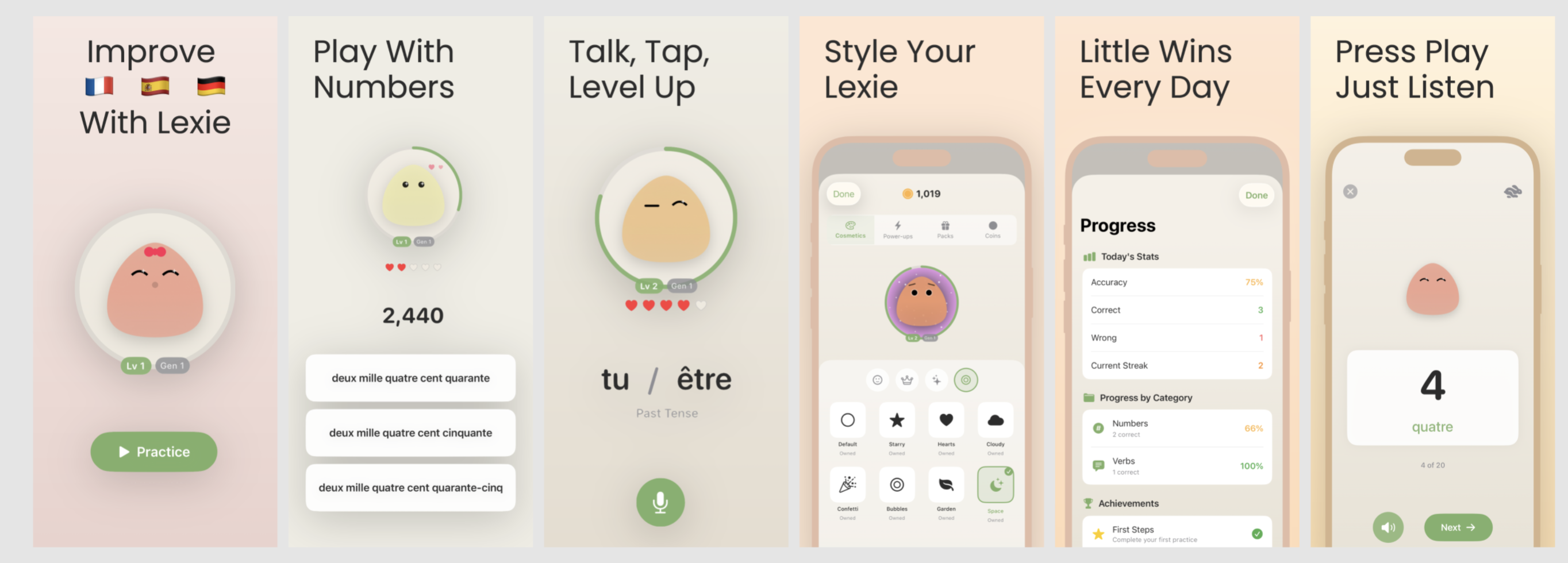
They were brilliant because they weren’t productivity tools. They were tiny relationships. Everything was implied, physical, slightly unfair, and somehow more motivating than any "Time to stand!" push notification has ever been. If you came back after a day away, the creature didn’t show you a progress chart, it showed you a mood.
That’s the shape I wanted for language drills: something that feels less like “open app → consume lesson” and more like “tap creature → it looks at you → you do a small thing together”. I wanted the warmth and the immediacy, without the emotional extortion.
So my brief turned into a very narrow design constraint with a lot of consequences:
- No “home screen” full of destinations.
- No tests you have to take before you’re allowed to practise.
- No progress cathedral you’re meant to worship in.
- Just one scene, one character, and whatever information absolutely must leak through to make the interaction legible.
It’s easy to say “minimal”, but it’s so much harder to say “minimal and still usable by a human being who did not build it”.
The blob wasn’t a mascot here, it was the interface. Which meant it had to do interface work.
Teaching a Circle to Care 
The moment you remove buttons, menus, and visible structure, you inherit a new responsibility: you still owe people answers, you just can’t give them in text.
When you open a normal learning app, you get reassurance for free. There’s a big obvious “Start” button. There are labels and counters and little UI receipts that say “yes, you are in the right place, yes, tapping this will do something, yes, you did something yesterday”. It’s not glamorous, but it works, and the user doesn’t have to play detective.
When you open a blob, the user is staring at an animated shape on a gradient background and thinking, with complete justification: are you sure this is an app?
So the first UX lesson was painfully simple: minimalism doesn’t grant telepathy. In a normal app the UI does a lot of quiet admin for you: it tells you what you can do next, what will happen if you tap, and whether you’re in the right place. When you delete all of that and leave a blob on a gradient, you’re basically asking the user to infer intent from body language. That can work–but only if the blob is unambiguous about two things: “yes, I’m interactive” and “yes, tapping me will lead somewhere predictable”.
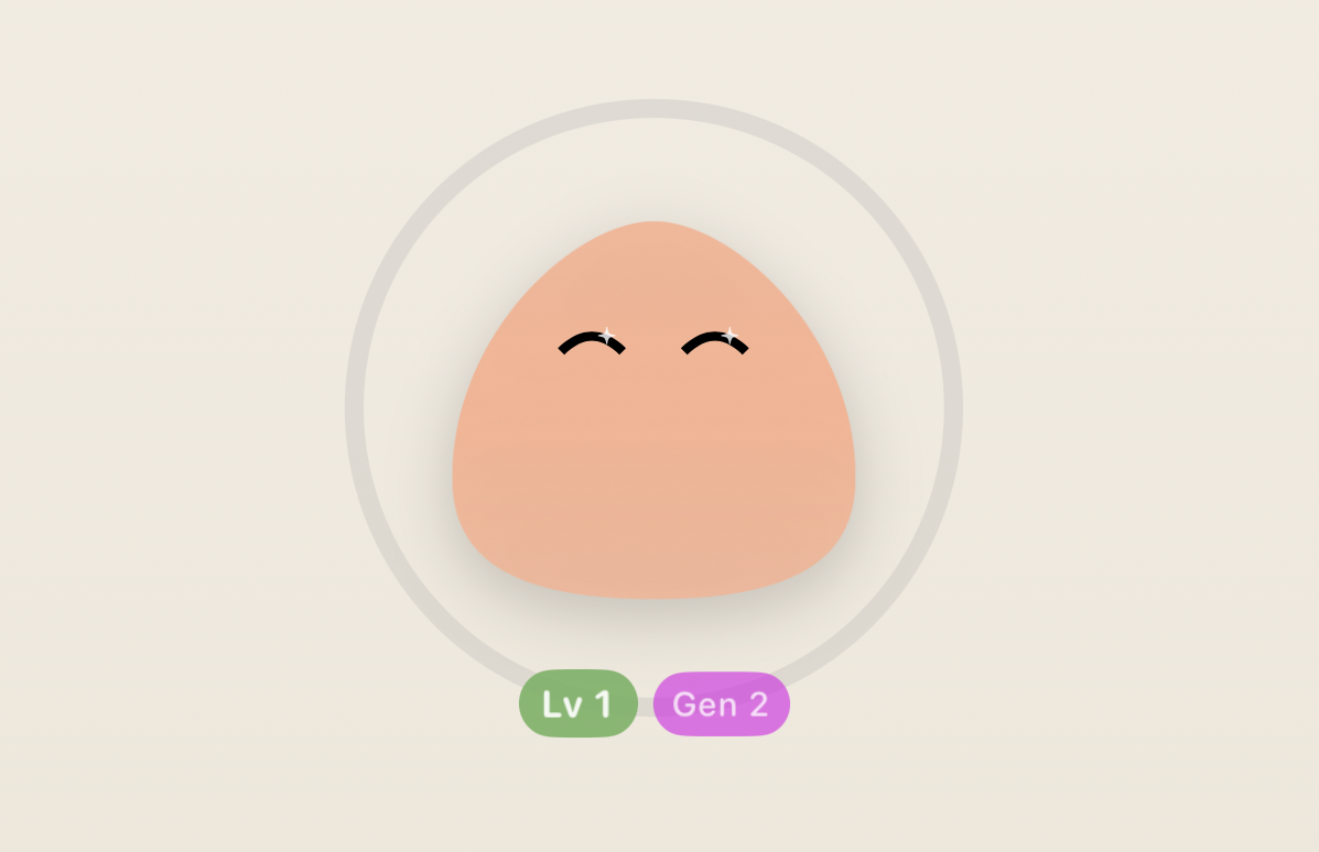
Early Lexie was just a gently breathing circle. It looked calm, premium, vaguely spa-adjacent. It also looked like something you’d see right before a meditation app asks for an annual subscription.
I tried to solve it the “pure” way first: more animation, more suggestion, more “if you notice the micro-shift in the shape you’ll understand you can begin”. That’s a fun idea if your users have nothing else going on in their lives.
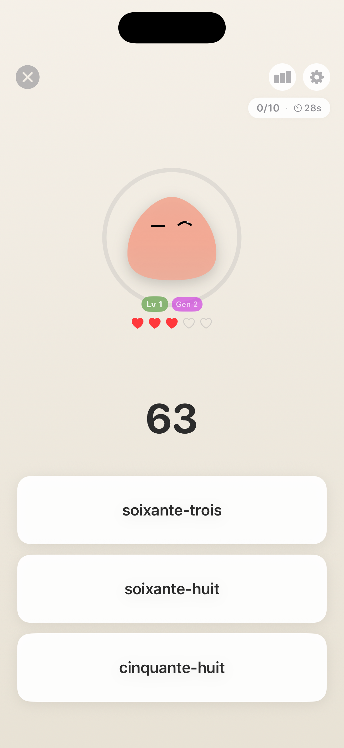
In the shipped version, there is a Start button. It’s small and it doesn’t dominate the scene. It’s not there because it’s pretty but because people deserve certainty within half a second, and a blob cannot deliver that guarantee on its own without becoming theatre.
Once a drill starts, nothing “navigates”. A prompt appears near the blob, and as you take your time answering the question, it subtly changes posture like it’s paying attention–a little lean, eyes tracking, the idle breathing tightening slightly. It’s a tiny moment, but it matters because it reframes what’s happening: you’re not entering a mode, you’re getting the creature’s focus.
Then comes the most dangerous part of any character-driven UI: feedback.
This is where every learning app turns into a casino if you let it. Confetti, fireworks, the whole 4th of July experience (I've seen it only in movies though, not sure why but it's not celebrated in the UK). “Amazing!” “Legendary!” “You’re on a roll!” If you answer correctly, a slot machine explodes. If you answer incorrectly, a disappointed owl files paperwork and probably takes away your dog.
I’m not morally superior to particle effects and shaders. I built the confetti version and it was genuinely fun. It was also exhausting in the way a loud pub is exhausting: a bit of stimulation, then a sudden desire to leave.
So I stripped it down to feedback that reads instantly and ends quickly. A daily practice gets a small hop, a brief brightening, a few coins that pop out and arc back into the blob like it’s absorbing the reward to acknowledge, not to boost your dopamine.
Incorrect answers were a bigger design fight than correct ones, because the default instincts are all wrong.
The first “honest” version made the blob sad. Eyes down, posture slumped, colour cooled. It was expressive and clear, but nobody wants to practise French numbers if it means disappointing a creature you made to be comforting. Tamagotchi could do that to children in the noughties, but adults today will simply uninstall you and go drink water in silence.
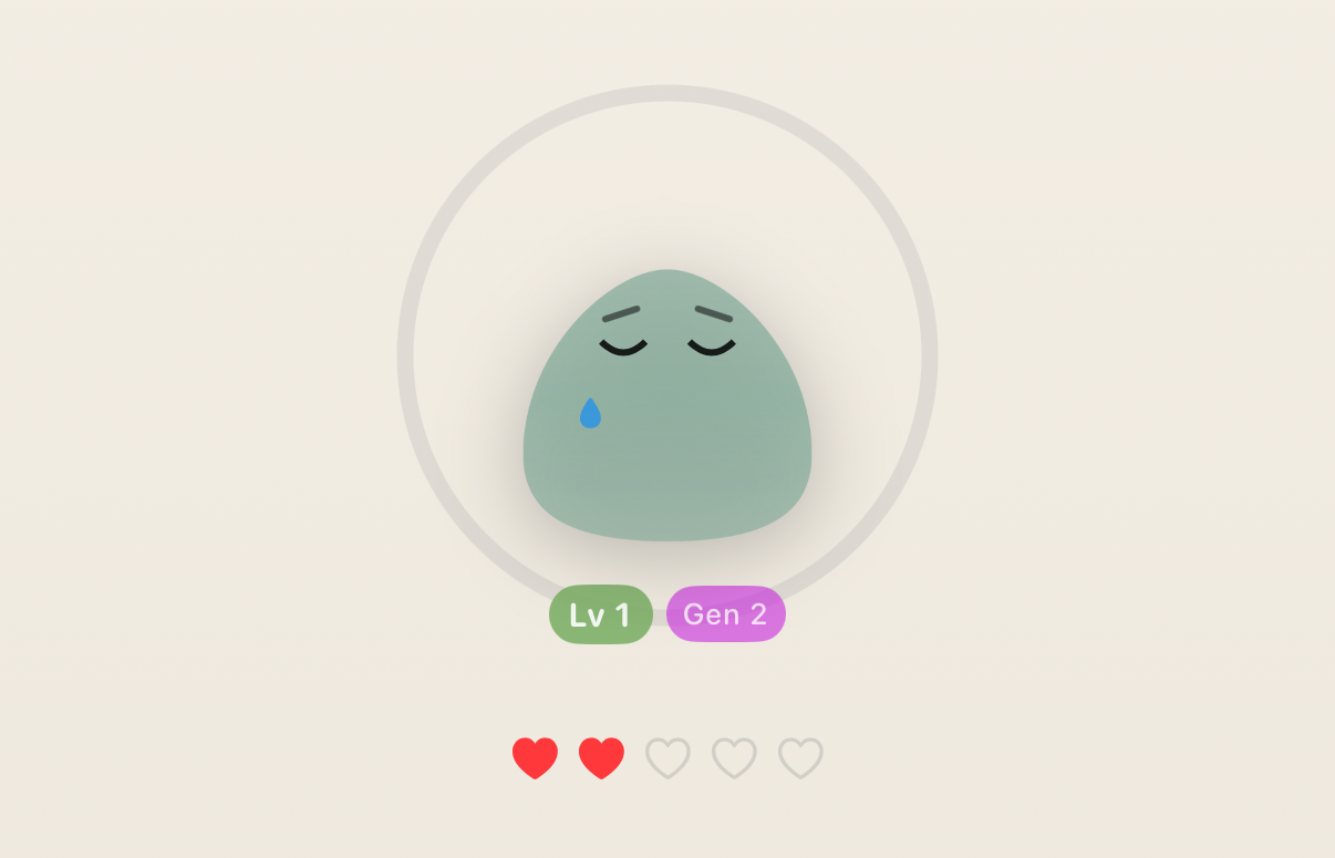
So I switched the emotion from judgment to confusion. Miss, and Lexie looks like it’s thinking, slightly puzzled, waiting. It still reacts–you still get information–but it doesn’t weaponise your mistake into shame.
All of this is design work you don’t have to do if you use normal UI, which is the second UX lesson: removing UI doesn’t remove complexity. It relocates it into motion, timing, and body language, and those are harder to get right because you can’t label them.
When Minimalism Hits a Wall 
The third UX lesson arrived a week into using my own app.
The blob was fun, and I kept the drills short. The interaction felt calm in a way most learning apps don’t. I’d open it while waiting for the kettle, do a handful of prompts, watch the creature perk up, and then close it feeling vaguely responsible.
And then, at some point, I realised I had no idea whether I was improving or just maintaining a pet.
This is the trade you make when you pursue a “single-scene” interface too aggressively: you can remove friction, but you can also remove evidence. If the app never tells you anything in words or numbers, you end up in an uncanny situation where you feel like you’re doing something, but you can’t verify it. It’s the UX equivalent of “trust me, mate.”
Testers (aka my wife, who am I kidding here) said the same thing but in more flattering terms: “Cute!” “Less scary than Duolingo.” Then the one question that matters: “Is this actually helping?”
Minimalism is only luxurious if the user still feels in control. But you can't manage something if you can't measure it. So I broke the “blob only” purity in a way I could live with: I added small receipts that don’t turn the experience into a dashboard.
First, a ring. It fills as you answer, like a quiet “enough for today” signal. When it completes, it does a subtle shimmer and then goes back to being decorative. It’s not there to gamify, it’s there to answer the simplest question: did I do anything meaningful, or did I just tap a circle.
Second, a tiny streak pill. Just a small indicator that you’ve done something today, and that you’ve been roughly consistent recently. If you miss a day, it resets without drama, because drama is the entire behaviour I was trying to design out of the interaction.
Third, a stats sheet that’s deliberately buried. There’s a small icon. Tap it and you get a panel with a few plain facts: how much you’ve practised recently and which ranges you struggle with. If you never open it, the app never nags you with it.
This is the shape I ended up believing in: keep the main surface quiet, but give the user an audit trail if they ask for it. The blob stays the primary interface, but it no longer asks for blind trust.
Lines I Refused to Cross 
Once you add rings and streaks and coins, you’re standing at the top of a very slippery slope.
One more step and the ring becomes a flame, the streak turns into a guilt mechanic, the blob becomes a supervisor.
It’s clearly effective and there apps successfully pulling that off. It’s also the opposite of the thing I was trying to build, so I ended up with a few hard lines that survived every “maybe we should...” conversation I had with myself.
Lexie can’t die. No pixel funeral, no neglected-pet tragedy, no “you failed” screen. If you keep getting things wrong, it doesn’t spiral into shame–it just... resets. A quiet little rebirth loop, the most Buddhist mechanic I could ship (I am not, as you can tell, a designer). If you vanish for a week, it goes a bit dim and undercharged, like it’s been sat in Low Power Mode, and then wakes up the second you tap it. Your life is allowed to exist.
There is no “streak in danger” notification. If reminders ever exist, they’ll sound like a polite tap on the shoulder, not a fire alarm. I am not building a tiny manager that lives in your pocket and counts your absences.
There is no leaderboard. The blob does not know your friends, but you get to keep your very own blob, isn't it cool?
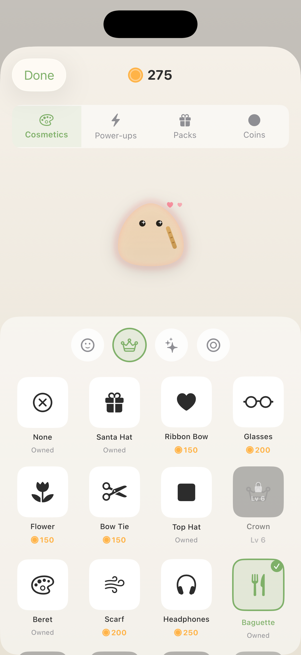
Rewards are cosmetic and unserious. You can unlock colours. The blob can wear a beret. It can look slightly more smug after you finally stop mixing up seventy and seventeen. None of it changes the learning itself. It just gives the relationship a bit of texture.
This is where the Tamagotchi inspiration loops back in a healthier form: the creature is there to make the interaction feel human, but it’s not allowed to punish you for being human.
Now That I'm in Québec 
By the time we actually arrived in Québec, I’d gained one extremely specific superpower: I can now hear a price and remain a person.
“3.99” registers as “money” instead of “incoming humiliation”. Phone numbers no longer turn into a single continuous noise.
What Lexie didn’t solve–and was never meant to solve–is everything around the number. “Pour ici ou pour emporter” is currently my nemesis. The first time someone asked, I understood none of it and answered “oui” with enough confidence to make it everyone’s problem.
That’s fine though. The blob isn’t a French course. It drills what it can drill properly, like numbers, some core forms, the boring fundamentals that keep showing up, and then leaves the rest to real life. If you disappear for a week, it is not the end of the world–it just wakes up, gives you some hardcore numbers to translate again, and does a wee level-up jig like you’ve achieved something.
Which, to be fair, I have.
I like turning mildly humiliating real-world edge cases into shippable apps; if you have a few of those lying around, send them to work@drobinin.com.