Colour is one of the quickest ways a poster can tell you what kind of film it’s selling.
Before you’ve read the title or registered the actors, your brain has already clocked the palette and filed it against a lifetime of genre expectations.
Over the past century, marketing teams have shifted from painterly illustration to photography and from saturated Technicolor hues to today’s more controlled, strategic colour use.
I wanted to take a data-led look at colours on movie posters, so I gather a few (well, 58,687) and analysed how different kinds of movies make use of each colour.
Before we go colour-by-colour, let’s get a general sense of colourful movie posters are.
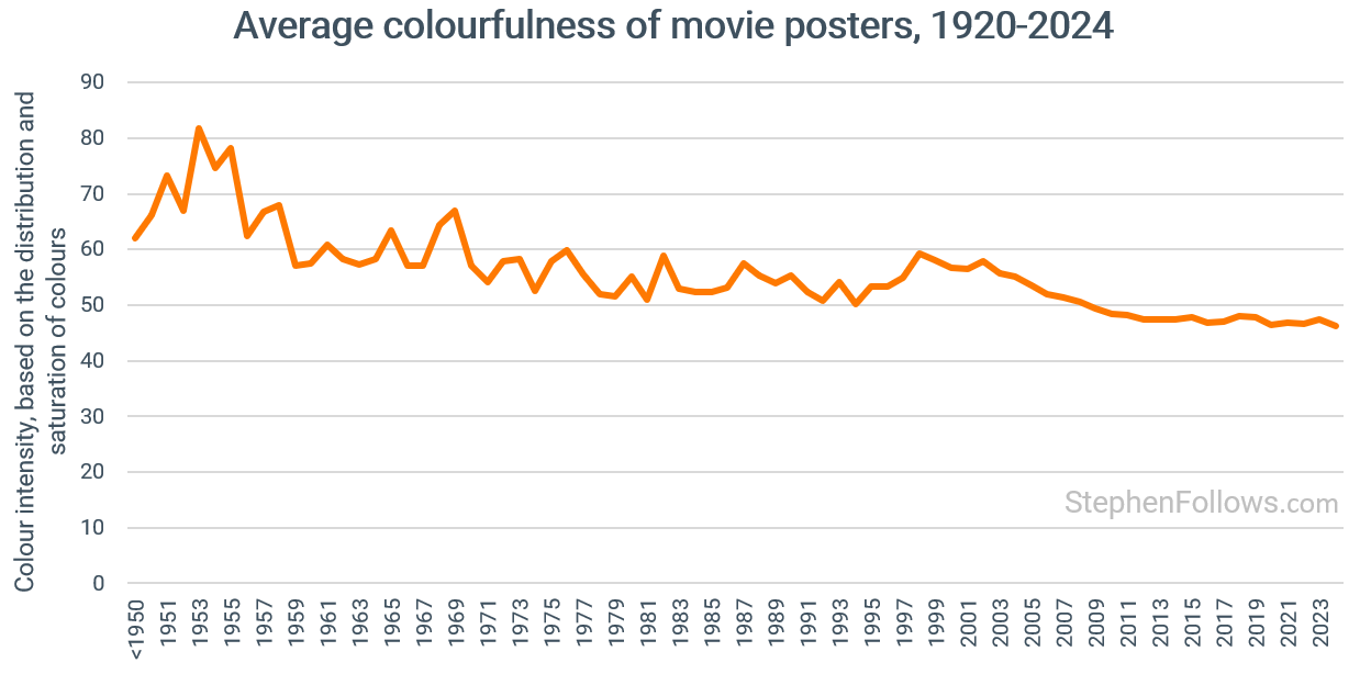
The first measure I tracked was a ‘Colourfulness score’. This measures how intense and varied the colours are in a poster. Higher values mean the image contains more saturated and diverse colours, while lower values indicate a more muted or monochrome palette.
The image below shows a sample of images on the scale from 'low colourful scores on the left to highly colourful ones on the right.
With this we can track how movie posters have been changing over time. Movies posters cover the whole gamut but there has been a consistent trend of the colour coming out of posters.
Next we can add a second calculation, that of the Brightness Contrast score. This measures the difference between the lightest and darkest areas of a poster. Higher values suggest stronger visual separation and bold contrasts, whereas lower values indicate a softer, more uniform brightness across the image.
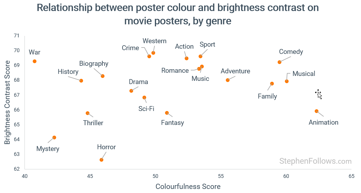
When we put these two measures together we get a fascinating reflection of the types of genres which are similar (or more accurately marketing to audience in similar visual styles).
Mystery, thriller and horror movies sit moodily in bottom left, reflecting low brightness and low contrast.
War, historical and biographical movies are in the top left, with low colour but high contrast.
Comedy, family and musicals are in the top right, with lots of colour and contrast .
The bottom right is a little sparse, with the closest genre being animation, perhaps reflecting that this includes both animations made of children and those made for adults.
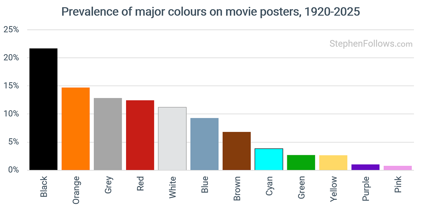
It might come as a surprise to some of you that the most frequently used colour on movies posters is orange. (well, technically black is more frequent but it’s not a ‘colour colour’, and some of that is down to text so I’ve decided to ignore black).
Lets have a look at each of the colours in turn.
Orange grabs your attention in a non-alarming way, it radiates warmth and amplifies human presence.
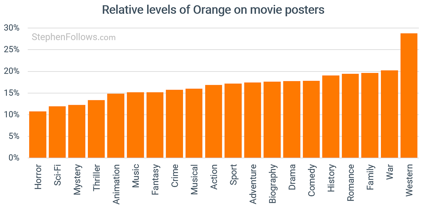
Comedies, adventures and family films are the biggest users of orange heavy palettes, often pairing it with sunny yellows to convey warmth, fun and accessibility. Action, sci fi and thrillers also rely on orange, especially when contrasted with blue, to signal spectacle, high stakes and elemental conflicts like fire versus ice or humanity versus technology.
Horror, thriller and mystery movies don’t tend to use much orange, save for things like firelight, sodium lamps and warning glows.
Orange if often used when:
Sun, dust or fire define the movie’s world(s). Deserts, sunsets, torches, explosions.
Historical texture matters. Sepia light, parchment, wood, brass and smoke.
Warm and approachable tone. Comedies, family travel, food stories, summer settings.
Post‑apocalyptic wastelands. Rust and ochre surfaces with cool tech accents.
Among the reasons orange has become such a go-to for poster designers is that:
The complementary contrast makes the poster readable at a glance.
Human skin sits on the warm side so orange brings faces forward.
Global campaigns favour a single look that survives as a thumbnail and matches the trailer.
Orange also partners cleanly with the cool side of the spectrum, which is why orange and blue have become the dominant blockbuster palette for posters in recent years.
The pairing maximises contrast, makes faces “pop” because skin lives on the orange axis, and signals action or sci‑fi at a glance. (Plus movie poster design is a space free from derivative trend following).
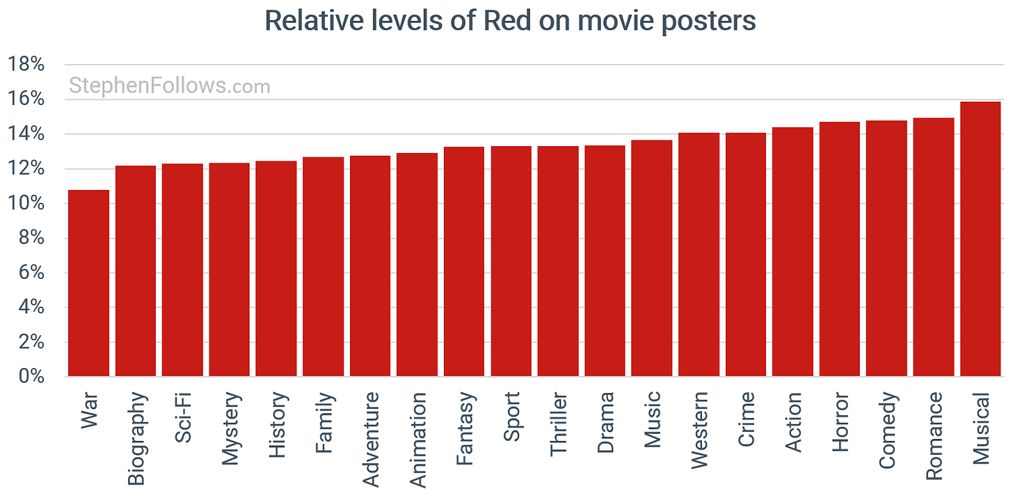
Red is one of the most arresting colours in poster design. It demands attention before the viewer has processed the title or the imagery. It carries a dual message that can pull in opposite directions – love and passion on one side, danger and aggression on the other.
The most common types of films to rely on a red-heavy palette are:
Horror, where red is almost always a stand-in for blood and mortal danger. It often appears in black-white-red schemes or as a sharp accent on a dark field.
Action and thrillers, where red signals energy, speed, urgency and conflict. It works well alongside black and white or within the blue-and-orange blockbuster palette.
Romance and drama, where red means passion, desire and emotional intensity, but can also hint at jealousy, turmoil and loss.
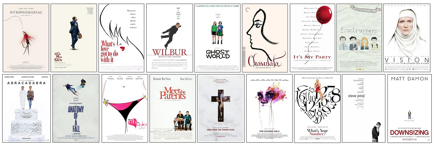
Comedy, where bold red typography on a white background has become a genre shorthand for high-energy fun.
Science fiction sometimes borrows from action and thriller conventions, using red as a flare of danger or a warning light within cooler palettes.
As you can see - red has many uses and meanings. The chart below shows the genres’ use of red and you’ll notice that there is very little variation between genres. This means that just using red is not enough to significant a clear genre.
This contrasts with more polarising colours such as blue, purple and pink which convey more meaning.
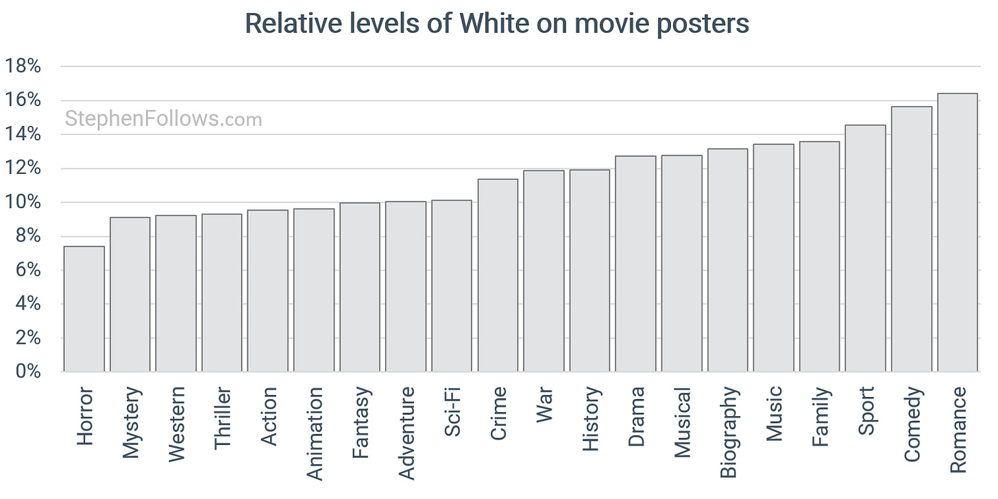
White is the most flexible colour in the designer’s kit. It can be warm and hopeful or cold and isolating, depending on what sits around it. It creates space, strips away distractions and puts the subject front and centre.
The most common types of films to rely on a white-heavy palette are:
Romantic comedies, especially those built around relationship dynamics. White backgrounds with bold red type and large character cut-outs are a visual shorthand for freshness, warmth and accessibility.
Horror, where white is flipped from safe to unsettling. Sterile backgrounds recall morgues, hospitals and isolation, making any splash of red or disturbing object more shocking.
Science fiction, which uses white to suggest minimalism, technological precision and futuristic worlds. It can be utopian or menacing, signalling both advanced design and the void of space.
Action, where white often appears in typography or as a high-contrast element against black, orange or yellow for maximum clarity and punch.
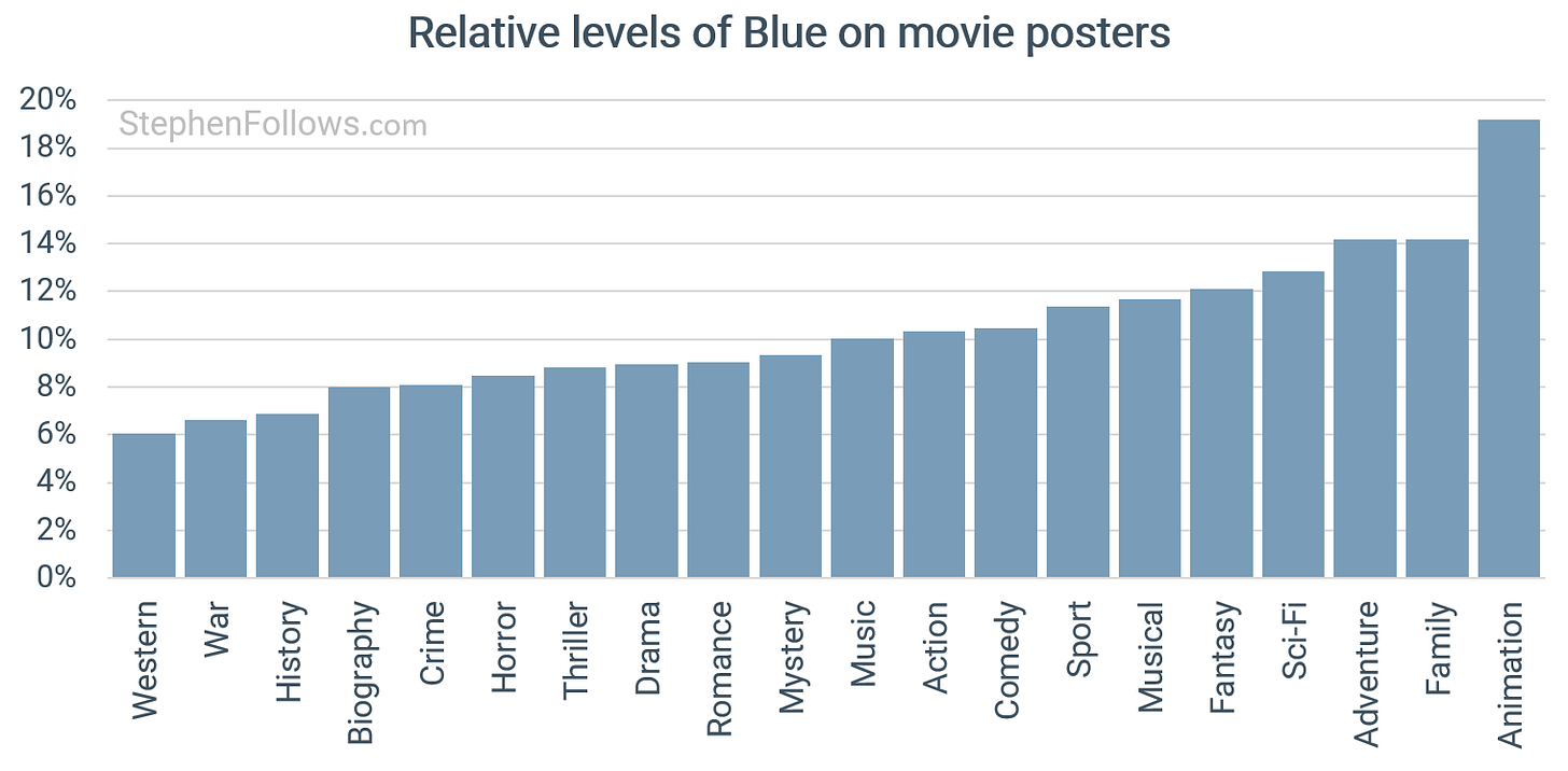
Blue earns its place when the story world demands it. Seas, skies, ice and neon tech all push it to the front. Animation and family films use it as the go-to backdrop for big skies and open water. Sci-fi and adventure thrillers lean on it for space, steel and the cool glow of screens. Crime, horror and mystery bring it in for night scenes, cold light and the suggestion of surveillance.
It’s largely absent among period, war and western movies where earth tones dominate.
When blue is used heavily, it’s usually because the whole environment is blue, such as an ocean crossing, an arctic wasteland, a story set under neon skies.
In design terms, blue with cyan keeps things modern and clean. Blue with white feels airy and bright. Blue with black signals night and unease. Add orange when you need faces, fire or typography to punch out. Pink and purple work as playful accents in musicals or animation.
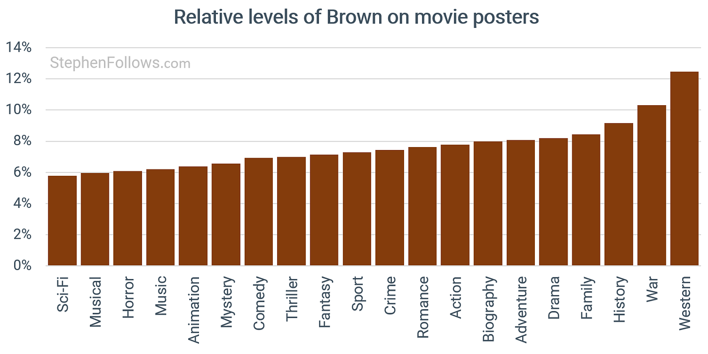
Brown is frequently used when a poster wants to feel rooted – in history, in labour, in the land itself. War and westerns lean on it for mud, leather, smoke and endurance. Historical dramas use it to strip away gloss, replacing polish with patina.
In horror and folk-thriller territory, brown turns cold and airless. It signals decay, rot, a world where life has drained away and the earth itself is hostile. Dystopian and post-apocalyptic films take it further, with brown as ash, ruin and the last scraps of a dead world.
Fantasy and quest adventures use warmer browns alongside green to ground their worlds in something tactile. In the right shade it’s homely and human, in the wrong one it’s the colour of despair.
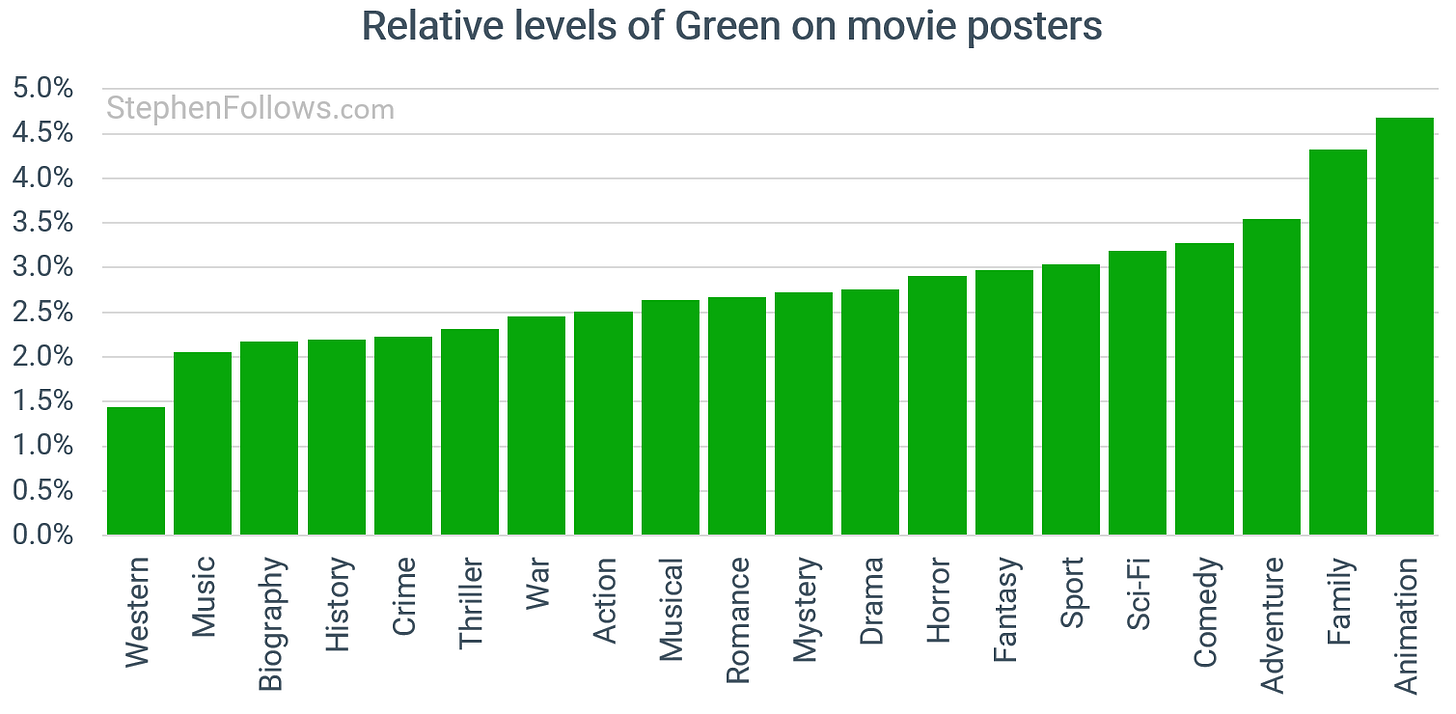
Green sits low in the averages but swings wildly depending on context. And when a poster goes green, it usually goes REALLY green.
You see green dominating in lush, nature-driven animation, family and adventure films, where fields, forests and canopies wrap the whole frame. Also among pastoral comedies, romances and dramas, where leafy colours read as wholesome, calm or human.
At the other end of the spectrum, neon, toxic and night-vision greens define pockets of horror, sci-fi and thrillers (think slime, radiation, code, alien glow), and often paired with black or cyan for maximum unease.
Creature features and swampy survival stories lean into murky greens for jungle menace, while in crime and mystery it turns olive or desaturated, signalling moral rot or sickness.
Historical, war and biography films rarely go heavy green unless landscapes, uniforms or documentary realism demand it.
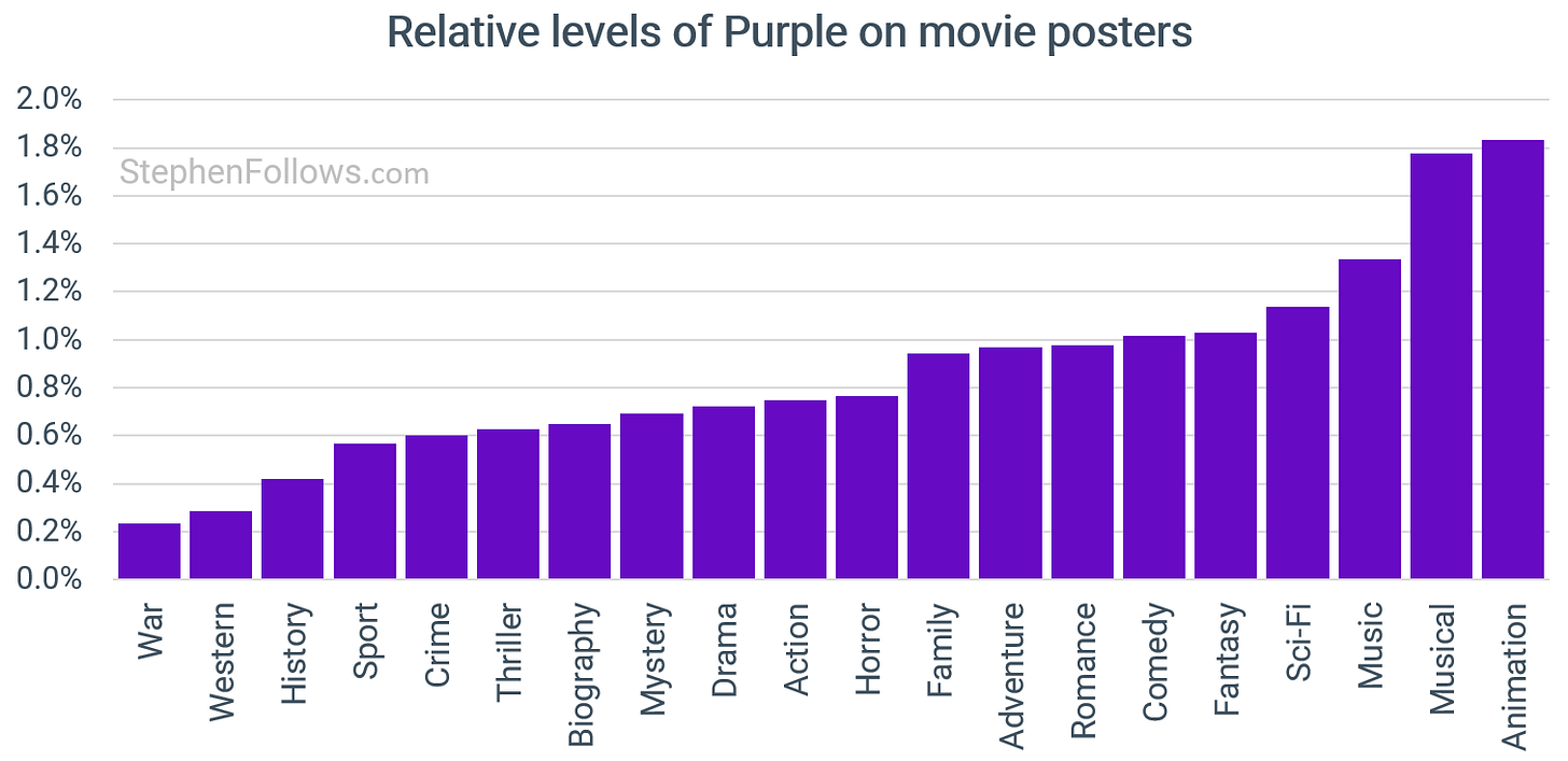
Purple is the iconoclast of poster colour. It rarely leads a palette, but when it does it signals something outside the mainstream.
In animation and musicals it leans whimsical or magical. In fantasy it can feel regal or mystical. Crime, sci fi and neo noir use it for sleaze, danger or otherworldliness.
Its scarcity makes it stand out, so a purple heavy poster often reads as a deliberate statement that the film sits apart from genre convention.
We’ll end of the loudest and most confident of the colours - pink.
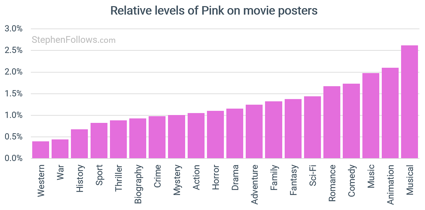
Pink is one of the most loaded and shape shifting colours in poster design. More than any other hue, its impact comes from the cultural baggage it brings into the frame.
In romance and romantic comedies, pink works as shorthand for affection, optimism and warmth. Soft blushes and pastels promise lightness and happy endings.
In teen films and high energy comedies, hot pinks and bubblegum shades flag youth, friendship, hyper femininity and social drama.
Certain period pieces and auteur films such as Marie Antoinette or The Grand Budapest Hotel use muted rose tones to add nostalgia, whimsy and ironic prettiness.
Pink can also be wielded as contrary message, such as being used in genres where it is not expected:
In horror and thrillers it becomes unsettling, using sweetness to create unease.
In crime dramas and neo noirs, a single pink element can destabilise expectations such as the cursive title on Drive suggesting tenderness inside a violent story.
Action and sci fi sometimes adopt neon pinks to tap into 1980s tech noir aesthetics or to build stylish tonal blends such as Baby Driver.
Pink also comes in a number of subtle-but-important variations. Pastels soothe but can signal naivety. Hot pinks are energetic and assertive but can feel shallow or abrasive. The Millennial Pink wave brought dusty, gender neutral sophistication, often tied to indie or art house positioning. In rare cases such as Barbie, pink becomes the brand, saturating the campaign so completely that it is the entire message.
Todays research looks at the colour and contrast values of the main poster for 58,687 feature films released over the past century. This is a bit of a simplification as movies typically have many posters, not least in different regions. In this case I will have got the most widely cited one, such as displayed on the Wikipedia page.
When referring to ‘sub-genres’ I mean the pairing of two major genres, such as ‘Action Comedy’ or Family Drama’. If a film was an Action, Comedy, Sci-Fi then it would appear in the following sub-genres:
Action Comedy
Comedy Sci-fi
Action Sci-fi
The order doesn’t matter, with ‘Horror Comedy’ being the same as ‘Comedy Horror’ given that I had no way to weight the two elements. (For more on which genres dominate in sub-genre pairing you might enjoy my research article entitled Which genres dominates when movies blend styles?).
In discussing variation within a colour, I used coefficient of variation which calculated as the standard deviation divided by the mean. In other words, it’s a way of showing whether the data is tightly clustered or widely spread, regardless of the overall scale.
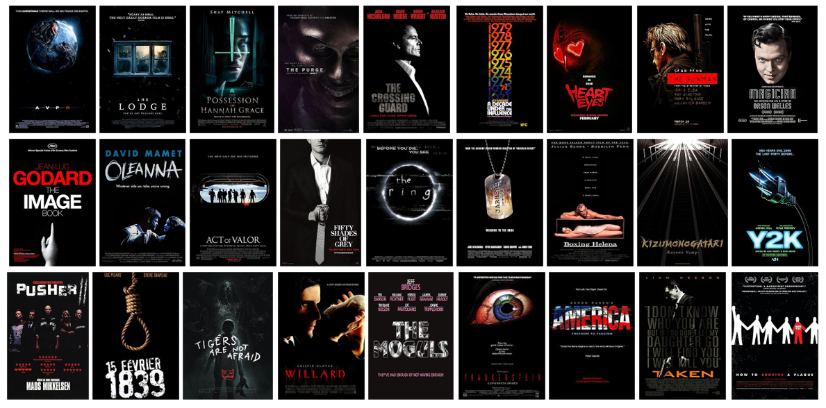
And, yes, I know that black is a colour. I just don’t think it fits with the colour analysis I had above. But to appease your noir nerds, here’s a dark montage for you.

